
All elements of design play an integral role in quilt design, but sometimes one or two stand out as key to a composition’s success. In the quilt I am sharing today, color and line are critical to the overall effect.
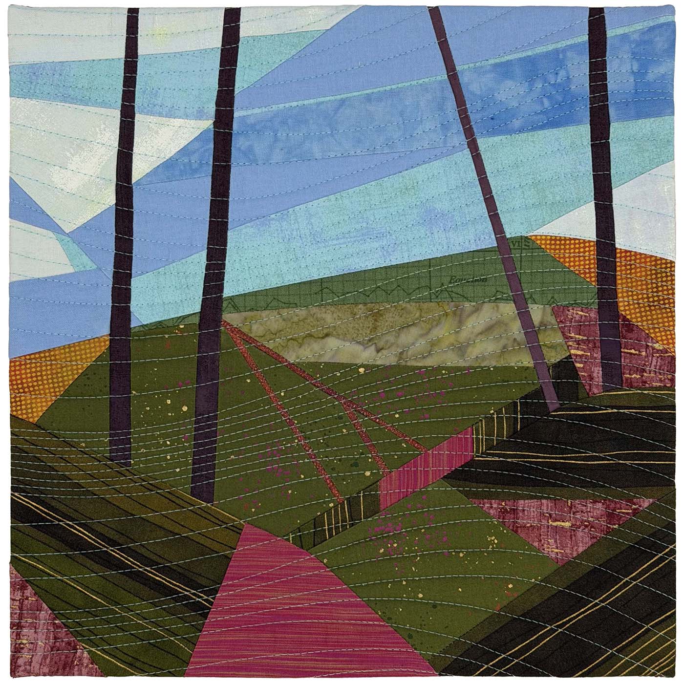
In the past two weeks, I have shared the first quilts I have contributed to the 2026 Telephone Tag series, a collaborative challenge I did with my regional SAQA group. Based on the game of telephone we played as children, this version is entirely visual rather than auditory. For the first quilt, we worked from another group member’s photograph to make a mini quilt, but all subsequent quilts are inspired by the mini quilts made by the person before us in the rotation.
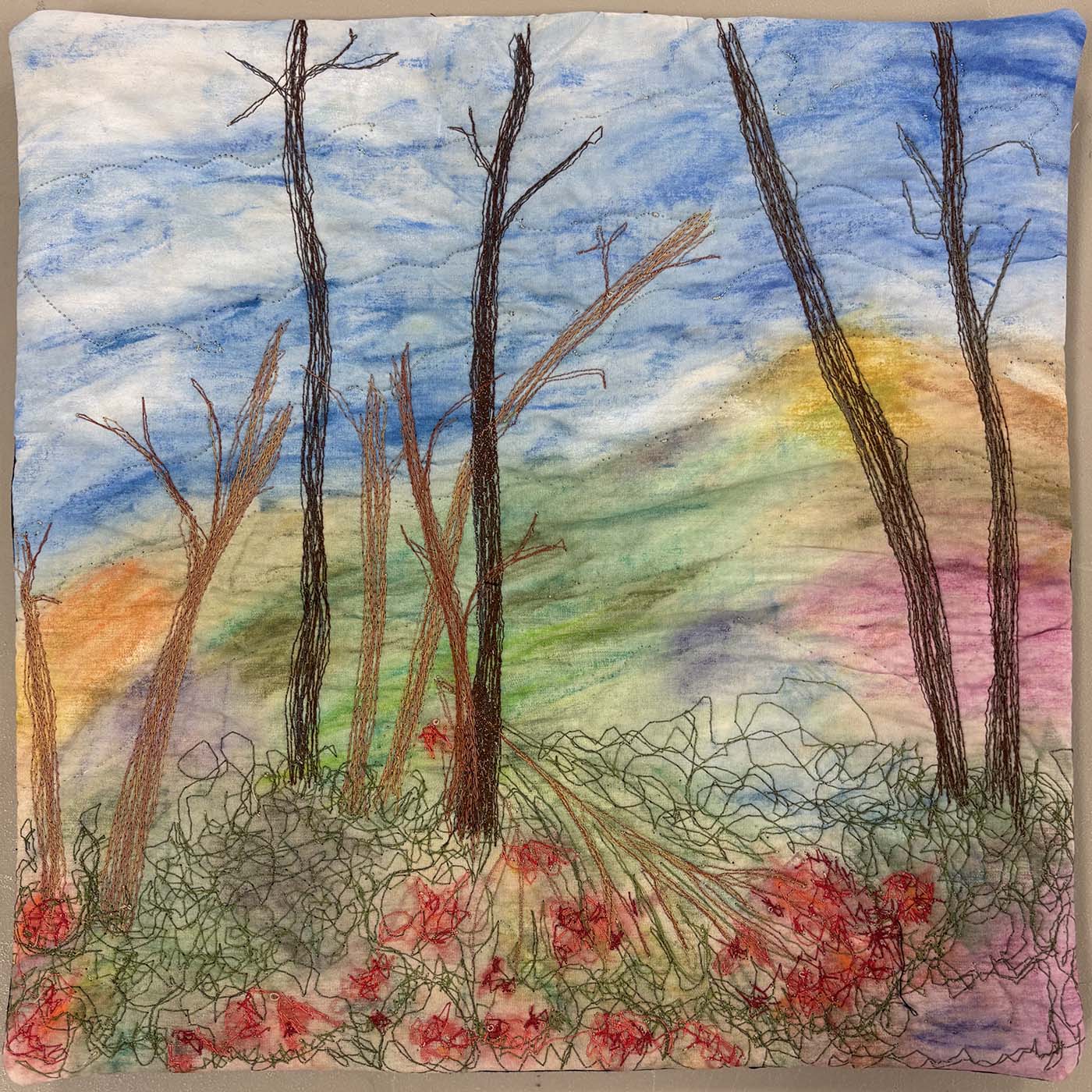
The Inspiration Quilt
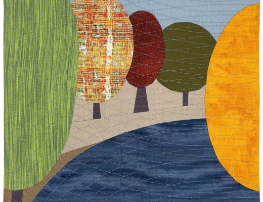
When I received the inspiration image for my third quilt, I was first struck by the painterly background and the strong use of line in the quilting stitches. After studying the source quilt, I decided my composition should embrace three aspects of the design:
- The feeling of late autumnal trees on gently rolling hills
- Multiple color shifts in the background, creating a painterly effect
- A strong use of line to move the viewer’s eye through the composition
Keeping these aspects in mind as my primary goals, I set out to create a design that reflects my quilting style.
My Design
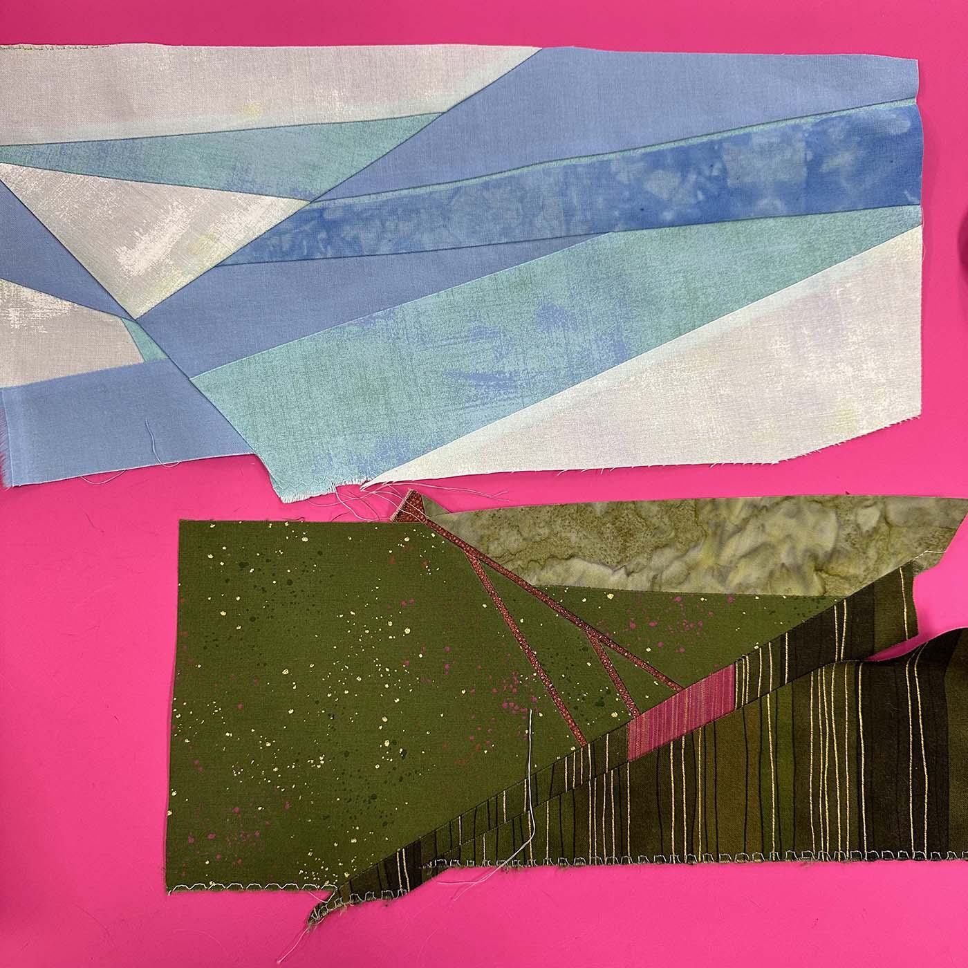
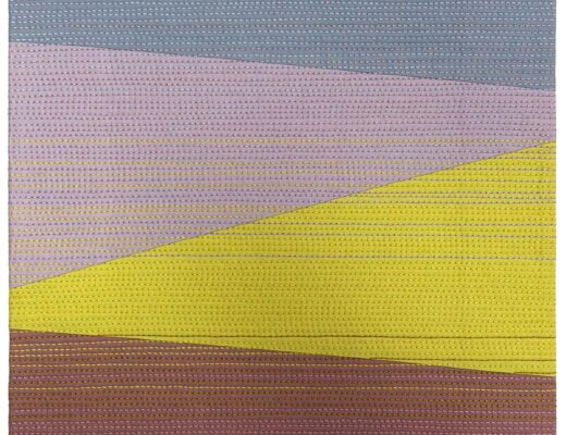
Even though I trained as a painter, it is extremely rare for me to paint on a quilt. However, collage is a close neighbor to painting, and improvisational piecing is my favorite way to create a painterly collage effect while embracing traditional piecing techniques.
By selectively incorporating strong pieced lines and fabric with distinctive linear prints, I could guide the viewer’s eye around the composition.
Pairing the overall composition with soft waves of linear quilting enhances the feel of gently rolling hills.
Color
To encourage myself to use smaller pieces of fabric, thereby creating a background evoking the feeling of paintstrokes, I pulled most of the fabrics for this composition from my scrap fabric bins, with the remaining pieces coming from my stash. The palette includes solids, prints, yarn-dyed wovens, and hand-dyed fabrics.
The dominant colors in this composition are green and blue with accents of violet, pink, and yellow. You may expect to see brown as a dominant color in an autumnal landscape, but I believe an overuse of brown can quickly destroy a composition. This probably stems from my painting background, when, as a student, we were often not permitted to use black or brown paint from a tube. If we wanted to use these colors, we had to mix them, which yielded a very specific palette that often leaned toward deep violets for the darkest areas of a composition.
Line
I used line in both piecing and fabric selection to guide the viewer’s eye through the composition. Selecting only the darkest tree trunks from the inspiration image simplified the composition and gave me a somewhat unexpected four lines to work with. You have probably heard somewhere along the way that you should use odd numbers of key components in your designs. While this is often true, there are ways to break this rule successfully. In this case, the tree trunks work in pairs, almost dividing the overall composition into thirds. The pairs also tilt towards each other at the top of the composition. When combined with the printed stripe in the bottom right corner and the piecing at the same angle at the base of the tree trunk, it creates an implied triangle that guides your eye through the composition.
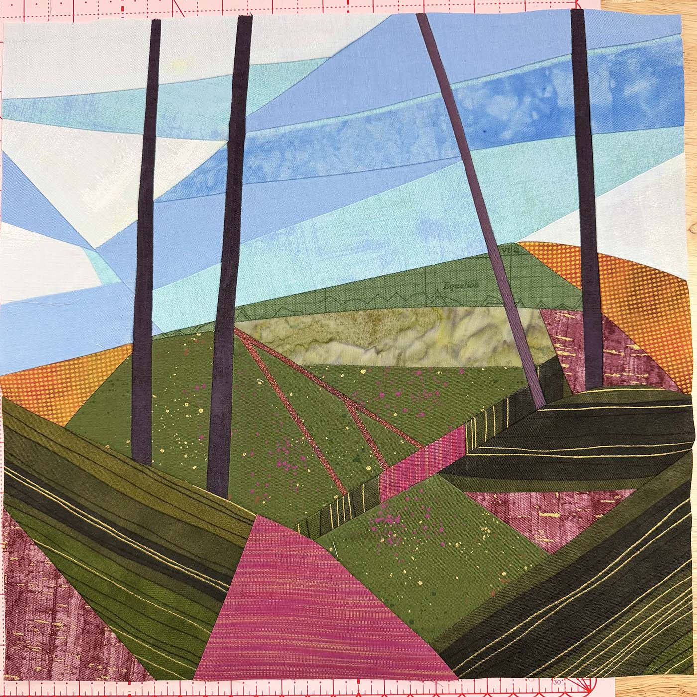
Several fabrics in the composition use line in their designs, but the strongest motif is the green-and-gold stripe. When used in the bottom corners of the quilt, the stripes effectively catch your eye when the pieced tree trunks try to push your attention off the edges of the composition, and with the help of the horizontal stripe in the center right, pull your attention back towards the center of the composition.
Quilting
For this design, I wanted the quilting lines to enhance a sense of an open, natural space, preferably in a way that enhances the gently rolling hills. The softly curving lines of light aqua quilting create the feel of a breeze moving through the trees. To achieve this effect, I drew several curved lines of varying shapes 1-2 inches apart across the quilt. Since the quilt is so small, I was able to eyeball additional lines of stitching between the first set by quilting halfway between the lines and repeating the process until I was happy with the quilting density.
Finishing
To give the illusion that the composition extends beyond the plane of the quilt, I used a faced edge to finish the quilt.
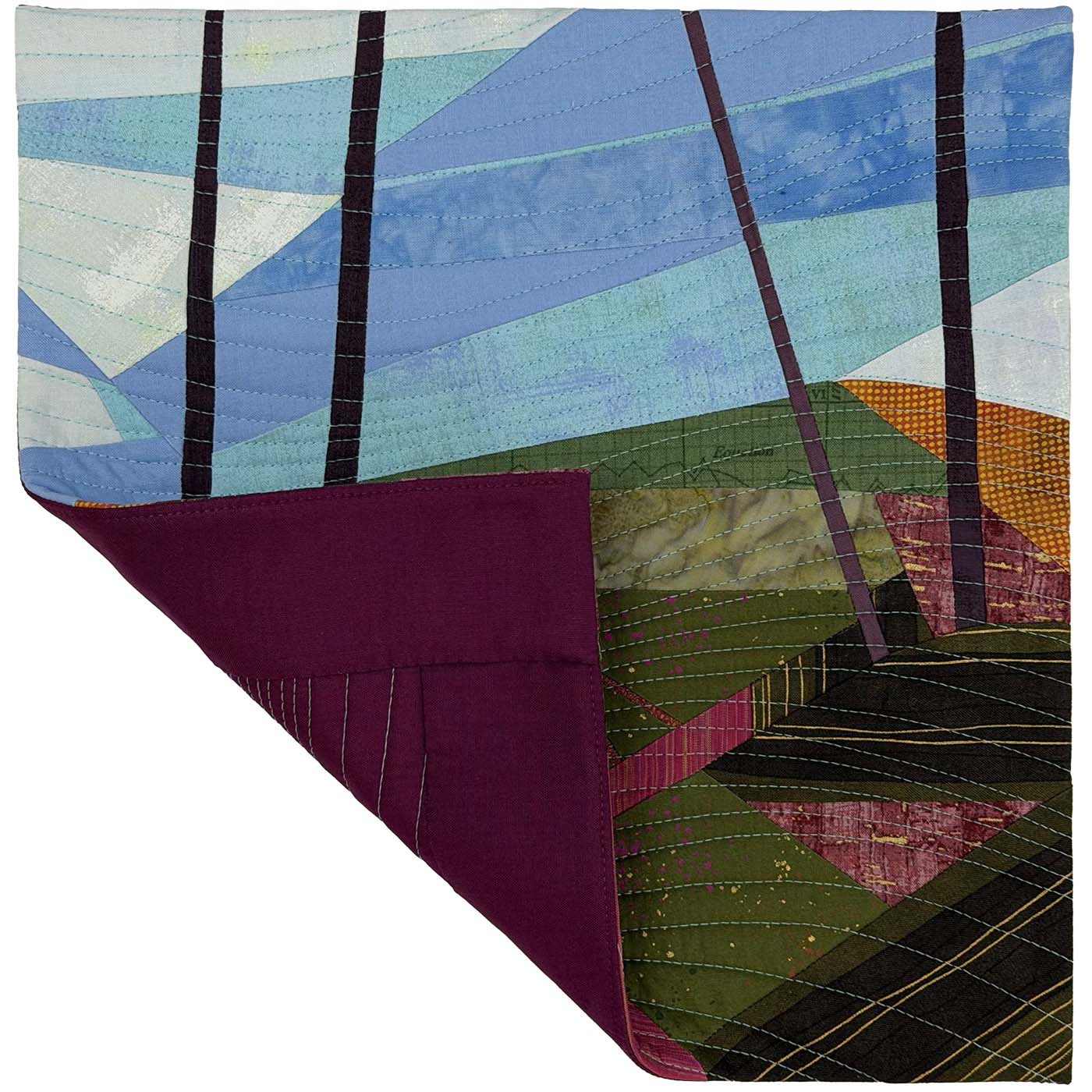
Quilt Stats:
- Title: Rolling Hills
- Size: 12” x 12”
- Techniques: Improvisational piecing, sliver inserts
- Quilting: Walking foot quilting on a BERNINA 770 QE PLUS
- Fabric: Assorted solids, prints, wovens, and hand-dyed fabric from my scraps and stash
- Batting: A scrap of Hobbs 80/20 Cotton/Wool blend
- Thread: 50-weight Aurifil
- Edge Finish: Facing
1 Comment
Kathie
July 31, 2026 at 8:11 amLove the thread painting and watercolor appeal of the inspiration piece! It’s interesting how you’ve replicated the lines, shapes and movement of colors using straight piecing. This telephone series is sew much fun!