Color is one of the most noticeable trends at any quilt show, and also has the potential to be one of the most fluid. Color trends vary from year to year, and while they often stick around for several years, they also tend to evolve to interact with even newer trending colors. This year I noticed lots of pink showing up in quilts as both focal and supporting elements. Since pink is my favorite color, I am totally on board for this trend. Even if it isn’t your favorite, check out some of these quilts, and you may change your mind.
Finding current trends within the work exhibited at a quilt show is one of my favorite activities, and this is my third and final post about trends I noticed at QuiltCon 2023. Other trends I noticed were Whimsical Quilts and Rectangles as a design Element.
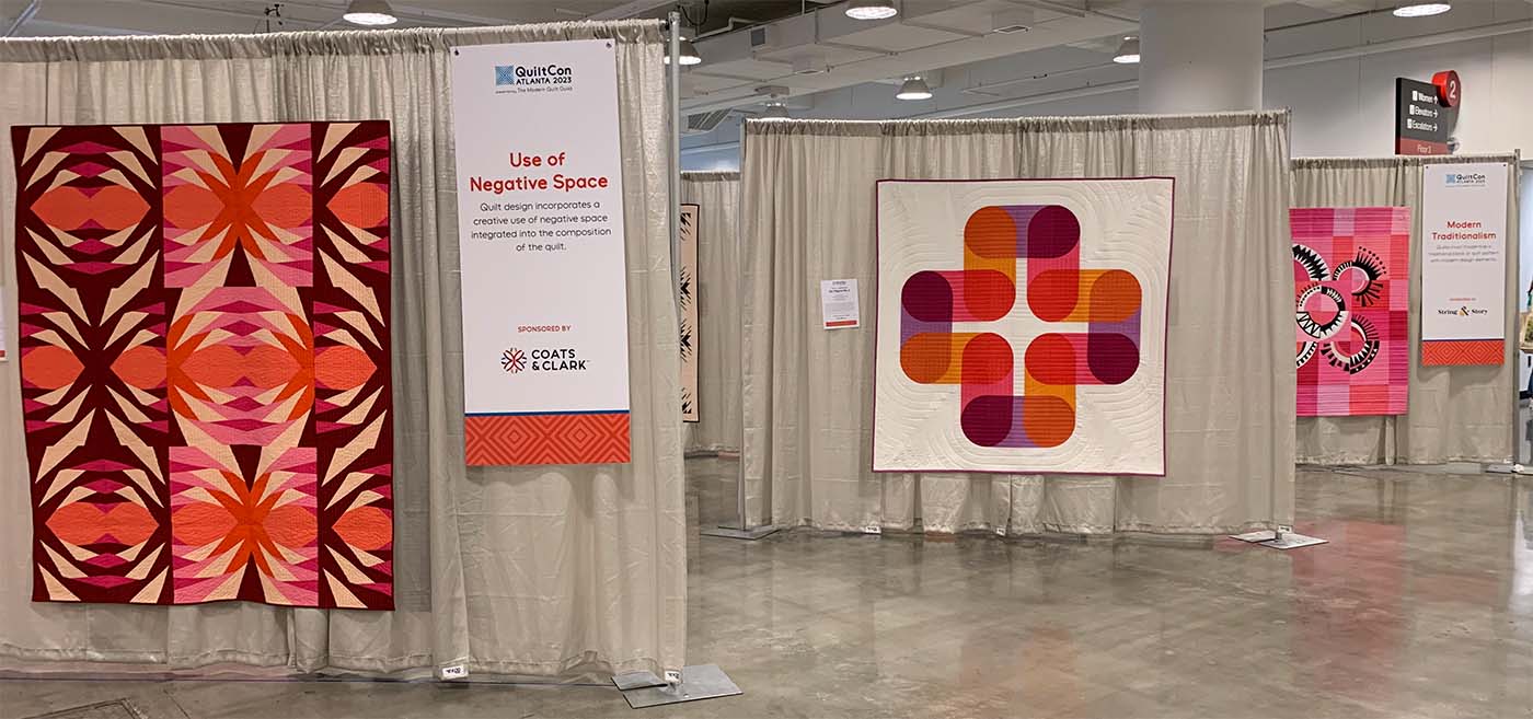
NONE OF THE QUILTS PICTURED ARE MY WORK! Each work is labeled with the maker, and their Instagram handle when available. These are in no particular order.
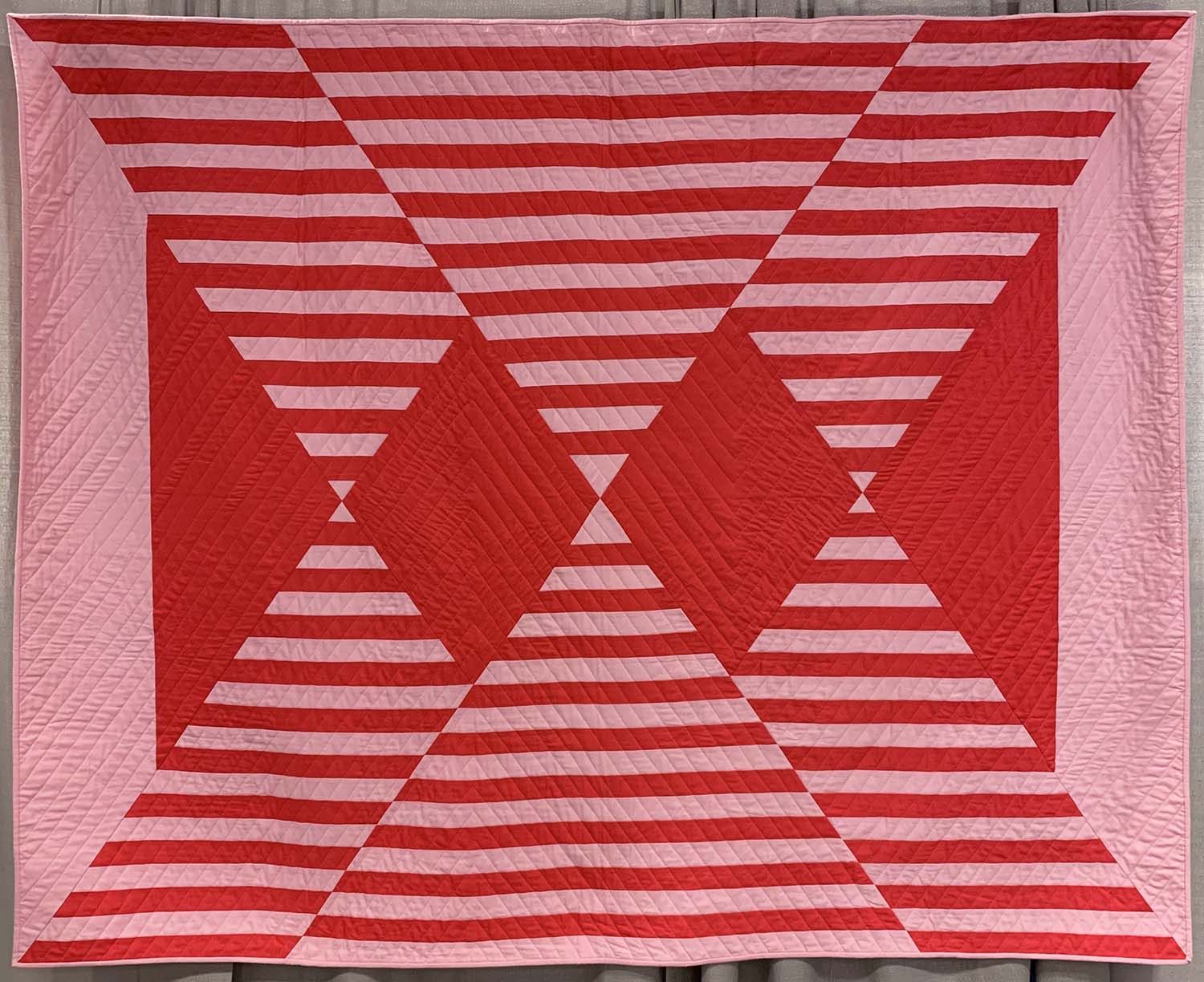
Cherry Ice Cream Smile by Phoebe Harrell
Instagram: @pixiecupindustries
Modern quilters have, thankfully, eschewed the quilt police, but once upon a time they were going strong. As a kid, one of the first rules of quilting I ever heard was that pink and red should not go into the same quilt. This made no sense to me- dark blue and light blue were ok, and wasn’t pink just another term for light red?
The pink and red combo in this design absolutely thrilled me and my inner eight year old! Pairing a bubblegum pink and a vibrant red is the perfect graphic representation I have always wanted.
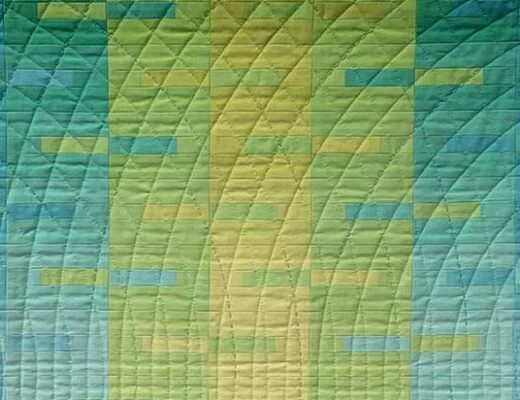
Macrame #1 by Abigail Vargas
Instagram: @avargasdesigns
One of the things I am loving about this pink trend is how it is getting combined with other equally intense colors. So often when we first start incorporating a new-ish color into a palette, we tend to pair it with a neutral set of colors. While neutrals always look good, I love the sense of adventure people have with their use of pink. In this quilt, the vibrancy of a full range of both pink and yellow mix with both bright and muted blues to create a modernized interpretation of an (almost) primary color palette.

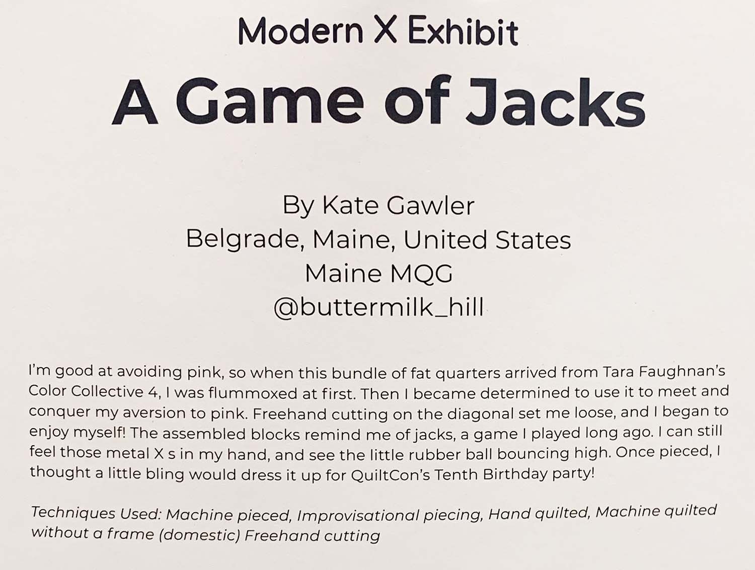
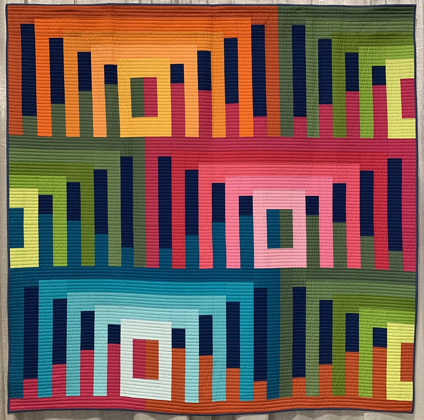
A Game of Jacks by Kate Gawler
Instagram: @buttermilk_hill
I never would have guessed that an initial aversion to pink could result in such a dynamic design, although perhaps a dislike for a color may force you to look at it in a different way. Light to medium pinks have an association with babies and young children. Due to this connection they have, in my opinion, been under utilized in recent years. This quilt shows how they can work in a sophisticated and unexpected color palette, and I hope to see more in the coming years.

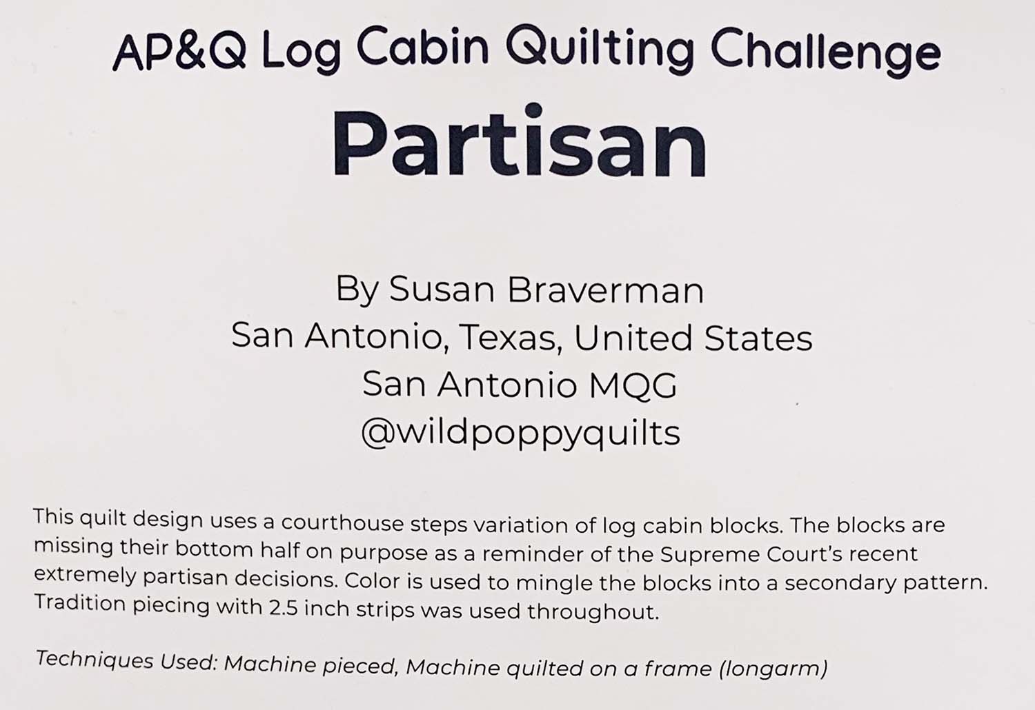
Partisan by Susan Braverman
Instagram: @wildpoppyquilts
In this piece pink embraces the same value range visible in each color range within the quilt. The play of intense colors of similar values makes your eye move around the design as each element comes forward and then recedes in turn.
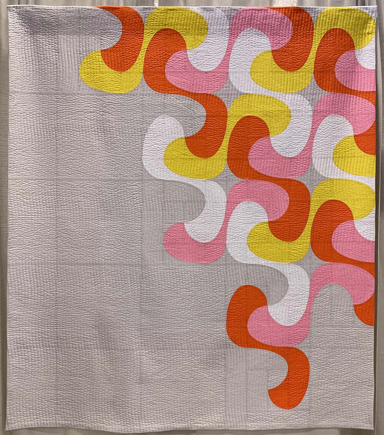
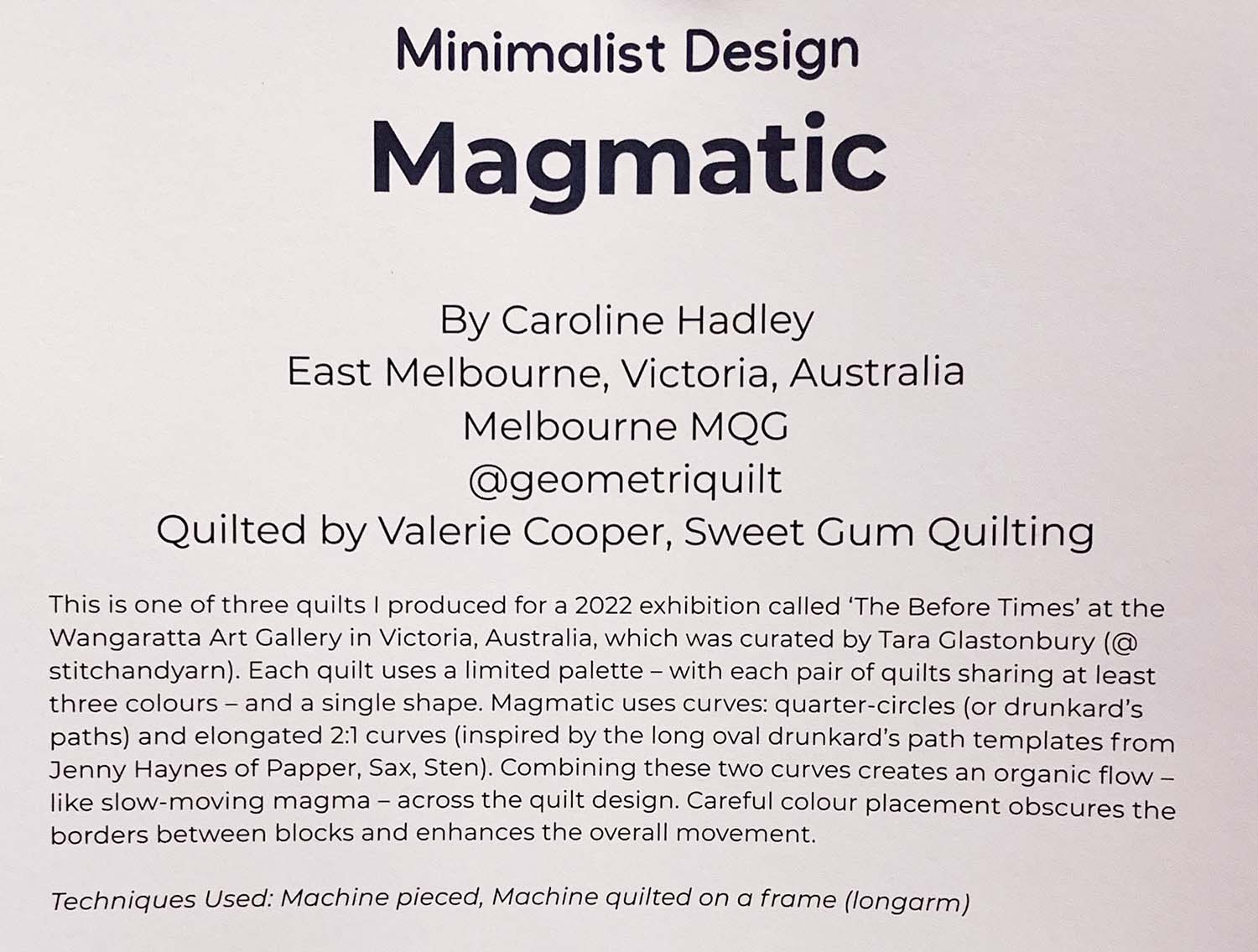
Magmatic by Caroline Hadley
Instagram: @geometriquilt
Pink and orange is favorite combination of mine, and this quilt makes me wonder why I have never tried it with a bright, true yellow. I like how this design is set against a pale grey background while also incorporating white fabric. That bit of white offers a striking contrast with the background that could have read as almost white if the contrast was not in the piece, and the white makes the intensity of the bright colors pop off the quilt.
Is pink here to stay?
Have you used pink in a quilt recently? Do you plan to? Will pink be a dominant color in QuiltCon 2024?

No Comments