Each QuiltCon contest is a carefully curated show that has a unique style each year. Because of this shifting aesthetic, it makes it a particularly fun show to look for upcoming trends. Last week I talked about whimsical quilts at the show, and this week I’m looking at a shape-based trend.
In 2022 QuiltCon was packed with circles and curves as dominant shapes, and this year continued that trend. However, I did notice a new shape on the block- the humble rectangle. While many quilts have a rectangular shape overall, I started to notice more rectangles being used as a major design component within the contest quilts. Check out a few of my favorites below that use rectangles in different ways and proportions.
NONE OF THE QUILTS PICTURED ARE MY WORK! Each work is labeled with the maker, and their Instagram handle when available. These are in no particular order.
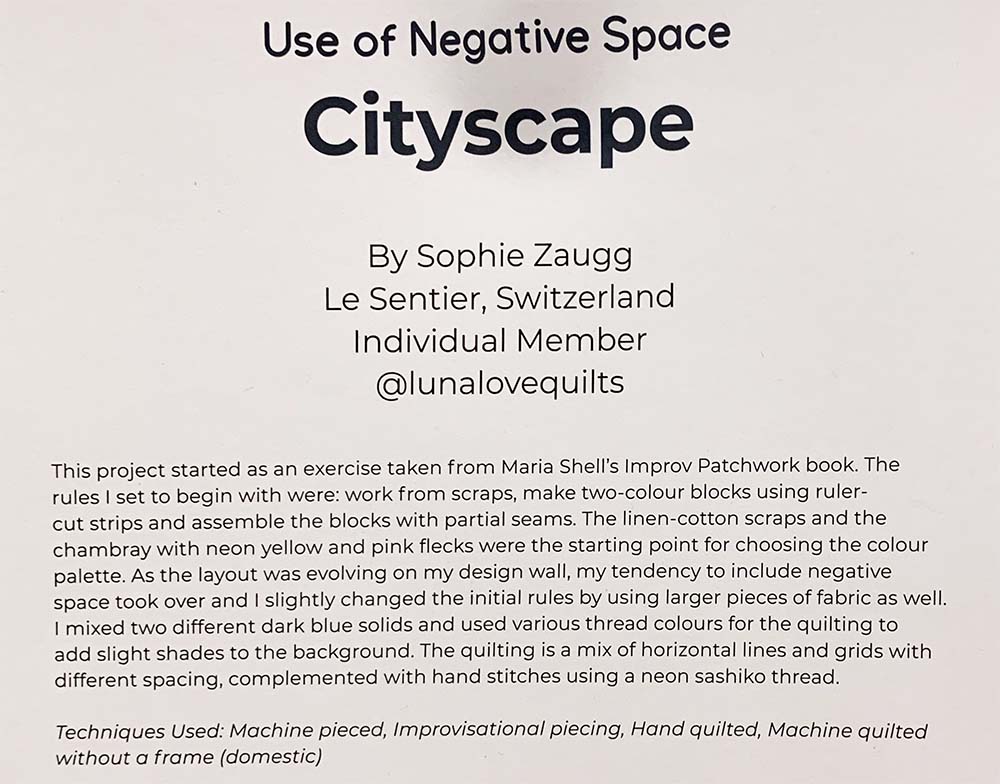
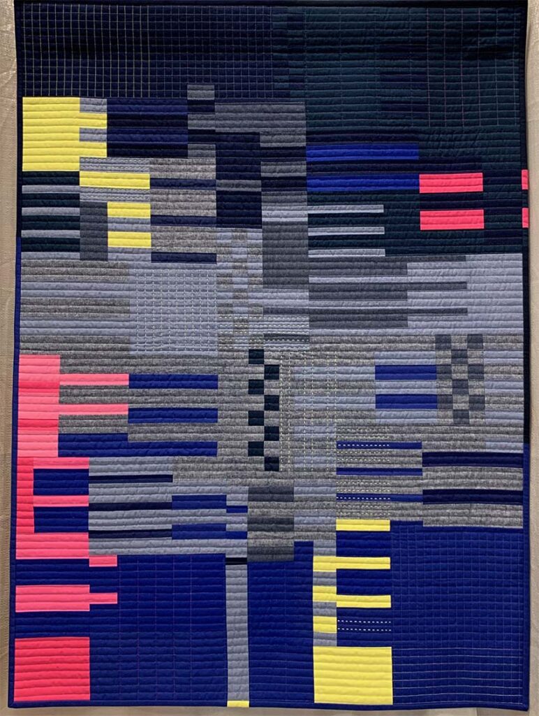
City Scape by Sophie Zaugg
Instagram: @lunalovequilts
Primarily horizontal rectangles mix in a wide range of proportions in this all over composition. The inclusion of checkerboard piecing and square grid quilting in areas enhances the shifting proportions of the rectangular units. Bold color blocking pairs with subtle color and texture changes to help move your eye around the structure of the design.
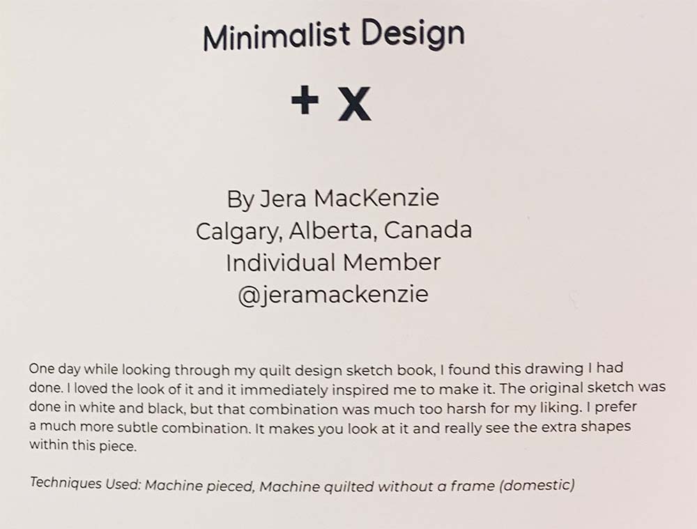
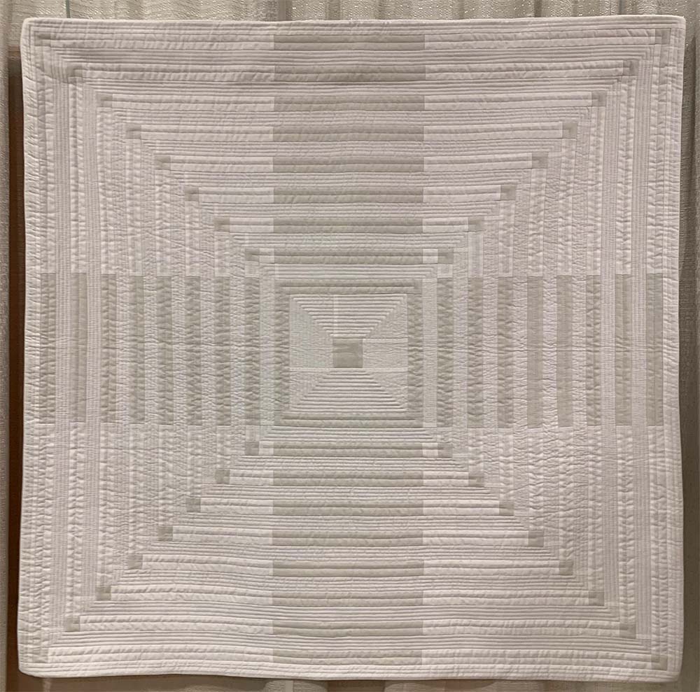
+ X by Jera MacKenzie
Instagram: @jeramackenzie
Building outward from a square central point to a square overall shape, this quilt uses long, narrow rectangles to create the illusion of four larger rectangles, two vertical and two horizontal.
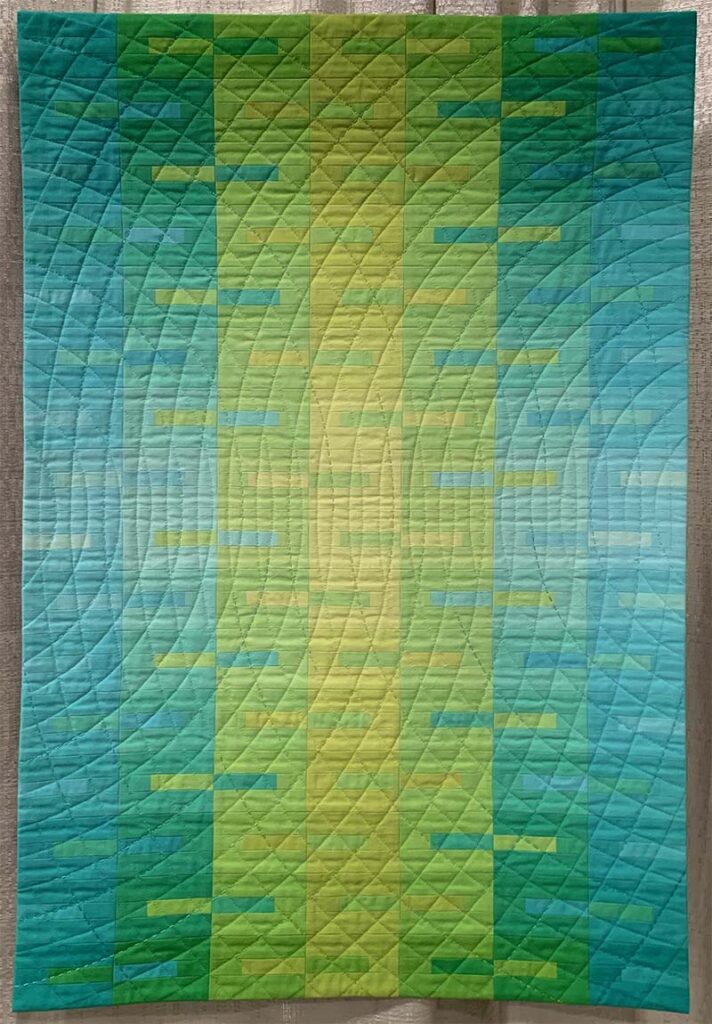
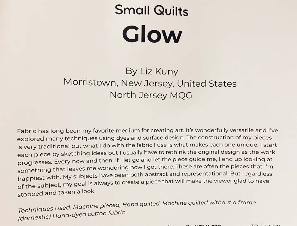
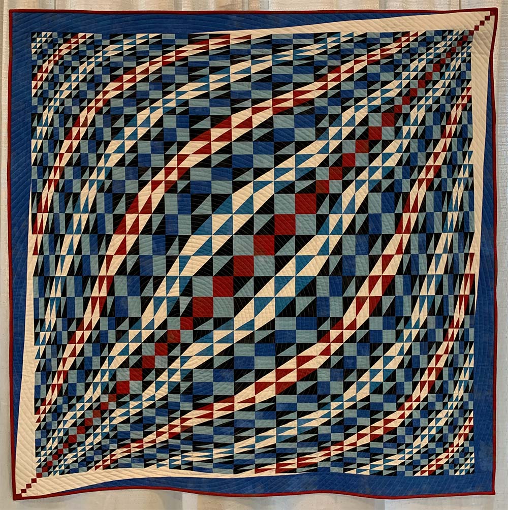
Glow by Liz Kuny
In this quilt narrow rectangles are inserted into larger rectangular blocks. The smaller rectangles use slight color and value shifts that help create a gradient in the overall composition.
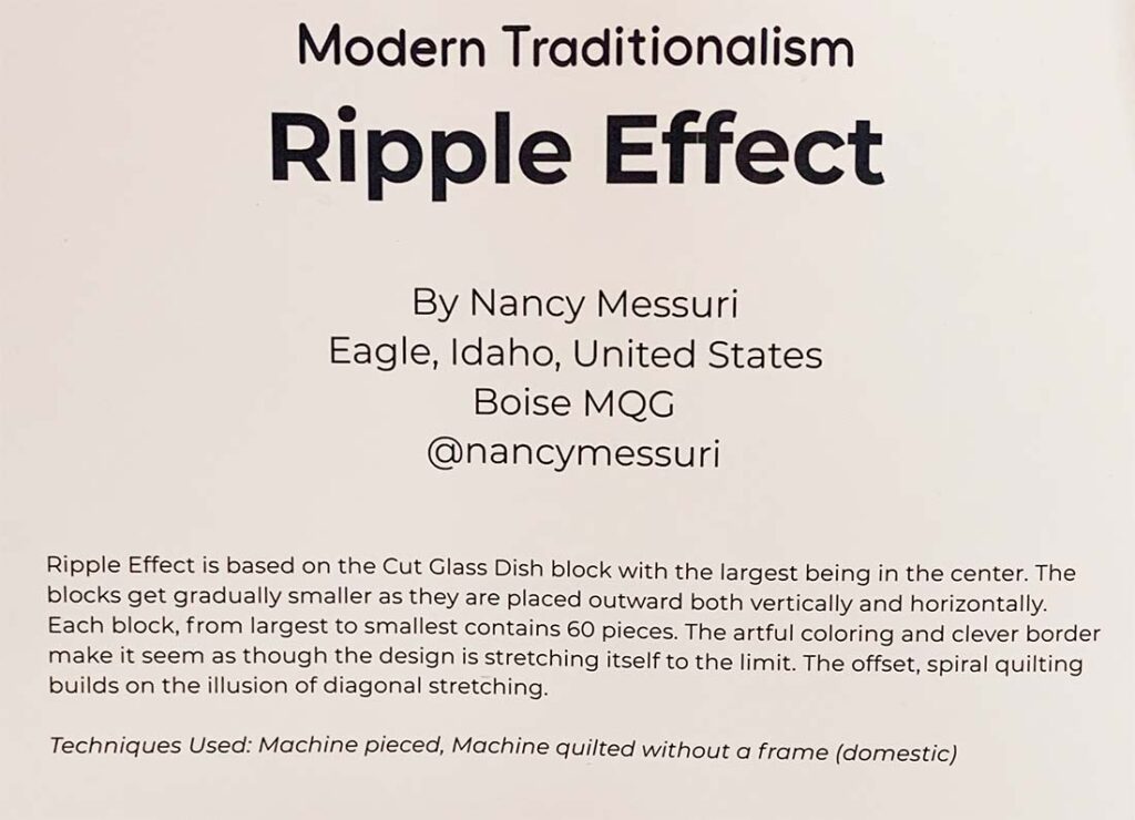
Ripple Effect by Nancy Messuri
Instagram: @nancymessuri
Proportion is key to this fabric challenge entry. Starting with a four patch block in the center of the piece, the proportions of the individual blocks gradually shift into various rectangular forms including both solid and half-rectangle-triangles to develop a dynamic sense of movement within the quilt.
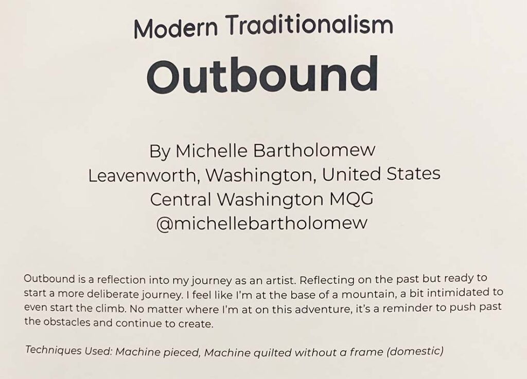
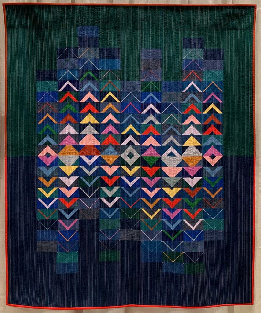
Outbound by Michelle Bartholomew
Instagram: @michellebartholomew
Flying Geese are often the first rectangular blocks we encounter in our quilting journeys. In this design the shifting colors within the dark background highlights the rectangle blocks as a secondary design behind the bold triangular forms.
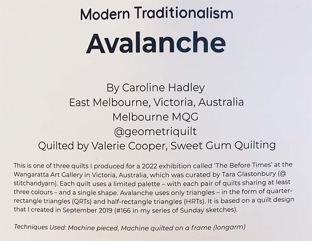
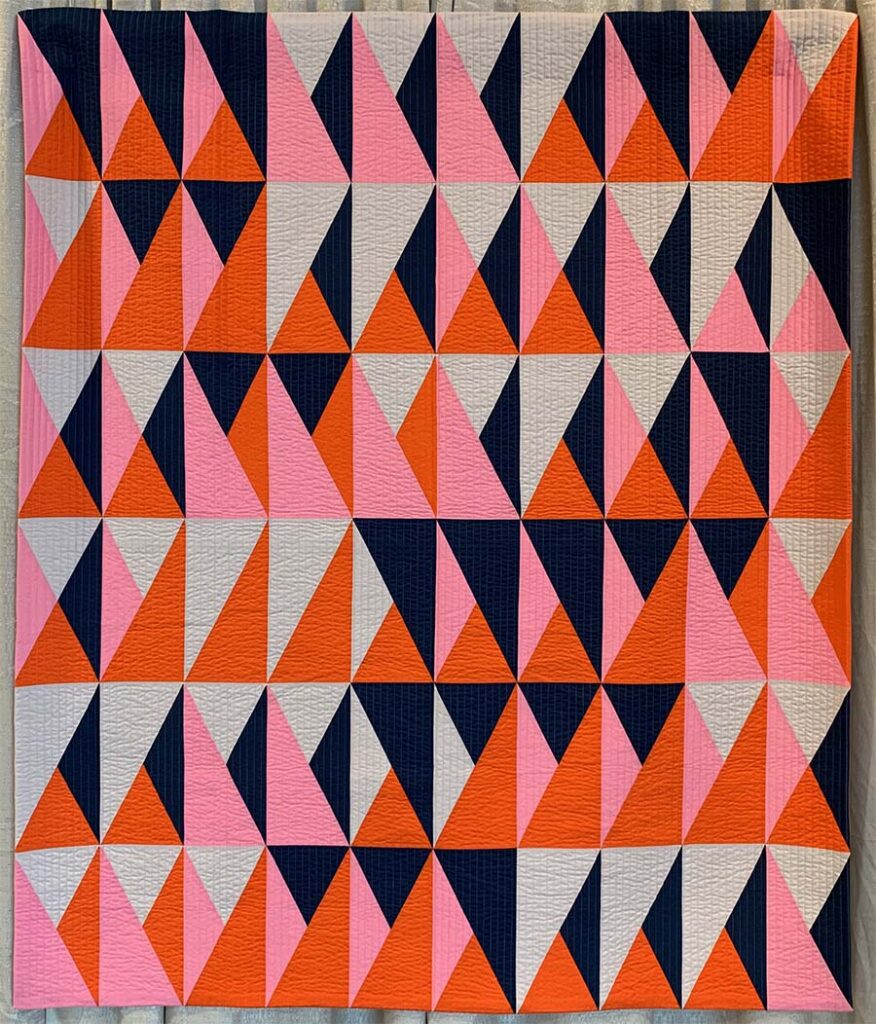
Avalanche by Caroline Hadley
Instagram: @geometriquilt
Vertical rectangles take a highly graphic approach incorporating half and quarter rectangle triangle blocks. A limited color palette combining bold colors and distinct values highlights the use of rectangles as complete blocks.
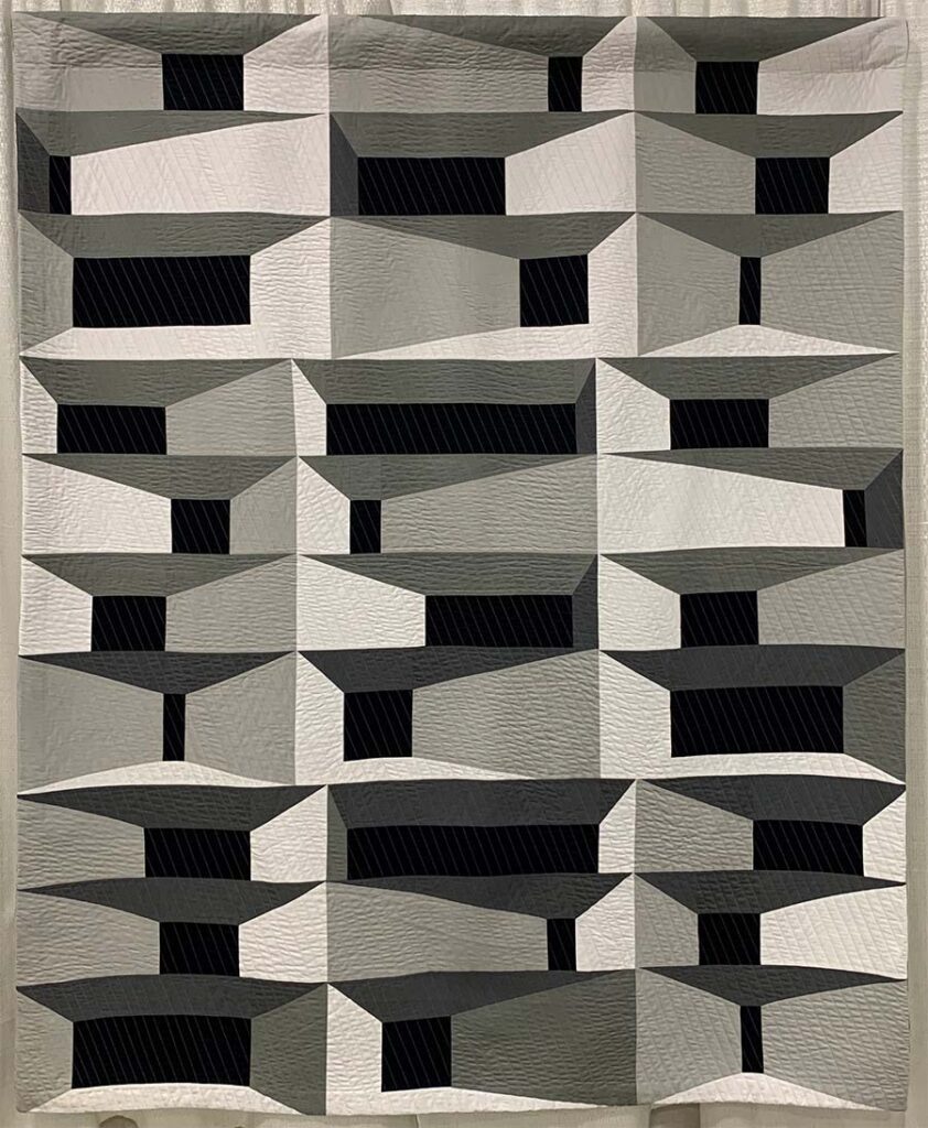
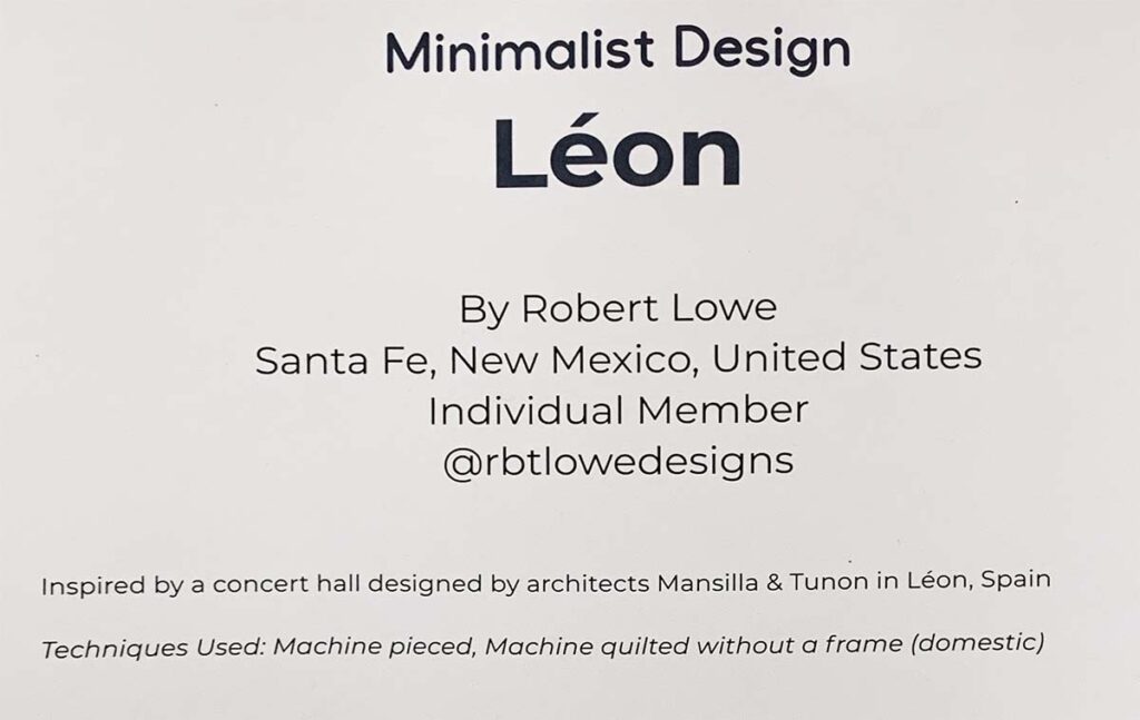
Léon by Robert Lowe
Instagram: @rbtlowedesigns
Inspired by architecture, each horizontal rectangular block incorporates a black rectangle that reads as an opening, creating the feel of separate compartments. Notice how the rectangle proportions shift between rows which makes the design less predictable and more interesting to look at.
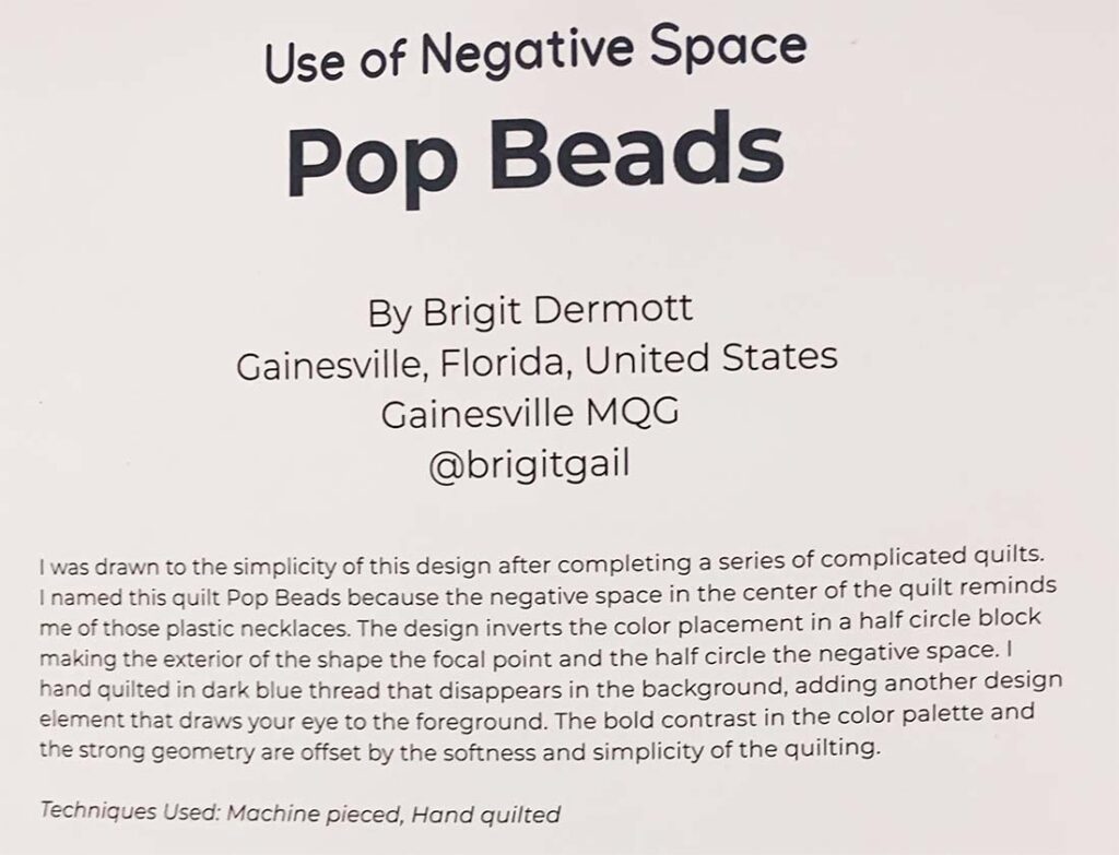
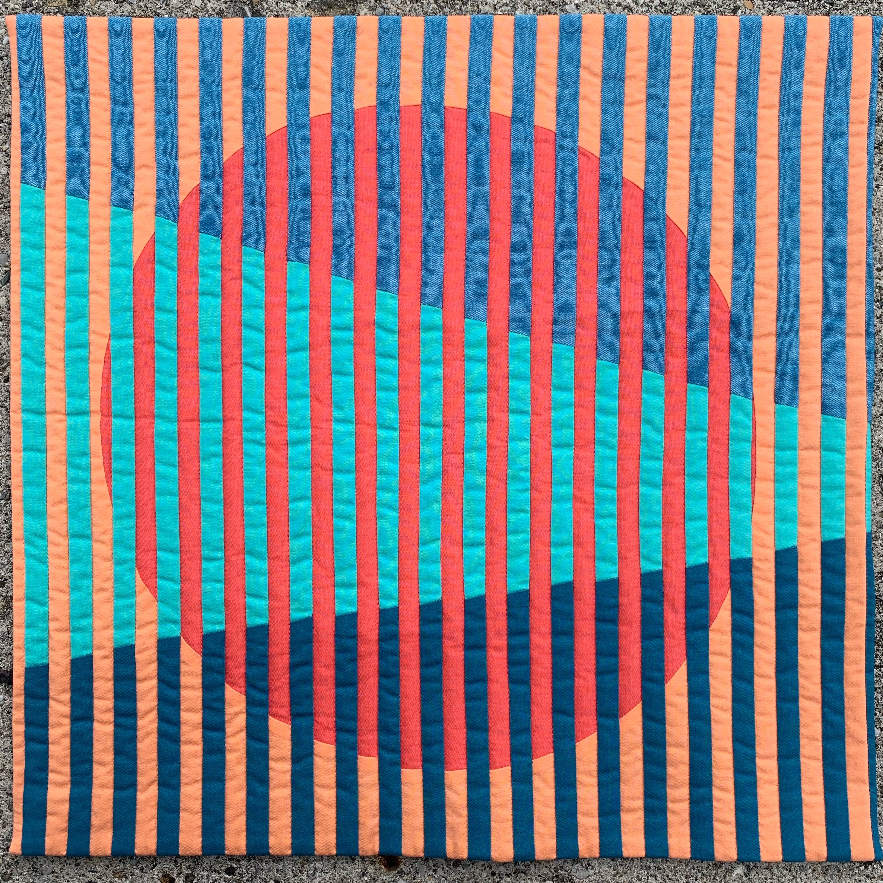
Pop Beads by Brigit Dermott
Instagram: @brigitgail
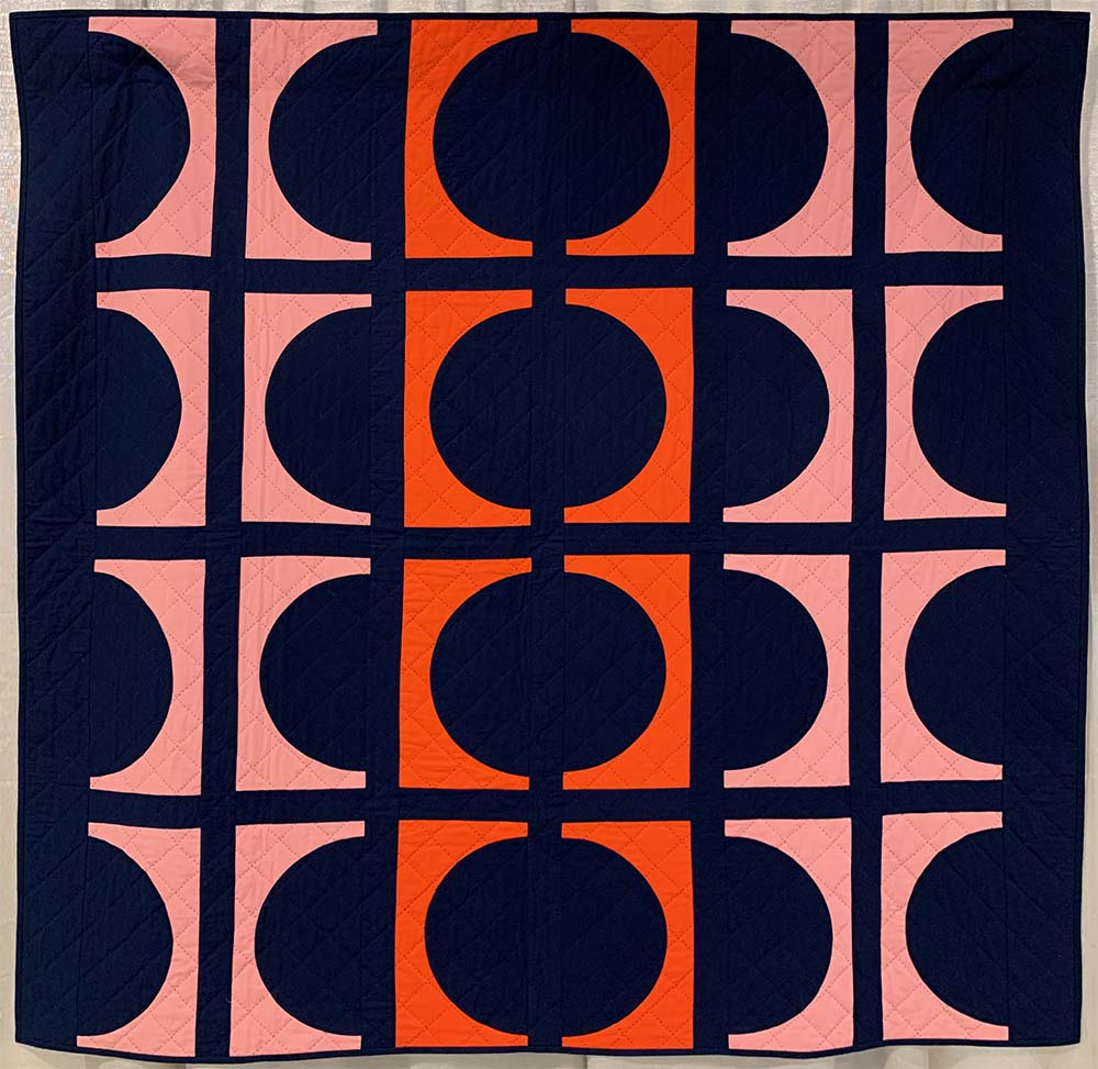
It has curves! And Rectangles! At first glance this quilt looks like a composition of square, but the individual block components are rectangles creating the illusion of circles down the center of the quilt.
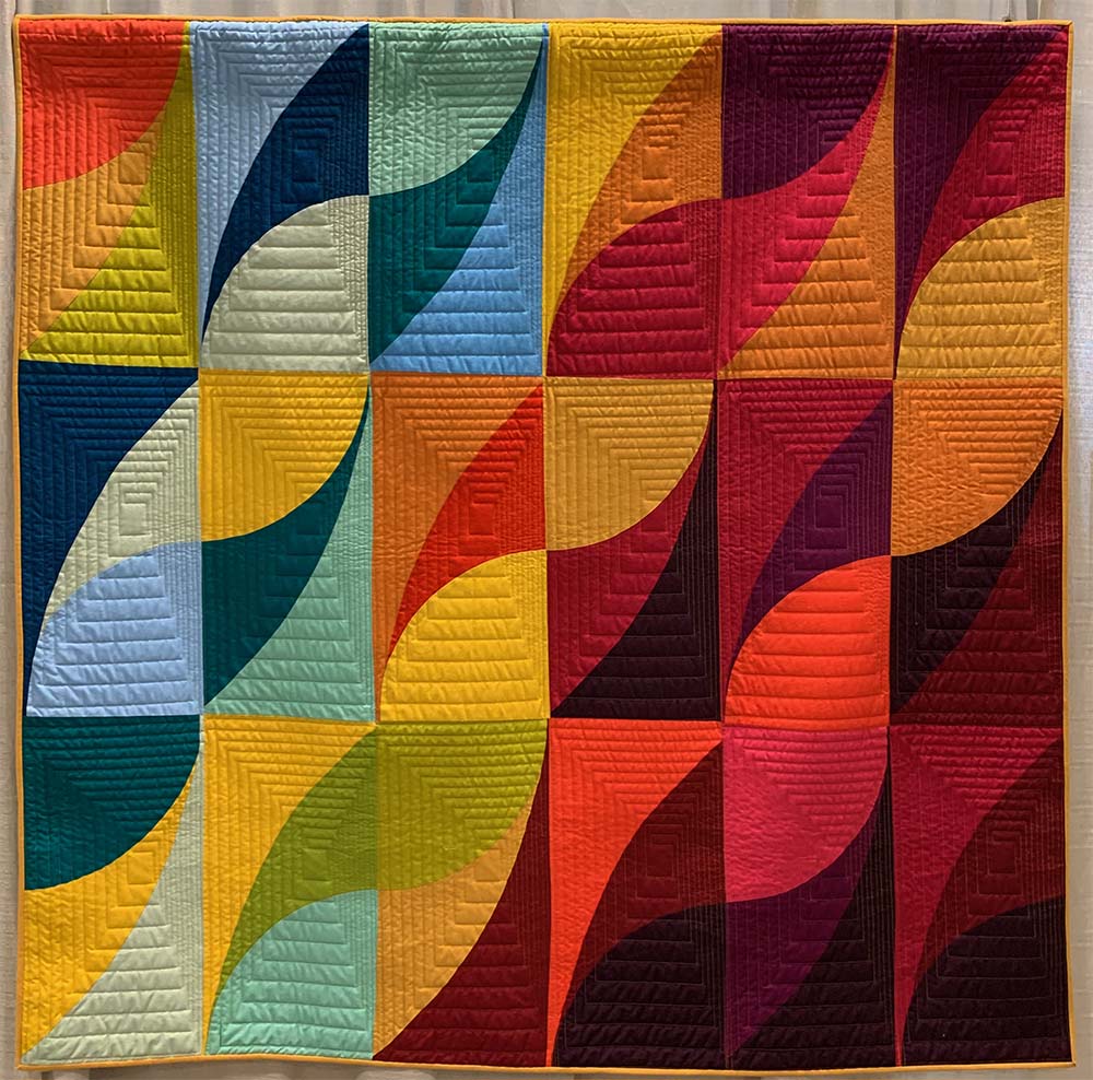
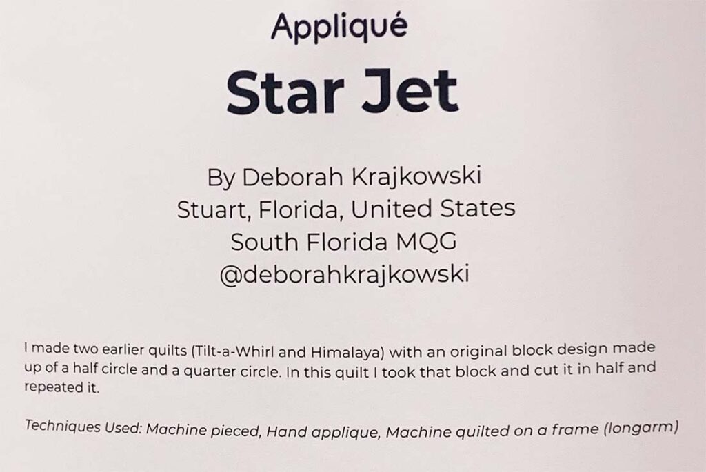
Star Jet by Deborah Krajkowski
Instagram: @deborahkrajkowski
More rectangles and curves here! The rectangular echo quilting in the individual rectangular blocks enhances the individual block compositions by creating a textural, off center focal point .
What do you think?
Have you been seeing more rectangles used as a design element? Have you used them or are you planning to give it a try? Do you think rectangles will appear more frequently moving forward?


No Comments