Quilting a Future: Contemporary Quilts and American Tradition recently closed at the Columbus Museum of Art here in Central Ohio, and I was fortunate to visit the exhibit a couple of times during its run. I have lots of thoughts still running through my head about the exhibit as a whole, but today I would like to share with you five of my favorite quilts in the exhibition. It was hard to narrow down my choices, but here are the five quilts I don’t want you to miss!
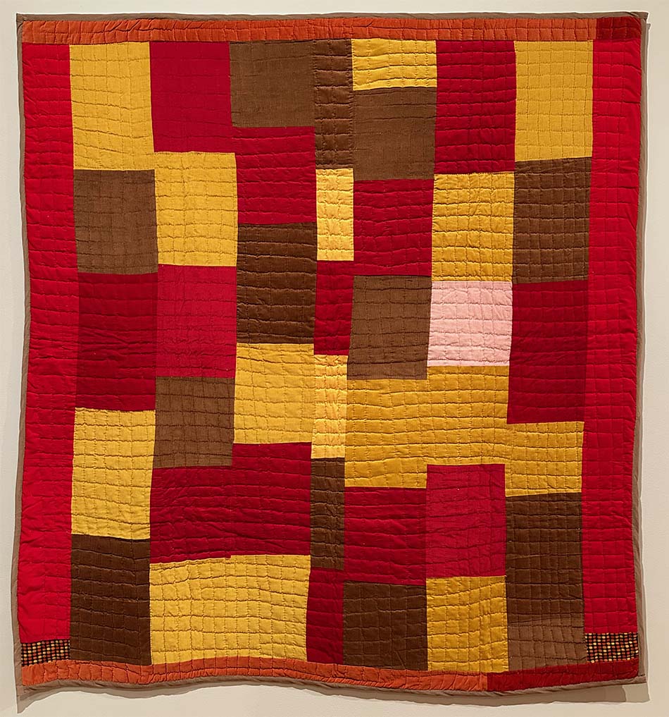
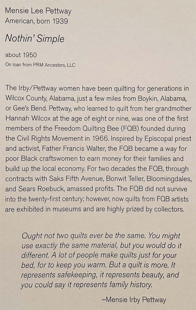
Nothin’ Simple by Mensie Lee Pettway
What I like about the quilt:
- Fabric Texture: Velvet and corduroy for the win! The fabric textures combined to give this quilt a luscious appearance. I’m sure the weight and softness of the fabrics combine to make this quilt feel amazing.
- Bold Color Blocking: The limited color palette includes subtle shifts within each hue, and the placement of each rectangle creates an overall flow throughout the composition of the quilt.
- Grid Quilting: The medium-scale hand grid quilting unifies the overall design, but I’m glad I didn’t have to hand quilt through all those amazing fabrics!

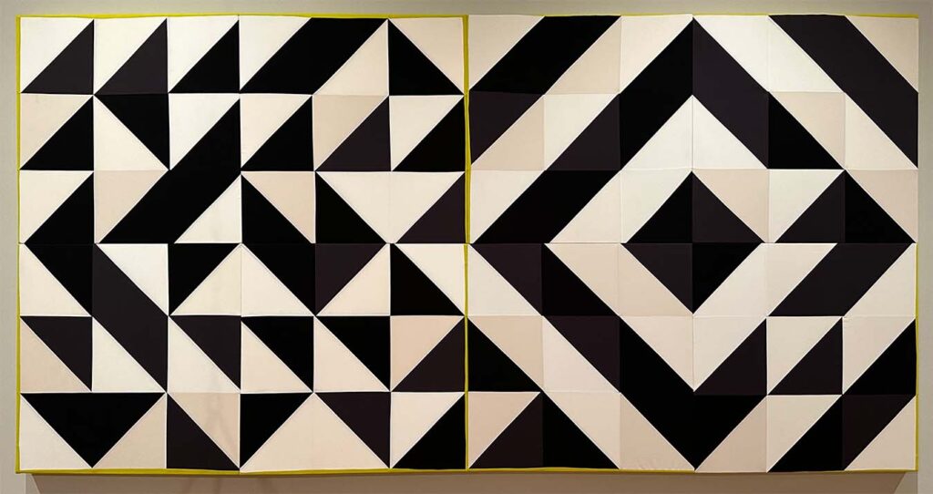
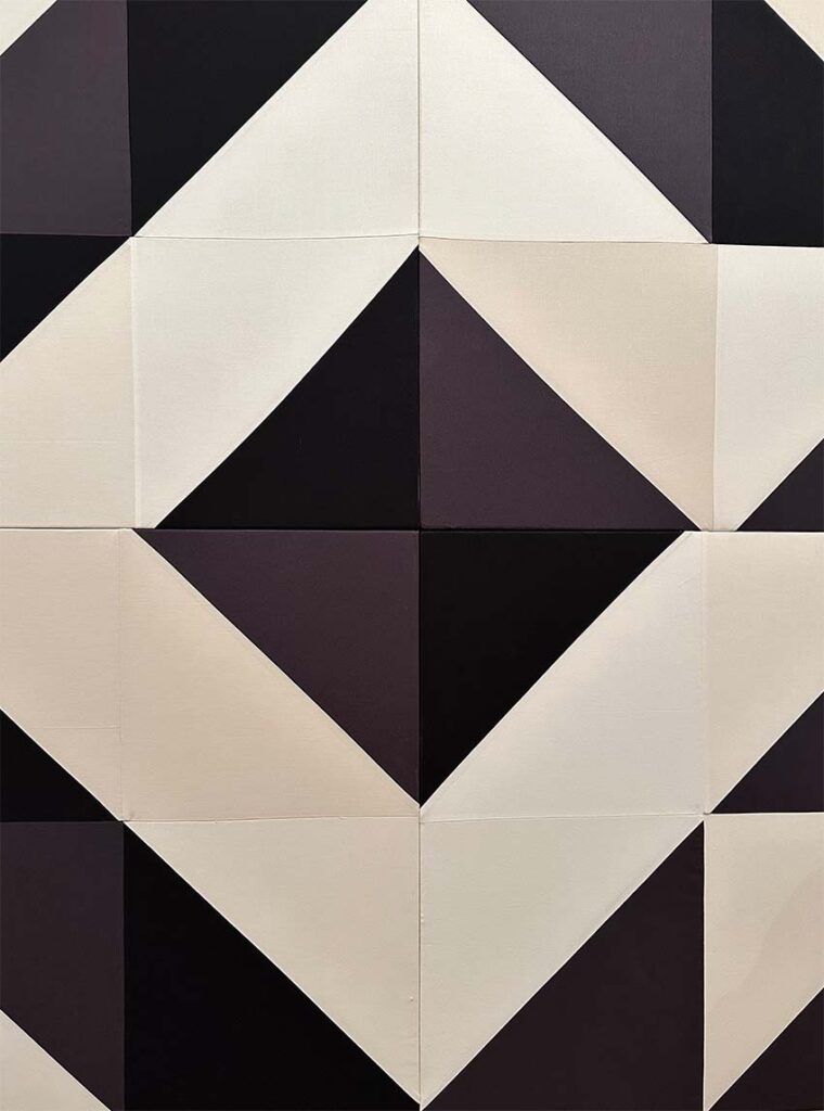
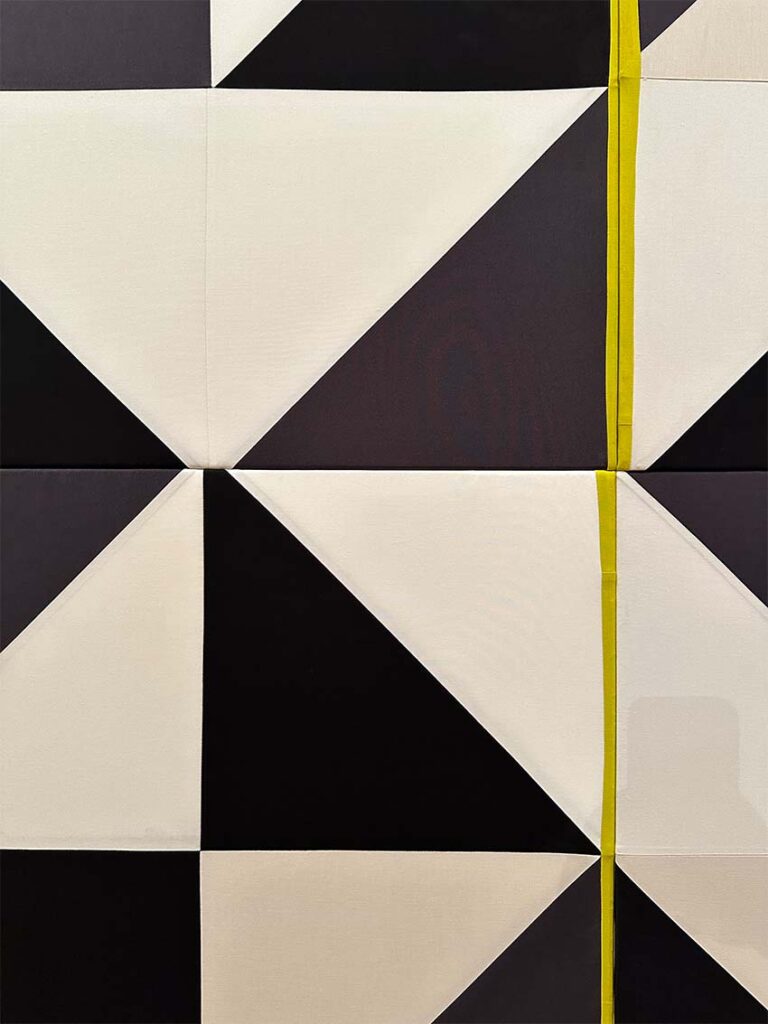
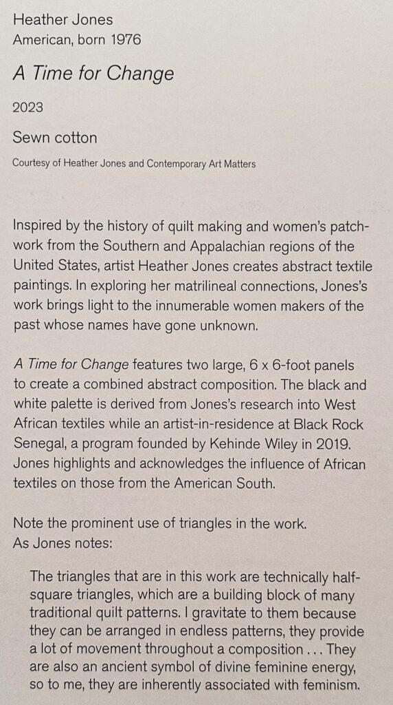
A Time For Change by Heather Jones
Note: This piece isn’t actually quilted. The composition is stretched onto frames.
What I like about the piece:
- Bold Shapes: The half-square triangle steals the show in this massive patchwork composition.
- Color Shifts: At first glance, this looks like a black and white quilt with accents of bright yellow-green, but as you look at it, you realize there are also several shades of grey and cream in the design mix.
- It’s not perfect: With simple shapes, we usually aim for perfection, but perfection was not the goal of this piece. Do you see where the blocks don’t line up and where the triangle corners get lost? The lack of perfection keeps you interested and your eye moving around the composition, adding to the piece instead of detracting from it.
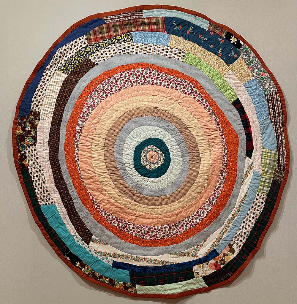
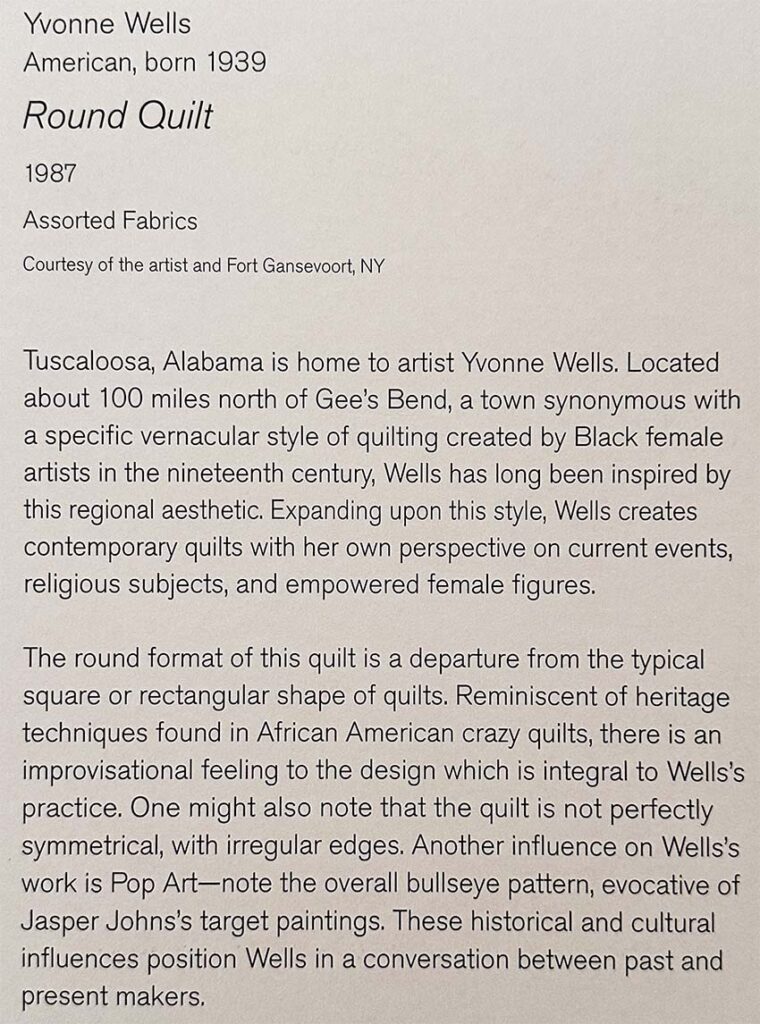
Round Quilt by Yvonne Wells
What I like about the quilt:
- Value Balance: The light, medium, and dark values balance beautifully in this piece, with your eye getting immediately drawn to the dark circle near the center of the quilt and then bouncing between dark crescents around the quilt before landing on the mostly dark edges and binding that frames the quilt in the space.
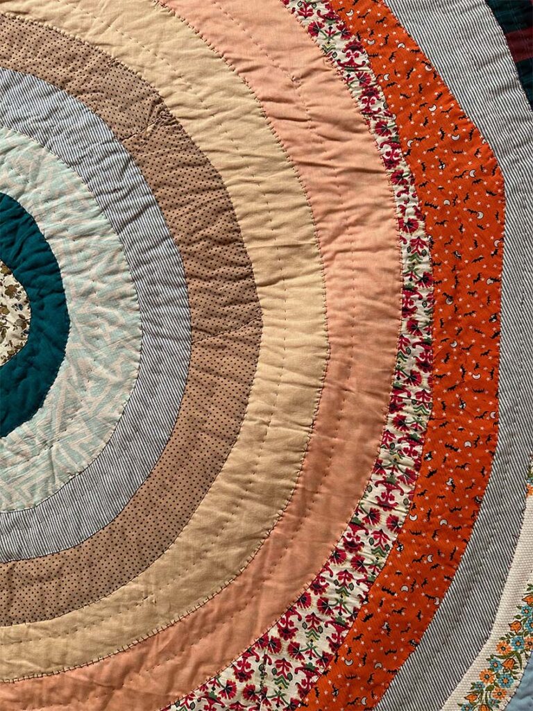
- Print Fabrics: The print fabrics incorporate different scales and designs, bringing life to the quilt. I am particularly fond of how stripes are used in this circular composition.
- Use of Irregular Shapes: Nothing in the quilt is a circle, but it is implied. We are allowed to see the hand of the maker, and the irregularities in the shape actually help guide our eye to other parts of the design.
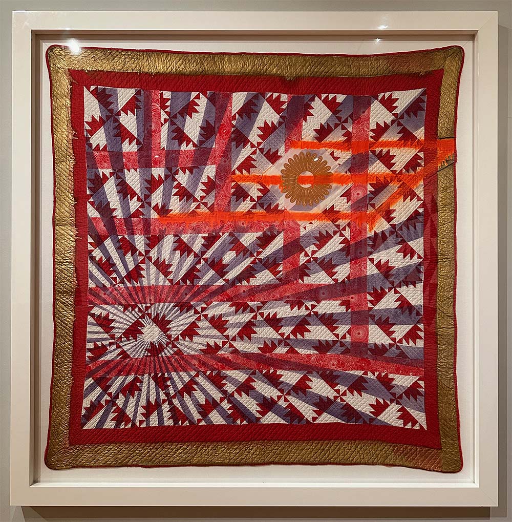
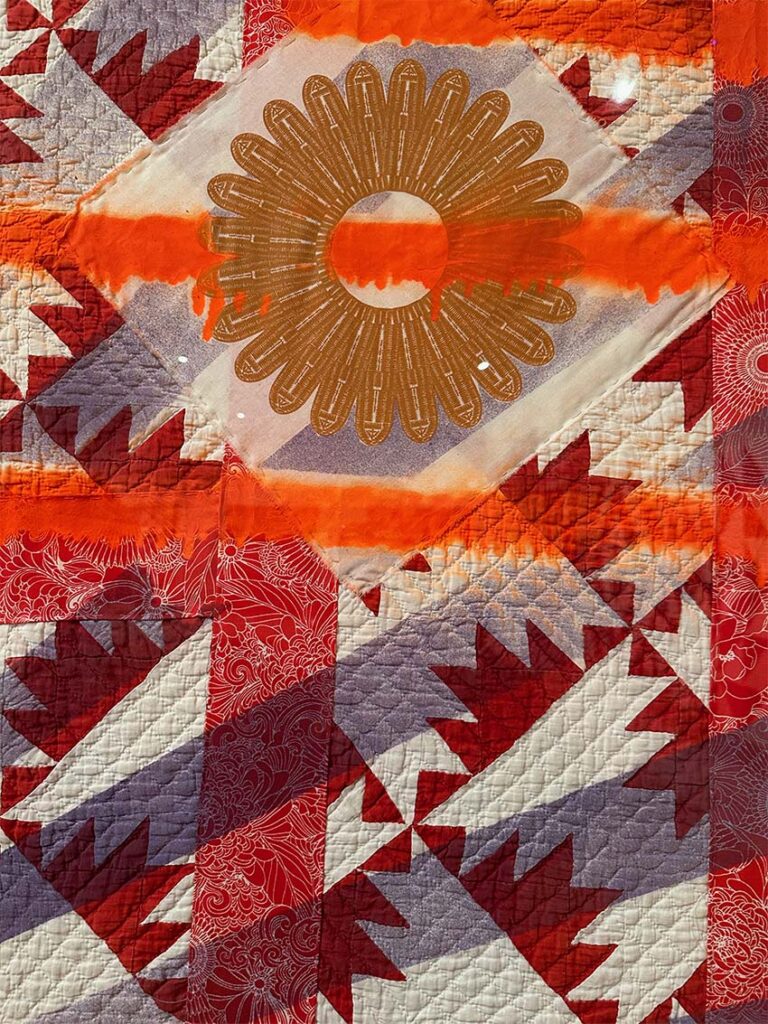
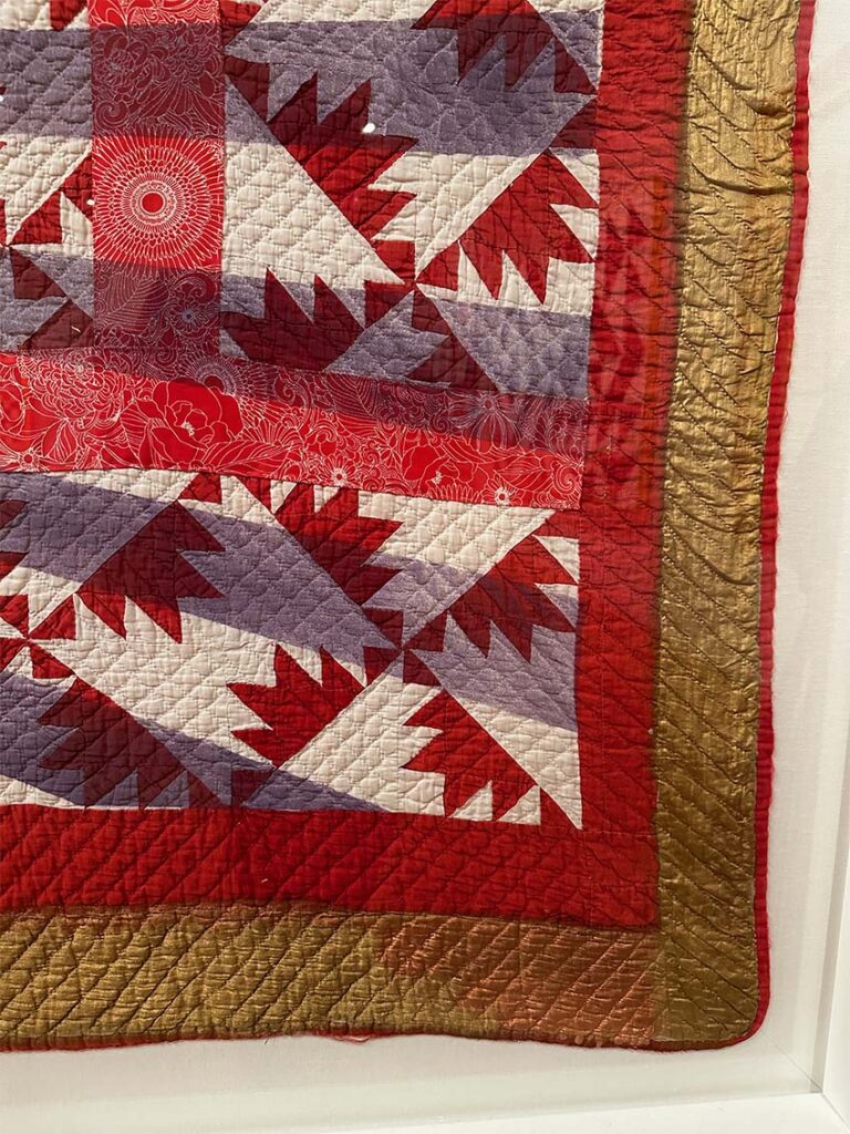
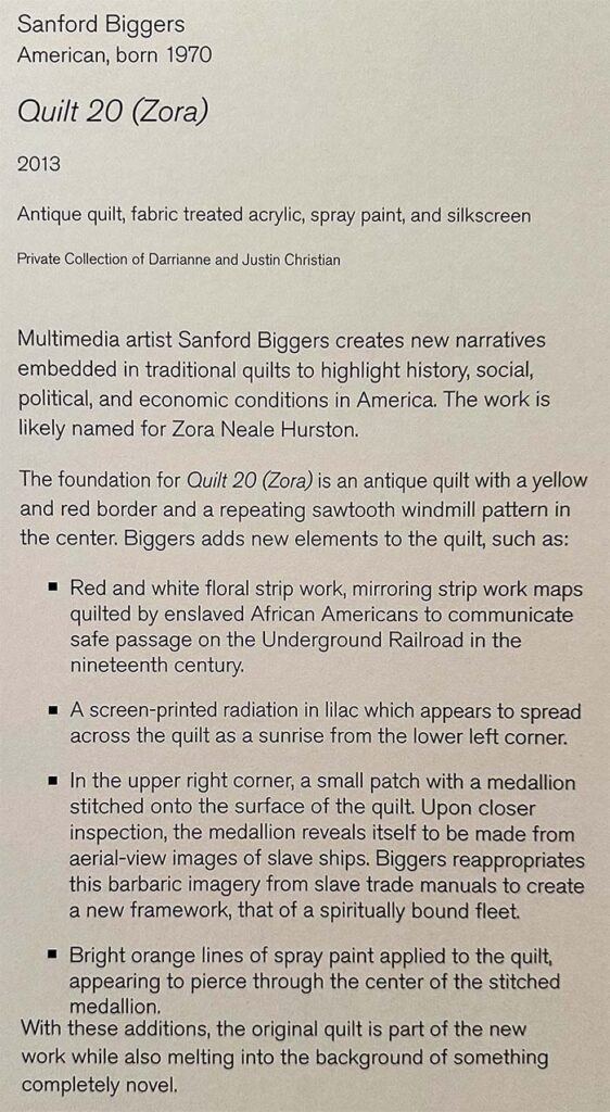
Quilt 20 (Zora) by Sanford Biggers
What I like about the quilt:
I have mixed feelings about this piece, but I think I looked at it longer than any other piece in the exhibit, so I would love to hear what you think.
- Visual Layering: The quilt is a canvas for painting and collage. The added elements add depth to the overall composition.
- The Original Quilt: The quilt itself was a work of art with its precise piecing and graphic composition.
Questions I have about the quilt:
- Why this quilt? Is there a reason that this specific quilt was selected as the base component for this artwork? Was it the design? Was it selected because of the quilt’s origins? Was it just the quilt that the artist happened to find at the time?
- Do we know the original maker? While other quilts in the exhibit would at least have “unknown” listed for the maker, this piece listed the quilt itself as a material, which doesn’t acknowledge the fact that the quilt itself was a piece of art on its own before these additional layers were added to alter it. Is this actually a collaborative piece?
- Would we think it’s okay to do this sort of additive process with other art pieces? Should we spray paint over paintings? Collage onto sculptures? Maybe. But at what point is the original work too valuable to rework? How do we make that choice?
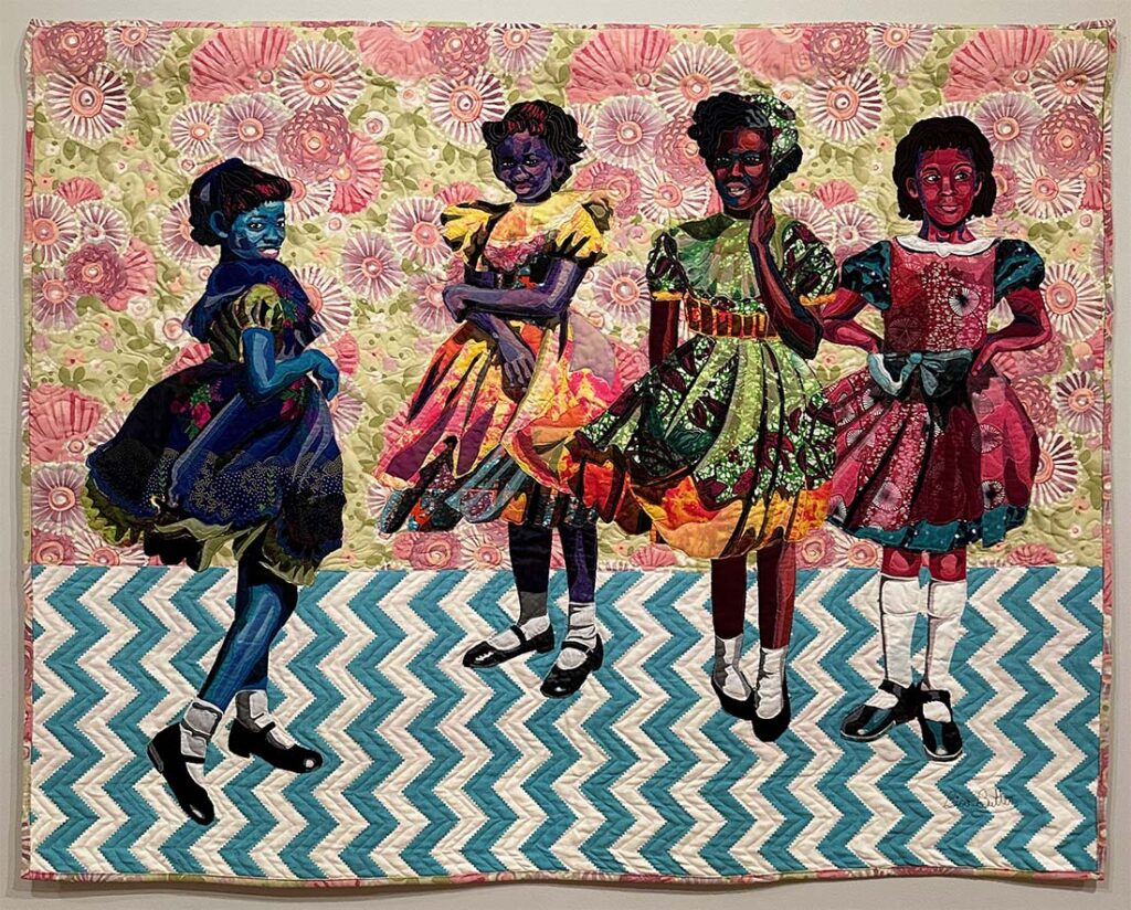
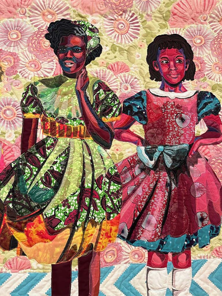
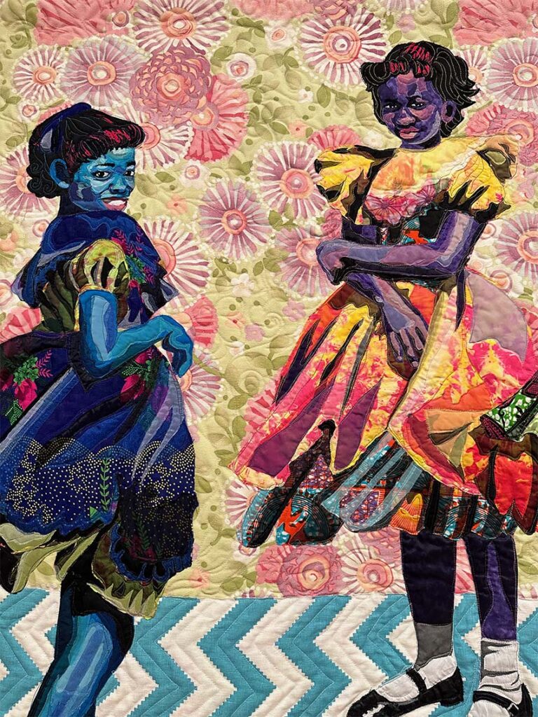
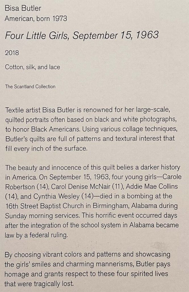
Four Little Girls, September 15, 1963, by Bisa Butler
What I like about the quilt:
- Fabrics: The range of fabrics used in each composition brings the designs to life. Butler is particularly skilled at mixing the scale of prints to their best advantage.
- Depth of Value: Developing highlight and shadow with fabric is tricky; this piece sculpts out shapes beautifully through fabric layering. There is no paint used!
- Movement: The cloth of the dresses move with the girls and direct your eye around the composition.
What do you think?
Which of these quilts drew you in? If you could go to the show in person, what were your favorite pieces?

6 Comments
Mary Ringer
February 2, 2024 at 6:55 amThese historical quilts are just amazing! The one with the four happy girls in Alabama who were later tragically killed is the epitome of joy and sorrow. I love the first one that included used velvet and then she hand quilted it!
Sue
February 2, 2024 at 8:53 amLove the little girls and the circle quilt. Very inspiring. Sounds like a great exhibit. They do a nice job!
Lynne MacDonald
February 2, 2024 at 2:50 pmBisa Butler! Hands down for me. She uses fabric in a painter-like way that is astounding. They way she expresses the personality and the emotion of people she depicts is astounding.
I really loved the graphic quality of the right-side half of Heather Jones’s piece. The simplicity of it really draws me. In your blog photo, hung just as the right side, it grabbed me. But when the left side is added, it loses me. Can’t say why… Loss of the simplicity?
I’m also very torn by the Sanford Biggers piece. At first glance I loved it, loved the layering and the asymmetry of the rays coming from the left. But when I realized it was non-fabric (and irreversible) overlay over someone else’s work, I didn’t at all like that!
Felt it was a lack of respect for the original maker, particularly when you called out that the underlying piece wasn’t even acknowledged, was treated as if it was just a preprint bought from the fabric store. Did NOT like that.
I respect the other two pieces, like the colors and the fabrics and the history, but they don’t pull an emotional response from me.
PWalters
February 3, 2024 at 10:07 pmIt was wonderful seeing this collection. Thank you
Controversy Ahead: Where I think the Quilt Exhibit at CMA Went Wrong – The (not so) Dramatic Life
February 9, 2024 at 12:01 am[…] exhibit entitled Quilting a Future: Contemporary Quilts and American Tradition. Last week, I shared five quilts that stood out in a sea of fantastic textile art. Today, I’m sharing my thoughts on the […]
Nann
February 9, 2024 at 9:50 amThanks for the mini show. I saw the entire Bis Butler show at AIC. What draws me to that quilt is that it memorializes them.