December brings snowflakes, gingerbread, and lots of talk about color! In the past week, both Pantone and Kona Cotton have released their colors of the year, and quilters are already talking about the possibilities.
Welcome to the Magentaverse
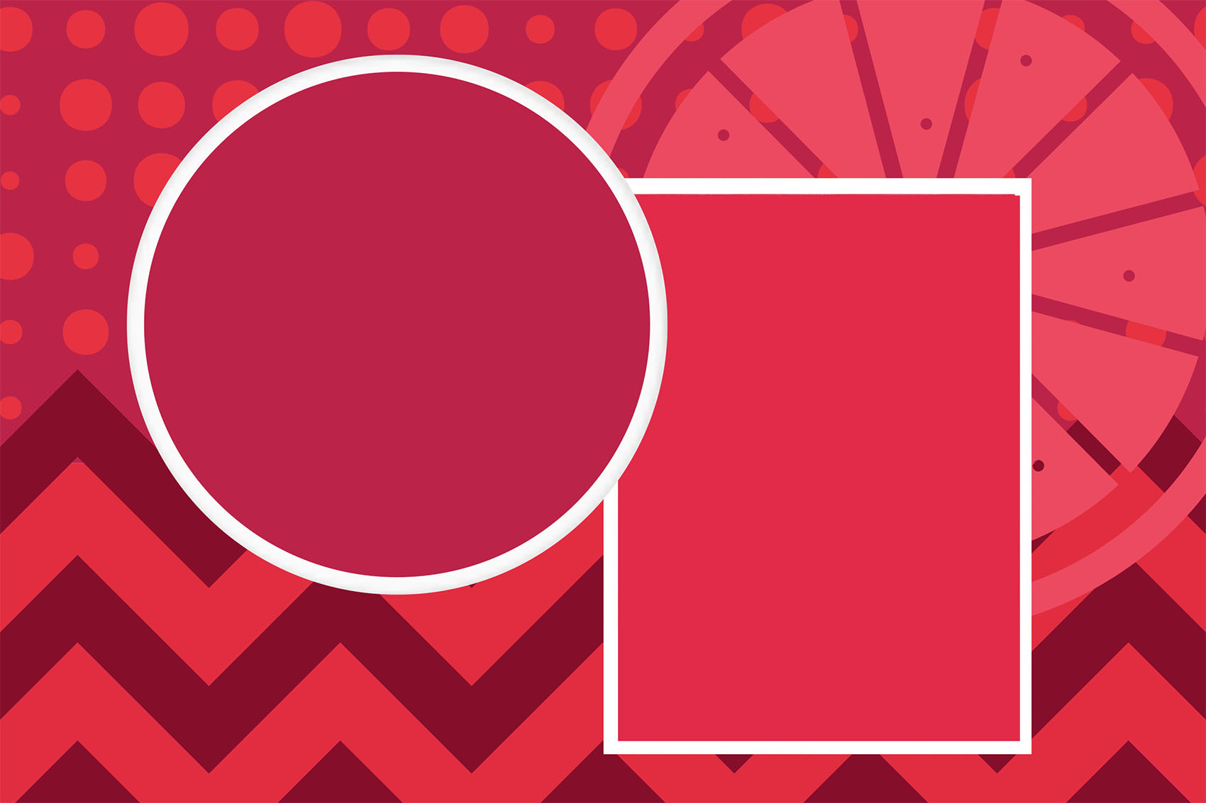
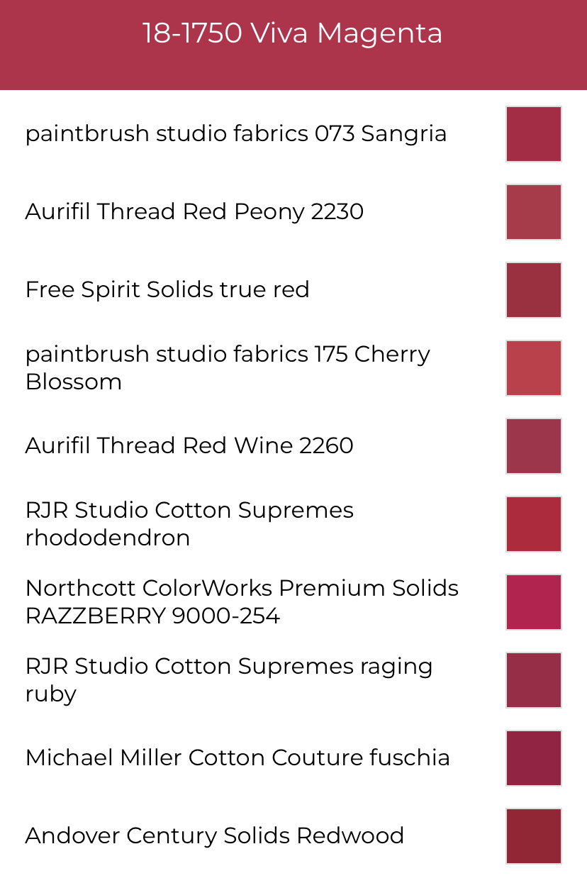
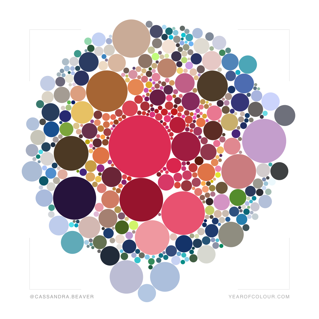
The Pantone color of the year influences color palettes used in products and artwork created worldwide. Viva Magenta (shown in the circle above) is a saturate violet-leaning red that creates a deep, delicious pink. Here’s how Pantone describes it:
This year’s Color of the Year is powerful and empowering. It is a new animated red that revels in pure joy, encouraging experimentation and self-expression without restraint, an electrifying, and a boundaryless shade that is manifesting as a stand-out statement. PANTONE 18-1750 Viva Magenta welcomes anyone and everyone with the same verve for life and rebellious spirit. It is a color that is audacious, full of wit and inclusive of all.
Pantone
Our Newest Crush
Kona Cotton’s color of the year is remarkably close to the Pantone color for the second year in a row. This citrusy red-orange (shown in the rectangle above) is vibrant, exciting, and looks great with the violet-leaning Viva Magenta. While the palettes I’m sharing here focus on the pantone color, many of them also incorporate Crush as well. You can pre-order Crush here. (Affiliate link: When you click here and make any purchase, you support this site at no additional cost to you.)

Using the Color of the Year
When approaching a new-to-you color, its tempting to pair it with colors you know will work. All colors pop against white and black almost always has a similar effect. Finding other neutrals that work with your new color is also a popular route because it is clear which color you want to shine.
I tend to be the most drawn to color combinations that draw a range of values and/or a similar saturation level as the key color. This technique allows the focal color to meld with its surroundings and play against the surrounding hues in a way that accentuates every color in the composition.
A Color Based Quilt Challenge
Sarah Ruiz and Elizabeth Ray are bringing back the Pantone Color of the Year Challenge! Make sure you are following them both on Instagram so you will be the first to know the details.
Spoonflower Challenge
If you are into surface design and are quick, this Spoonflower design challenge may be perfect for you. For this challenge, Spoonflower gives you a predetermined palette that highlights Viva Magenta. Entries are due next week, so this weekend is a great time to jump on this challenge.

A New Color Tool Made for Quilters
Steph Skardal has come out with a new color tool for quilters! It’s an app called A Quilty Solid. It is available for iOS now and is coming to android devices soon. The app has several tools focused on helping quilters determine the best quilting solids to use for a particular color palette. It even includes the best matches of Aurifil Thread!
Color Palettes with Viva Magenta
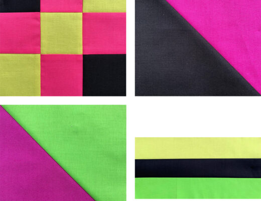
All of these palettes include five colors featuring Viva Magenta. Of course you could have a palette with as many colors as you like, but five colors can serve a a basic range that you can easily expand or simplify- some of my favorite Modern quilts only use two colors!

I’m calling this palette “Viva” because I feel it captures the color range embraced by the Pantone introduction images. It includes highlights of a vibrant medium pink to a shadowy deep violet
Analogous Palettes
Analogous palettes combine colors next to each other on the color wheel. When developing an analogous color scheme, you can place your key color anyplace within the gradient. Crush and Viva Magenta are close neighbors in the color community, making them combine beautifully in an analogous color scheme.

With Viva Magenta as the central color of this palette, it stretches to a warm yellow orange on one end and a cooling violet on the other.
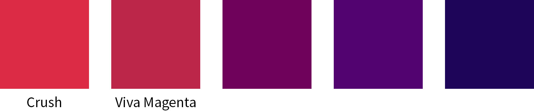
Citrusy, red-orange Crush cools as we move through saturate violets to an inky midnight blue.
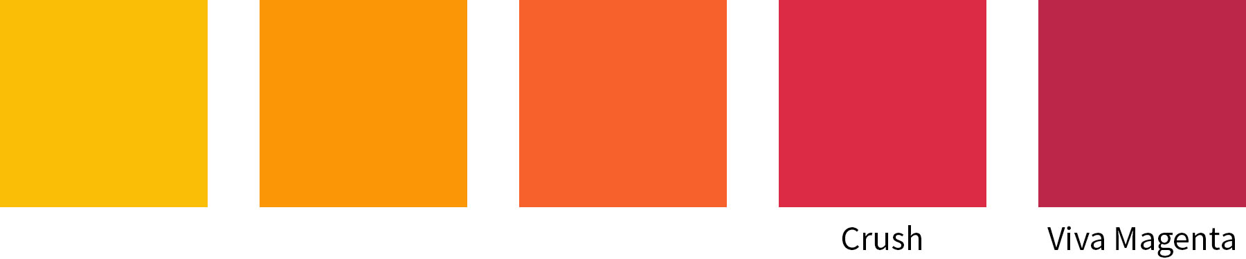
Can you feel the heat from the warming analogous palette? An intense yellow and burning oranges mix with Crush and Viva Magenta for a firey effect.
Split Complementary Palette
While analogous colors stick together on the color wheel, complementary colors are total opposites. With the split complementary palette, we start with the key color and then choose the color on either side of it’s complementary color.

The complement of Viva Magenta is a minty green, so the split complement palette gives us a yellow green and a turquoise/teal. (Check out the Christmas palette below to see a complementary palette)
Seasonal Palettes
Do you have different quilts for different seasons? Or have you seen artwork that feels like it captures a moment in time? Each time a new color of the year is announced, I like to visualize how that color would feel at different times of the year.

For Spring I paired floral inspired pastels with the shocking Viva Magenta.

Viva Magenta combines with the heat of yellow and orange and cooled with soothing ocean hues.

The lush greens of the warmer months darken, the leaves turn and we embrace shadowy violet as the days get shorter.

The blue greys of winter are accented by the vibrance of Viva Magenta- Like a Cardinal in the snow.
Occasion Color Palettes
People love a reason to celebrate, so lets look at how Viva Magenta works with a couple holiday palettes.

Reading as almost red, Viva Magenta and an ultramarine blue combine with lighter, yet still intense turquoise and hot pink and light grey to create a modernized interpretation of classic Americana.

By combining Viva Magenta with a complementary emerald green and lighter values of each color, you get a twist of the classic red and green Christmas color palette.
(Almost) Neutral Palettes
How would Viva Magenta play with some (almost) neutrals? These greyed out hues allow the color of the year to take on a dominant role.
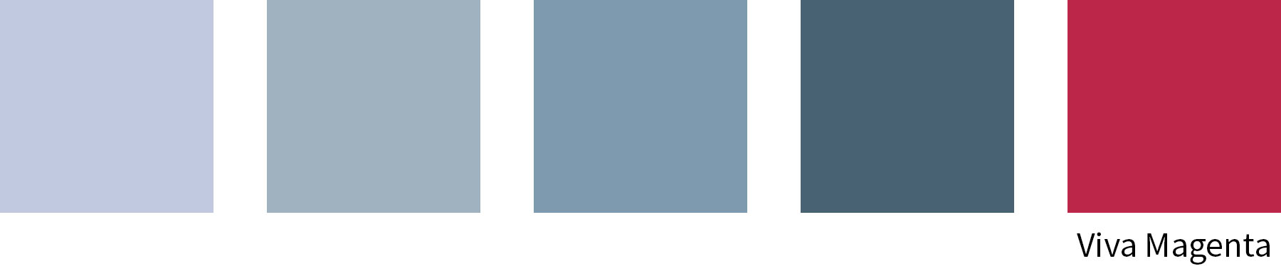
These greyed out blues and lilacs recede, creating a strong focal point of Viva Magenta.
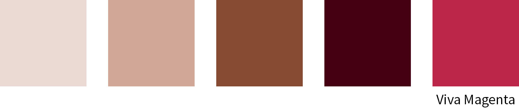
Since Viva Magenta lives in the warm part of the color realm, warmer neutrals embrace it in a way that allows the Viva Magenta to meld with its surrounding colors.
Just for Fun Palettes
These palettes are the result of playing with the color of the year and seeing what feelings the color could evoke.

Blush was the first palette I came up with when I saw Viva Magenta. This palette highlights the warmth and optimism of the key color. After I created the color scheme, it reminded me a bit of a makeup palette (ok, not the orange!)

Sunset is among my favorite palettes. Orange, pink, and red violets create a highly dynamic combination.

This palette makes me want to curl up with a book and a cup of cocoa in front of a fire.
What is Your Palette?
Are you planning to use Viva Magenta or Crush in a project this year? I can’t wait to see what you make!
5 Comments
Linda Selby
December 9, 2022 at 6:36 amI love the summer palette the best! Great to see you last night and thank you for my “favorite” gifts! Have a merry Christmas.
Beth
December 9, 2022 at 9:40 amThanks for all the great color choices. Last year I started a quilt in the Cool Neutral pallet with magenta which is very close to the color of the year.
Carol Stewart
December 9, 2022 at 10:13 amThank you Cassandra for bringing color palettes to your blog. Very appreciated!!!!
I found I love the Autumn palette the best.
How to Use Pantones 2023 Magenta Color - Paducah Insurance
December 15, 2022 at 12:05 pm[…] Source: The Not So Dramatic Life […]
How to Use Pantones 2023 Magenta Color
December 15, 2022 at 12:26 pm[…] Source: The Not So Dramatic Life […]