What’s more exciting than the upcoming holidays? The annual Color of the Year Announcements!
Wait, are you saying I’m the only person who gets that enthusiastic over color predictions?
The color announcements made this week, particularly the Pantone Color of the Year, will impact the color schemes available to us for years.

Embrace the Warmth
The Pantone color of the year influences color palettes used in products and artwork created worldwide. Peach Fuzz (shown in the circle above) is a pastel orange, evoking the cozy warmth of Summer. Here’s how Pantone describes it:
Peach Fuzz captures our desire to nurture ourselves and others. It’s a velvety gentle peach tone whose all-embracing spirit enriches mind, body, and soul.
Pantone
Let’s Freshen Up
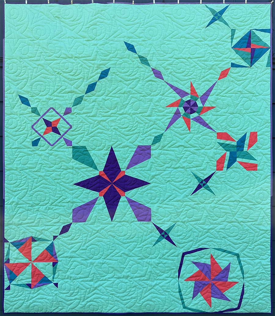
This year Kona Cotton selected a minty green called Julep (shown in the rectangle above) for their Color of the Year. Recently, I started to love this green hue and used an extremely close color as the background for the 2023 Quilt Concert Quilt.
While the palettes I’m sharing here focus on the Pantone color, many also incorporate Julep. You can pre-order Julep here. (Affiliate link: When you click here and make any purchase, you support this site at no additional cost.)

Using the Color of the Year
When approaching a new-to-you color, it’s tempting to pair it with colors you know will work. Most colors work well with white backgrounds and pastels like peach fuzz and julep pop against black backgrounds. Finding other neutrals that work with your new color is also popular because it is clear which color you want to shine.
I tend to be the most drawn to color combinations that draw a range of values and/or a similar saturation level as the key color. This technique allows the focal color to meld with its surroundings and play against the surrounding hues to accentuate every color in the composition.
Pastels have fallen out of favor in recent years, and I’m glad to see them come back into style. We quilters need a wider range of values in our fabric palettes! However, it can be tricky to approach pale, muted tones when we are used to highly saturated hues.
A Color-Based Quilt Challenge
Sarah Ruiz and Elizabeth Ray are hosting the Pantone Color of the Year Challenge again in 2024! Make sure you are following them both on Instagram so you will be the first to know the details.
Spoonflower Challenge
If you are into surface design and are quick, this Spoonflower design challenge may be perfect for you. For this challenge, Spoonflower gives you a predetermined palette highlighting Peach Fuzz. Entries are due soon, so this weekend is a great time to jump on this challenge.

A Color Tool Made for Quilters
How do you choose which fabrics and threads are the best matches for the color of the year?
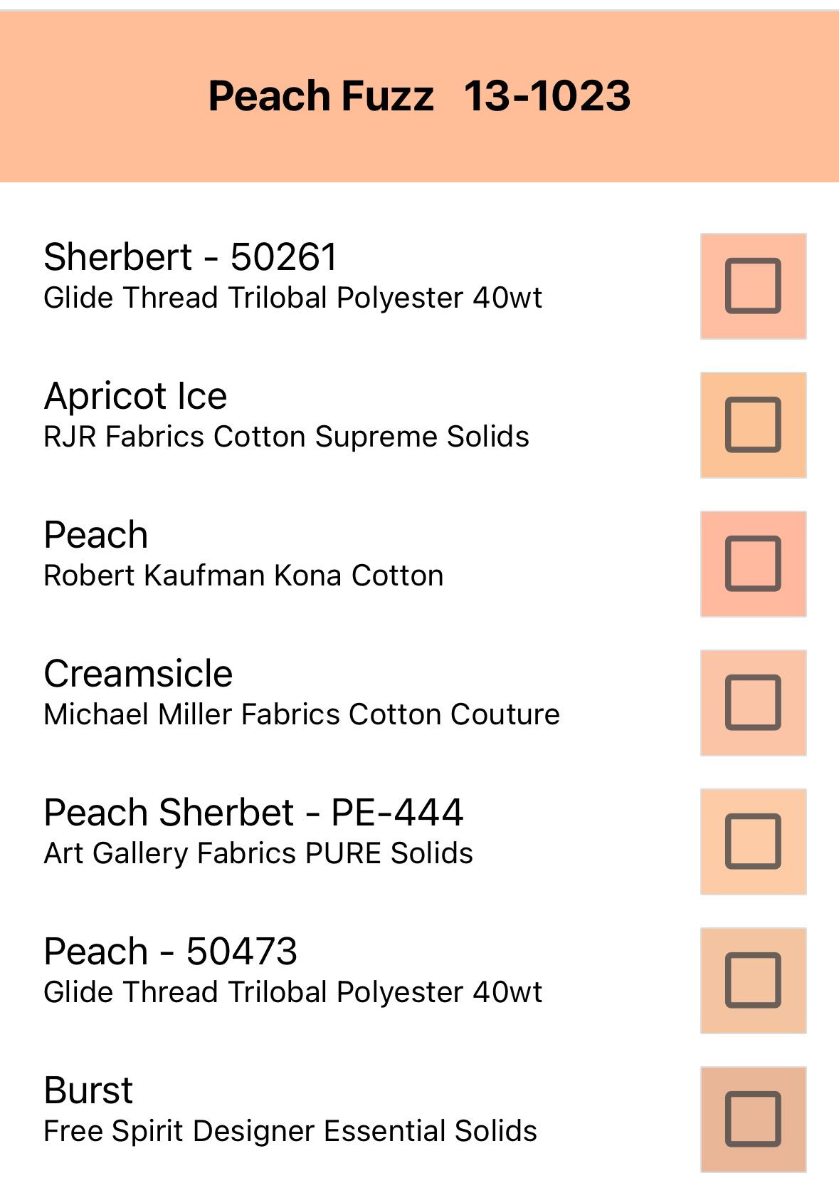
Steph Skardal created an app called A Quilty Solid. The app has several tools focused on helping quilters determine the best quilting solids for a particular color palette. Here, you can see a portion of the quilting solids and threads that closely match Peach Fuzz:
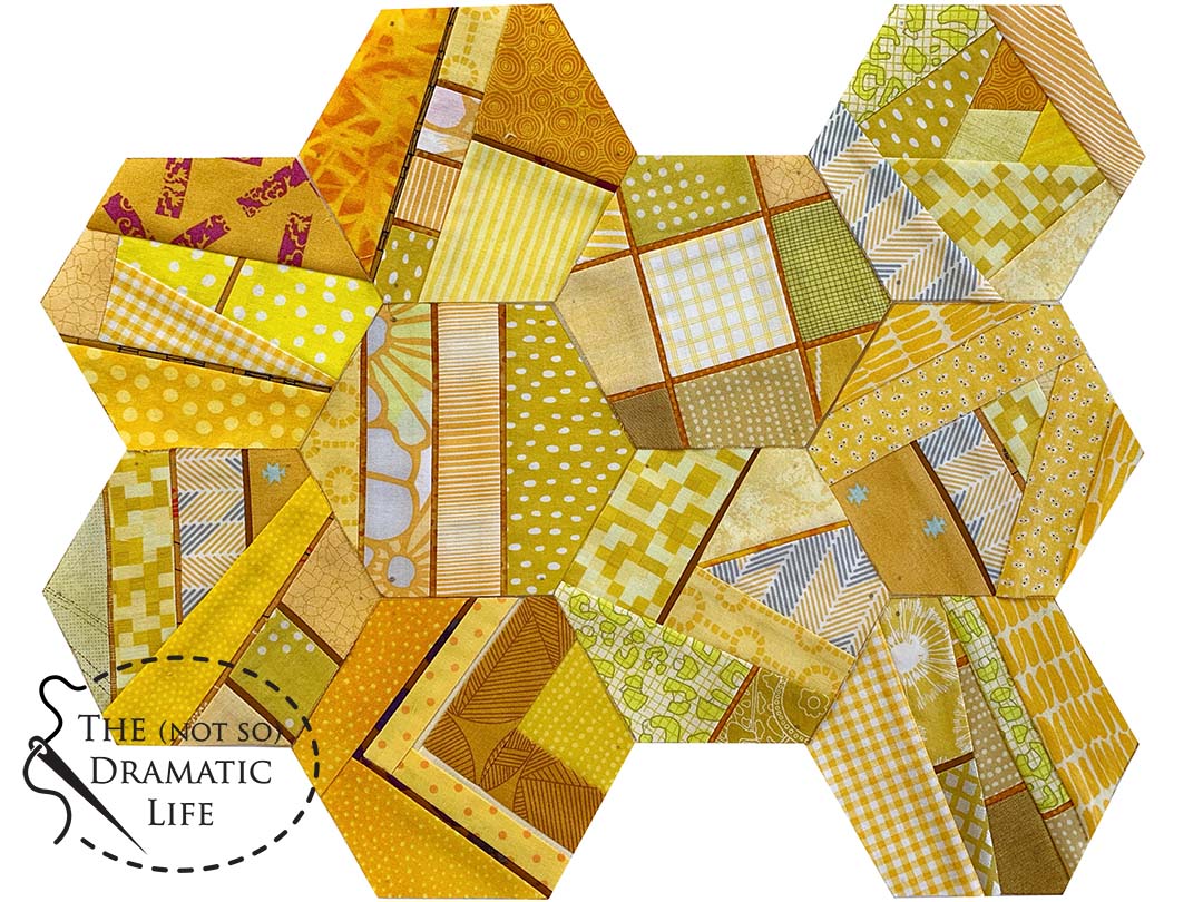
Color Palettes with Peach Fuzz
All of these palettes include five colors featuring Peach Fuzz. Of course, you could have a palette with as many colors as you like, but five colors can serve as a basic range that you can easily expand or simplify- some of my favorite Modern quilts only use two colors!

One of the first color assignments I had as an undergraduate art student was to do a large-scale pastel drawing featuring a one-inch square of fruit skin. I selected a peach and fell in love with the subtle shifts of oranges, yellows, pinks, and reds. The Peach Bellini palette captures these colors associated with peach skin- I can almost smell the juices running from a perfectly ripened peach.
Analogous Palettes
Analogous palettes combine colors next to each other on the color wheel. You can place your key color anywhere within the gradient when developing an analogous color scheme.

With Peach Fuzz as the central color in this analogous color scheme, the palette stretches from a sunny yellow to a warm, corally pink.
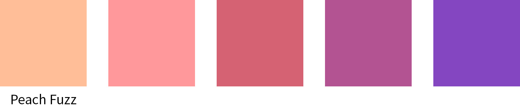
Peach Fuzz captures those warm pink tones on its way to warm violet.
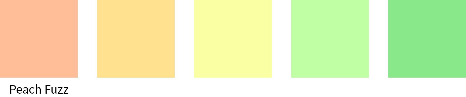
Try cooling down your Peach Fuzz palette as you move through the yellow tones to fresh, calming greens.
Split Complementary Palette
While analogous colors stick together on the color wheel, complementary colors are opposites. With the split complementary palette, we start with the key color and then choose the color on either side of its complementary color.

The complement of Peach Fuzz is blue, the the complementary colors are blue-violet and blue-green.
Seasonal Palettes
Do you have different quilts for different seasons? Or have you seen artwork that feels like it captures a moment in time? Each time a new color of the year is announced, I like to visualize how that color would feel at different times of the year.

A bouquet of flowers inspired the Spring Palette for Peach Fuzz.

Summer is captured with colors you would see during a fun day at the beach.

Peach Fuzz warms up for autumn as it mingles with colors from the changing leaves and purple-toned shadows.

In winter, Peach Fuzz is surrounded by soft, muted colors as they reflect off of rolling hills of snow.
What is Your Palette?
Are you planning to use Peach Fuzz or Julep in a project this year? I can’t wait to see what you make!


No Comments