A key color of coral? Yes, please!
I hardly had to read further when Abby Vargas put out a call for blocks for the fourth Exquisite Quilt Project.
This is the second time I have participated in the Exquisite Quilt project, and you can read about the first time here.
The Exquisite Quilt is a variation of the drawing game, the exquisite corpse, in which participants draw a portion of a human body then fold the paper so only the connector portion is visible. So if the first person draws a head, they only leave the point of neck visible to the next artist. That person knows they need to add a torso, but have no idea what the head looks like. The results have the potential to be quite amusing!
In the quilt version of the project all participants create their blocks at the same time, then send them off to Abby who then makes the blocks come together in a complete design. The connectors for the blocks are one inch square and must be centered on the sides of the blocks. Participants could choose to have one, two, three, or four connectors on each block.
Thinking in Color
The key connector color for the quilt is Painter’s Palette Coral, which is a favorite of mine, and part of what drew me to this quilt, but the rest of the color palette presented a bit more of a challenge.
Inspired by the Redwood Trees of Northern California, Abby requested that the remaining colors of our block include green and…
Brown.
If you have been around here long, you may have noticed that brown fabric is not really something that appears often.
I also realized during this project that my interpretation of “brown” is pretty narrow. In a meet up, Abby shared some examples of brown in quilts- I wouldn’t consider any of them brown. You see, as a painting student brown paint wasn’t really allowed in most courses at my school. We were taught to think in the form of neutralized color, which may read close to brown in context with the colors around it, but it was not out-of-the-tube brown. This was so drilled into my memory, I couldn’t even think about the fabrics for this project as “brown.”
The First Exquisite Block
Since trees influenced the color palette, I decided to take inspiration from a different tree for the first block.
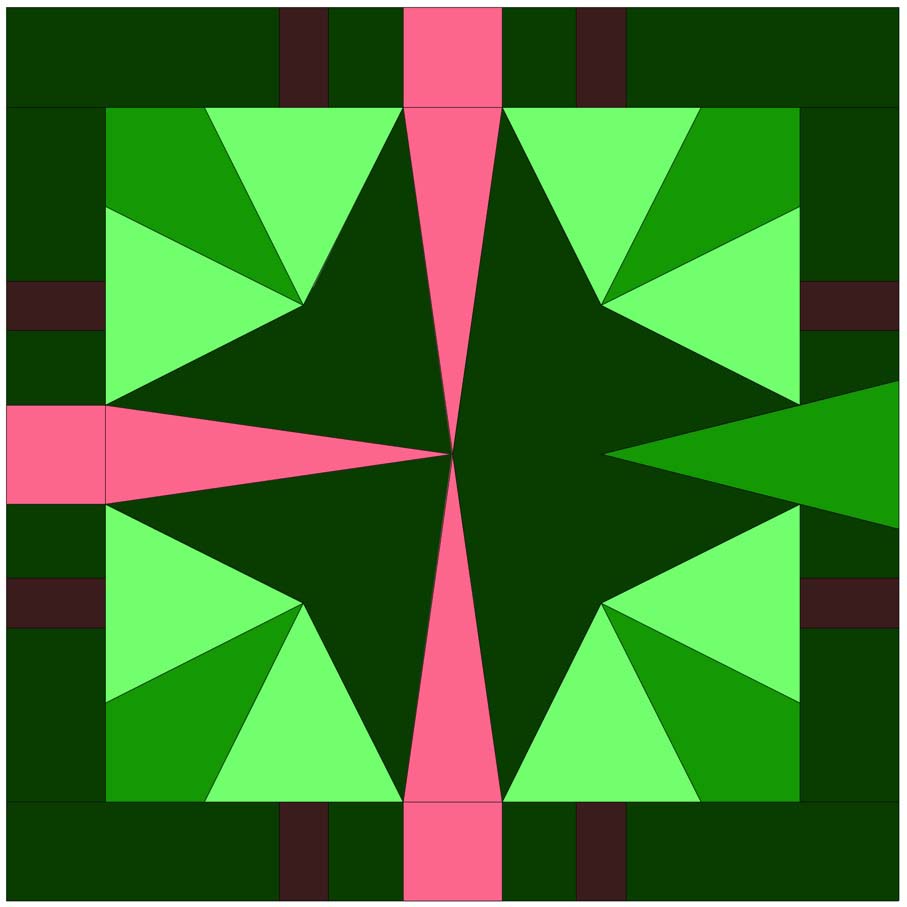
As a kid at camp, we were once lead to a clearing with our eyes closed right as we entered the area. We were all told to lay down and then open our eyes. The evergreen trees surrounding us grew in such a way that the peaks seemed to arc over us.

This block is reminiscent of that experience with abstracted evergreens emerging from all four sides of the block. The “brown” tree trunks are actually a very deep slightly neutralized violet. You may remember this color from last year’s 100 Day Pink Log Cabin– where it did not look brown.
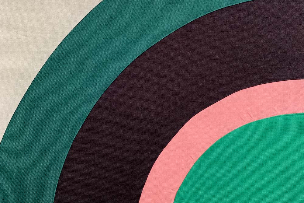
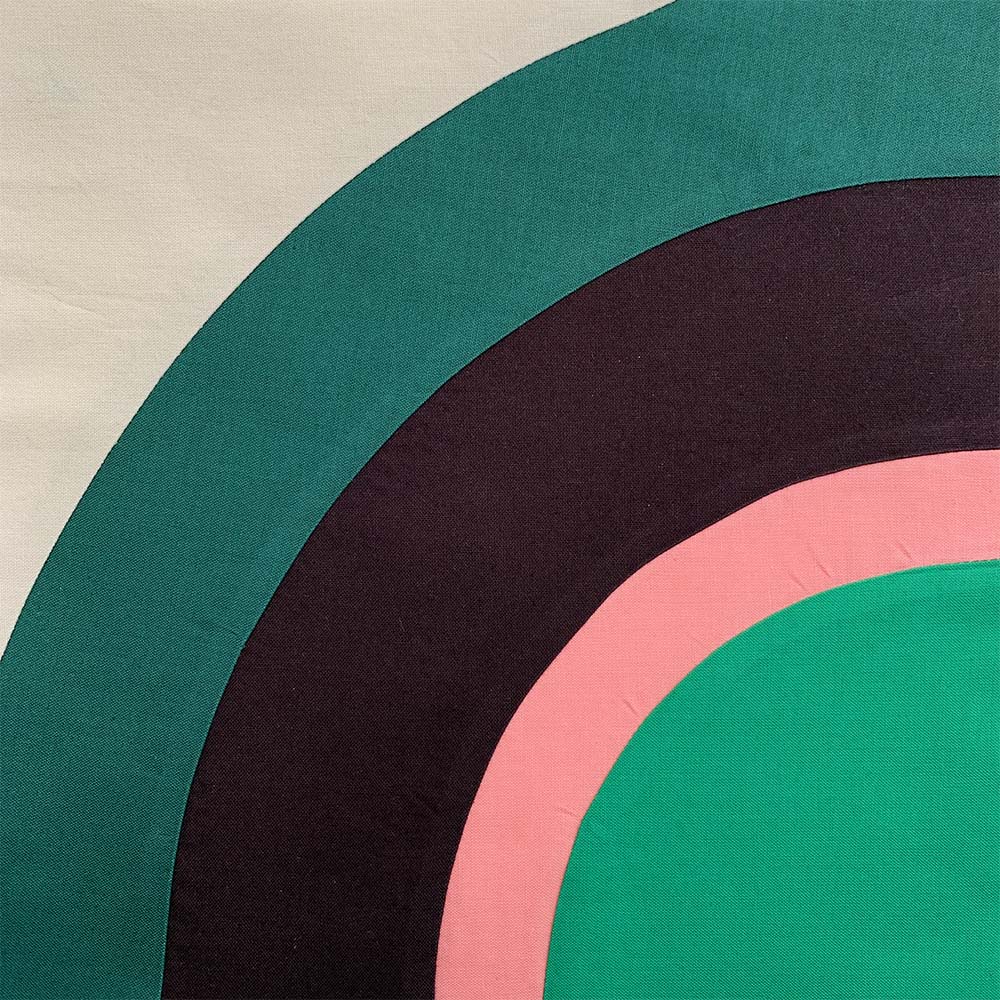
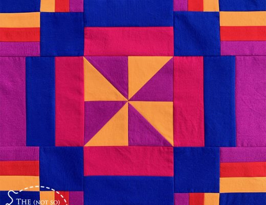
The Second Exquisite Block

With the opportunity to explore to different variations on the primary theme, I thought it would be fun to come up with a design the polar opposite of the first block. Here’s how:
- Straight lines change to curves
- Lots of little pieces go to a block consisting of five pieces
- Abstract pictorial moves to a graphic motif
See it come together
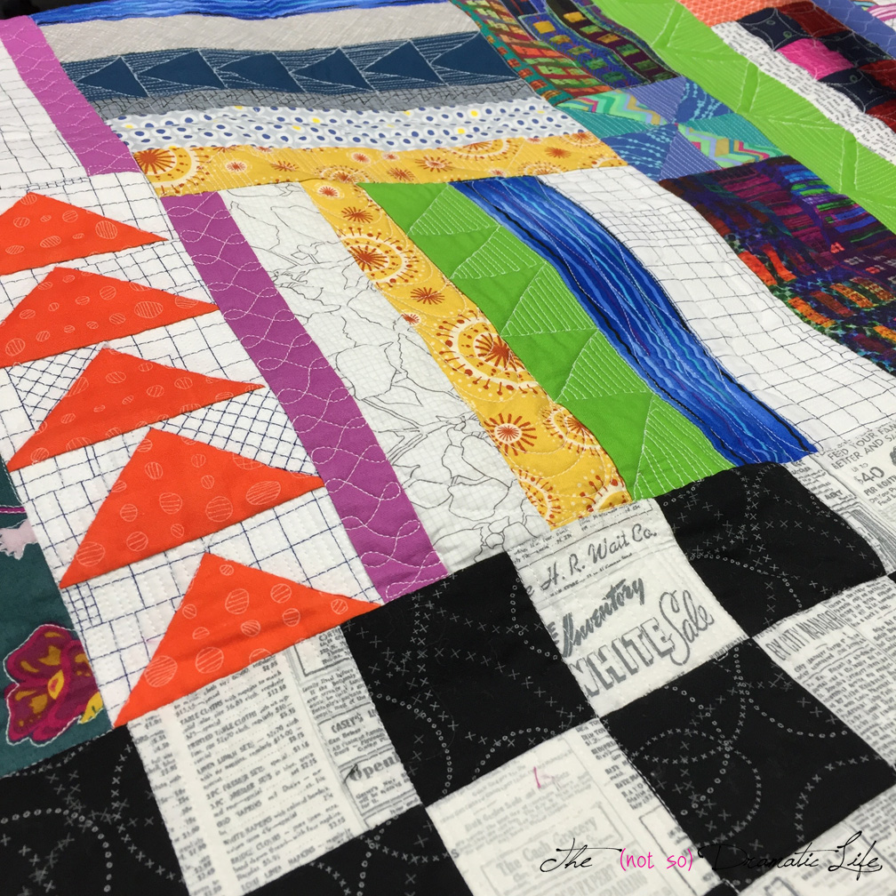
These block are on their way to join all of their recently created friends. I can hardly wait to see how they come together. If you are looking forward to seeing the final results, you can follow @exquisitequilt on Instagram!

No Comments