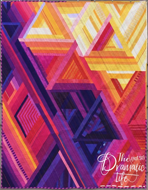
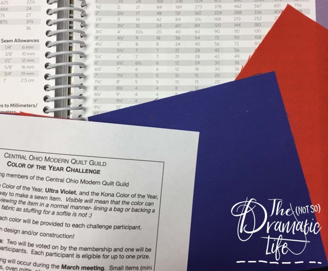
Each year the Central Ohio Modern Quilt Guild issues a color challenge. For the past two years the challenge has been the same: Combine the Pantone and Kona colors of the year into a single sewn object. My project for last year’s challenge was an improv quilt inspired by the Franklin Park Conservatory. The quilt I made for this year’s color challenge is also improv, but it is more structured this time around.
In 2018 the Pantone color of the year is Ultraviolet and the Kona color is Tiger Lily. Among our group this combination had both lovers and haters.
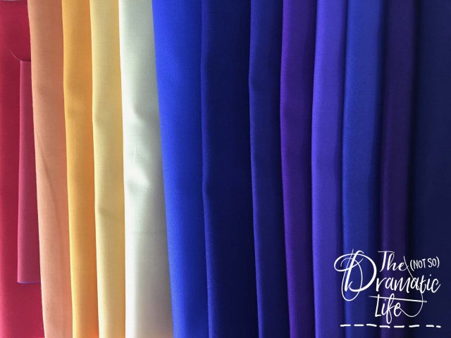
I could definitely see the potential, and wanted to embrace the violets while pushing the piece toward warmer tones. The beginning of my fabric pull looked like this.
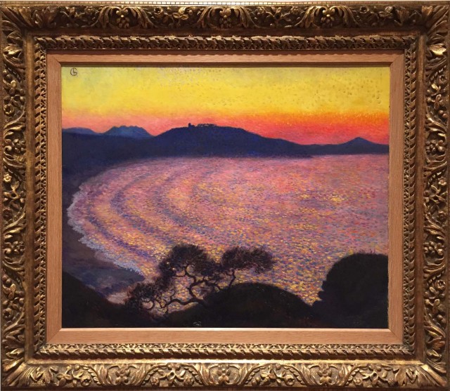
Around the time this challenge was issued, the Columbus Museum of Art was hosting a special exhibit which included this oil painting, The Bay of Saint-Jean-de-Luz, by Georges Lacombe which was painted around 1902-1904. The color range in this painting was exactly what I had imagined when I saw the challenge colors.
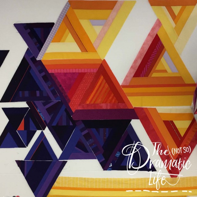
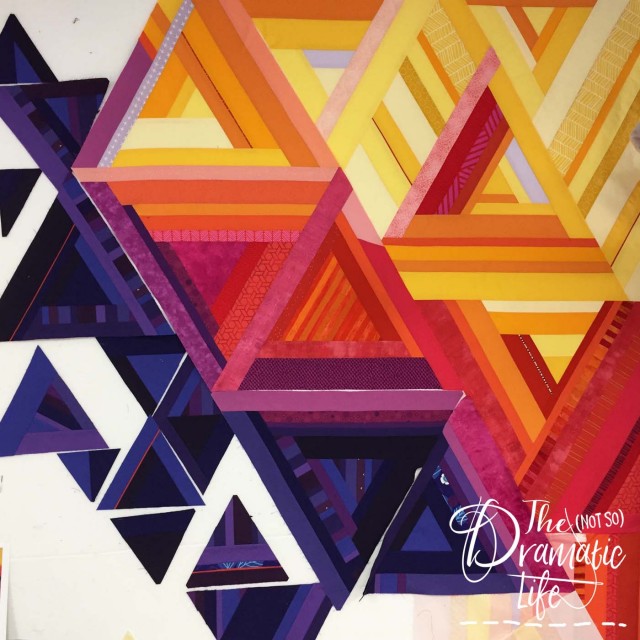
The quilt top was constructed using structured improv- I measured and used rulers, but the placement of each piece of fabric was determined on the fly. About 2/3 of the quilt went together quickly, but the lower left corner was problematic.
After over a month of struggling with it, I finally came to terms with the fact that I just didn’t have the right pink fabrics to complete the top. (How could I possibly be lacking pink of all colors!) Once I added more pink solids to the palette, the top was easy to finish.
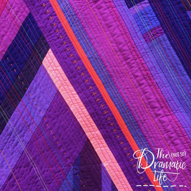
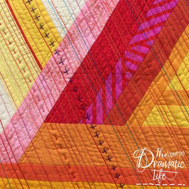
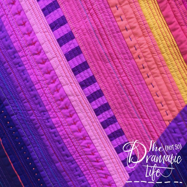
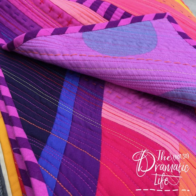
Since the quilting is done on a 120 degree angle, and the piece isn’t particularly large, I decided it would be easier to do the quilting with a walking foot on my domestic machine. It is almost matchstick quilted. The machine stitching is randomly spaced from 1/8″ to 1/2.” Once the machine quilting was finished, I added large stitch hand quilting in the larger gaps between the machine stitching. It was important to me that the quilting stitches add personality to the quilt, so I used a range of thread colors and weights. By the time the quilting was finished I had incorporated 50wt, 40wt, 28wt, and 12wt thread into the quilt.
The majority of the fabrics used in the quilt are solids, but there are a few prints worked into the design. One of those prints, a Tula Pink stripe, was perfect for a bias binding. I combined this print with some yellow solids to finish off the quilt.
Quilt Stats
Title: Zenith
Size: 53″ x 69″
Techniques: Machine Piecing, Structured Improvisational Piecing
Quilting: Almost-Matchstick machine quilting on a Bernina 1008 domestic, large stitch hand quilting
Fabric: Assorted quilt shop quality, 100% cotton solid and print fabrics, and backing of wide-back Tula Pink Print
Batting: Hobbs Tuscany Wool
Thread: Quilted with 50wt, 40wt, 28wt, and 12wt cotton Aurifil
Binding: Tula Pink stripes and yellow solids, cut on the bias at 2″ wide, machine stitched to the front, hand finished
This quilt is entered in the Pantone Color of the Year Challenge at Bryan House Quilts and No Hats in the House. Click the links to check out all of the fabulous entries! My country of residence in the United States.



11 Comments
Danice
May 11, 2018 at 8:36 pmWonderful looking quilt, and that you also used Kona’s Tiger Lily. I used it in my pillow also.
Heather Black
May 11, 2018 at 9:11 pmWow, this is an amazing quilt! From your inspiration to quilting the whole piece is so stunning!!
Rochelle Summers
May 11, 2018 at 11:12 pmWhat a gorgeous quilt. I love the colors and the design. It somewhat reminds me of the Alison Glass print Geometry. The use of the pins to bridge the blue/red colors really works well. And I love the yellows and oranges. Your color and design choices always leave me with a smile. Good luck in the competitions.
Aileen
May 11, 2018 at 11:29 pmWhat an amaz8ng combination of machine and hand quilting. It looks sensational!
Shelley
May 12, 2018 at 9:26 amWhat a beautiful interpretation of the painting. Gorgeous colors! Your quilting was imaginative and just completed it perfectly!
Yvonne @Quilting Jetgirl
May 12, 2018 at 10:43 amThe addition of a few specially curated print fabrics works so nicely in the composition, Cassandra, and your hand quilting pulls me in for more. I really like the transition and tension you created with the piecing and color placements.
Marla Varner
May 12, 2018 at 10:51 amWhat a gorgeous quilt! I love the addition of the hand quilted details, especially that little row of plus stitches.
Mary
May 12, 2018 at 2:30 pmI love the stitching on this quilt!
Nicole Hannah
May 13, 2018 at 1:09 amCassandra, I’ve loved this since I saw it on IG just a couple of days ago but I really liked reading about the challenge and process.
Also awesome is the way you used hand stitching to carry the warm and cool colours across to the other sides of the quilt. All in all, a fantastic quilt. Yay you!
Cheryl Brickey
May 13, 2018 at 4:56 pmBeautiful quilt! I love the bright colors, triangle improve, and how the quilting pulls the entire composition together.
2018 Year in Review – The (not so) Dramatic Life
June 1, 2021 at 4:40 pm[…] and Tiger Lily (Kona), and I had a great time putting them together into this quilt! Zenith received a second place in the Modern category at the American Quilter’s Society Fall Paducah […]