In 2006, I was named the Time Magazine Person of the Year. So were you. And everyone else in the world. The magazine cover featured a mirror that declared YOU the person of the year. The rise of user-generated content across the internet made all of us more influential than ever before.

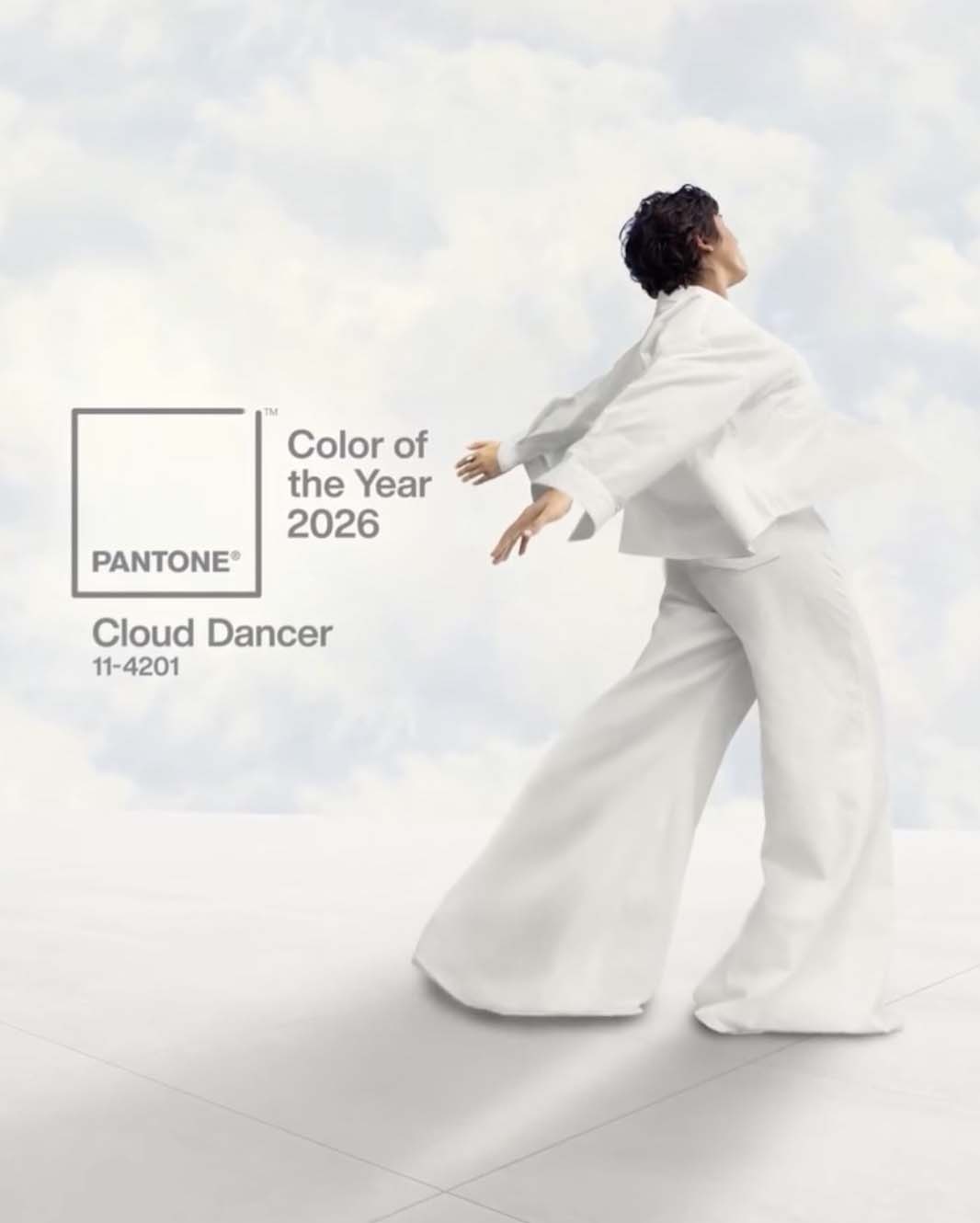
The 2026 Pantone Color of the Year
It seems Pantone is having its “YOU” moment by declaring Cloud Dancer, an off-white color, the Color of the Year. Here is what Pantone has to say:
Introducing Pantone Color of the Year 2026, PANTONE 11-4201 Cloud Dancer, a lofty white that serves as a symbol of calming influence in a society rediscovering the value of quiet reflection. A billowy white imbued with serenity, PANTONE 11-4201 Cloud Dancer encourages true relaxation and focus, allowing the mind to wander and creativity to breathe, making room for innovation.
Pantone Color of the Year 2026
Similar to a blank canvas, Cloud Dancer signifies our desire for a fresh start. Peeling away layers of outmoded thinking, we open the door to new approaches. An airy white hue, PANTONE 11-4201 Cloud Dancer opens up space for creativity, allowing our imagination to drift so that new insights and bold ideas can emerge and take shape.
Laurie Pressman
Vice President, Pantone Color Institute
Pantone has given us a blank canvas, which, once again, feels like a prominent organization has relinquished its decision-making to the population as a whole.
Cloud Dancer and Other Colors of the Year
Since the first color of the year in 2000, white has never been selected, but I think there is a good reason for this- white has always had a place in art, fashion, decor, and any other area of design.
Looking at past colors of the year, there is almost always push-back when the color is first announced, but within one to two years, the color has infiltrated every area of our lives. Occasionally, colors don’t noticeably take hold, but that is the exception rather than the rule. People were livid in 2016 when Pantone selected both Serenity (pale blue) and Rose Quartz (pale pink) as colors of the year. One of the big complaints was that two colors were selected- why couldn’t they make a decision? (Little did we know what was coming for 2026!) Now, both Serenity and Rose Quartz appear regularly on their own and in combination.
Specific colors always move in trends. Sure, you will always be able to find blue fabric, but whether that blue leans towards aqua or periwinkle will depend on current color trends. This constant evolution is why I’m a fan of building a working stash so I can always have a full range of fabric colors on hand.
The purpose of the Pantone Color of the Year, at least in past years, is to highlight a color that is emerging, but is far from prominent in the current design space. It is a good sign when the selected color doesn’t immediately resonate with everyone. If everyone is immediately excited about a color, it’s already too prominent to be on the early end of a trend. As a designer, I want to be among the first to work with an up-and-coming color rather than latching onto a trend already nearing its peak.
Thoughts on Recent Color Trends
I’m usually good at predicting color trends. As a kid, it drove my Mom crazy that I would always ask for some article of clothing in a specific color each Christmas, and that color was nowhere to be found. The following year, that color was everywhere, but I was always on to the next hue by that point. This skill has frequently translated into the ability to closely guess Pantone Colors. However, I have totally failed with these guesses for the past three years. (I still say Peach Fuzz should have been green!)
You may have picked up that I am unimpressed by the selection of Cloud Dancer, and you would be correct. What would I have selected? My choice would be a dusty blue-green in the aqua to teal realm. Almost any value in this range would work with what I have started to see. As much as I love pure, bright colors, pastels and muted tones are coming into favor, and many of these do create a cozy, lived-in feel.
Using the Color of the Year
At this point in my post on the Color of the Year, I typically share a dozen potential color palettes that incorporate the color of the year in unexpected ways. However, I am confident that everyone can find a way to use off-white. It’s a blank canvas- you just put it with other colors you like.
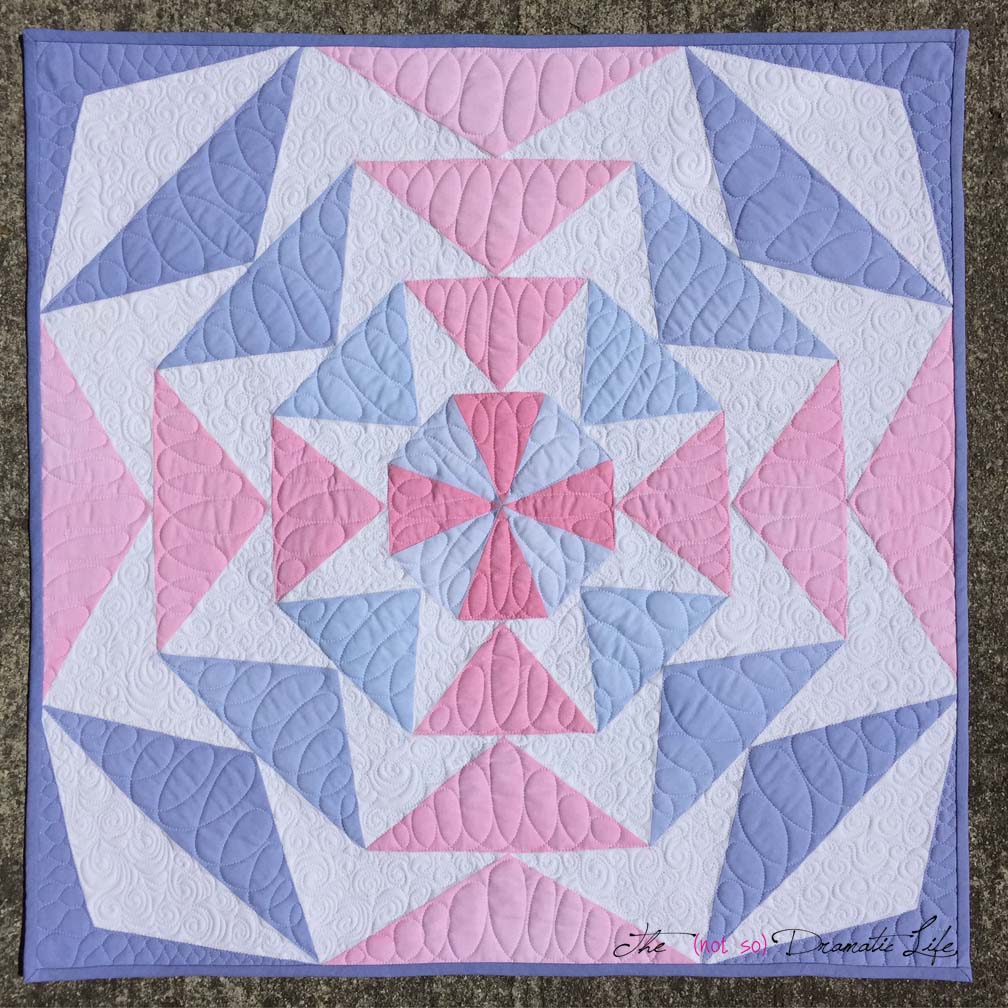
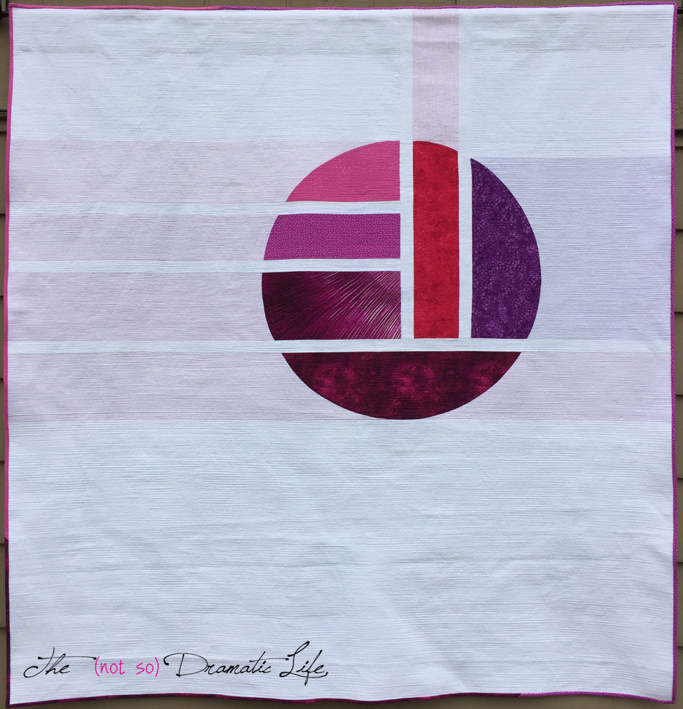
Quilters, particularly modern quilters, have been using vast amounts of white in their designs for over a decade. The Use of Negative Space Category at QuiltCon was dominated by quilts featuring large fields of white space. (I’m not criticizing that trend- several of those quilts were mine!) Recent years have seen a shift in the modern quilt aesthetic toward more color and pattern, and I would hate to see this growth reverse as the overall design trend eventually takes hold.
Why Use the Color of the Year?
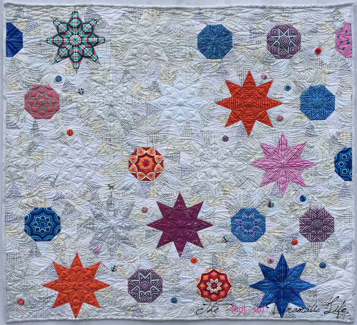
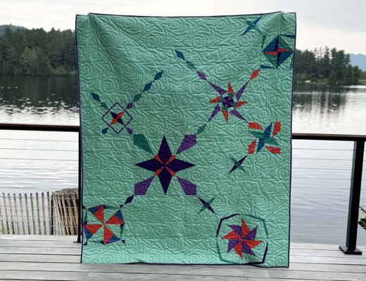
Do you need to use the color of the year? No. However, using a color outside of your go-to palette can force you to be more creative in all aspects of design. Mocha Mousse, the 2025 Color of the Year, is a terrible fabric color, but I made two quilts using it. Forcing myself to use a color I dislike led me to create two quilts that may never have existed otherwise. One won the Pantone Quilt Challenge, and both are heading to QuiltCon.

The Pantone Quilt Challenge
The Pantone Quilt Challenge is one of my favorite annual events, and it helps push me to try something new. Everyone has their own approach to color, but for me, I design in a way that highlights the challenge color rather than just using it.
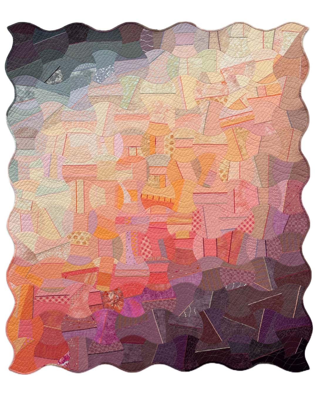
For the 2025 challenge, I used Mocha Mousse to create a foundation paper pieced mini quilt of an abstracted landscape.

In 2024, I highlighted Peach Fuzz by using an unexpected gradient to create a modern interpretation of a traditional apple core quilt.
The Pantone Quilt Challenge is happening again this year, but this year’s hosts, Sarah Ruiz and Audrey Esarey, may be planning something different, given the unusual color selection.
Ideas for Using Cloud Dancer
Virtually Everyone reading this post has used white in a quilt, so using Cloud Dancer isn’t really a challenge. However, using Cloud Dancer in a way where the color is the star of the design is extremely challenging. Here are a few ideas I’ve had that could inspire some Cloud Dancer quilts:
- Use white in the focal areas of a block instead of in the background
- Make a wholecloth quilt that uses quilting stitches as the primary design elements
- Consider fabric modification techniques featuring texture
- Make low-volume, nearly-white prints work for you in a new way
What do you think of Cloud Dancer? Will you be using it intentionally this year as a focal aspect of design?


1 Comment
Kathie
December 12, 2025 at 10:48 amMuch like you, I tend to design outside of trends only to find them the up-and-coming trends. Point in case, after I painted my living room a deep Navy, Pantone announced that color as it’s COTY. I painted my walls beige shortly before decorators announced that they were leaning away from gray to browns. So, I get your forethought regarding color. Sew, believe me when I say that Pantone is helping us move away from the ever-present gray to a more inviting neutral. I personally love white. I wear it, I decorate with it and I find my quilting much more exciting when I play in white negative space. I challenge you to embrace the white by pairing it with your favorite colors and see how far you can go in your journey to embrace this elegant neutral. I can’t wait to see how you manage that. You will be amazed in a year.