QuiltCon 2022 had spectacular quilts lining every aisle of the show, and I have already shared some of the trends I noticed including the use of neutrals, circles, and curves.
Today I have selected five quilts that are among my favorites to take a closer look at. Even though I love most of the award winning quilts, I intentionally did not include any in this piece because those quilts tend to be posted frequently. As usual, these are in no particular order.
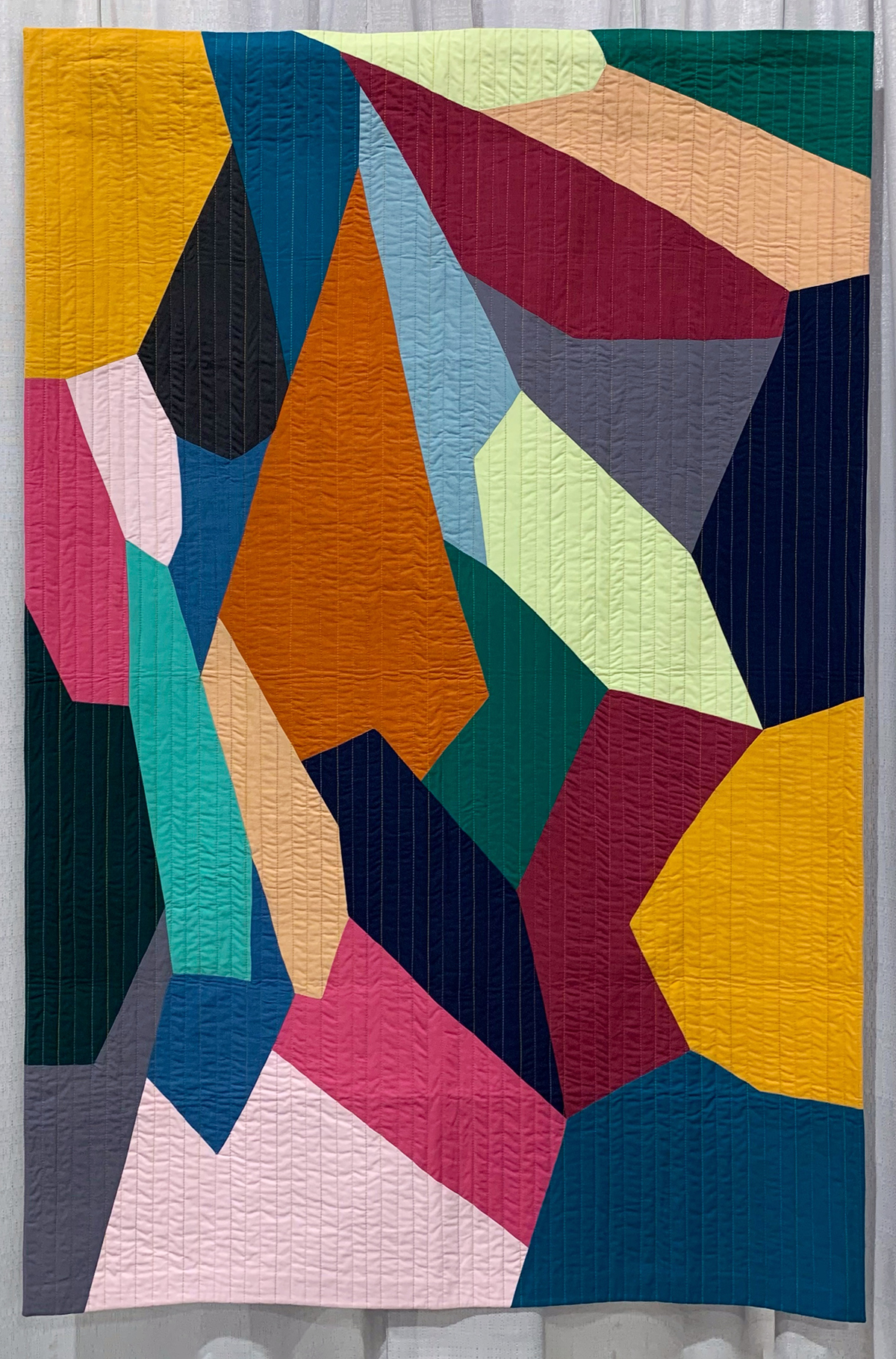
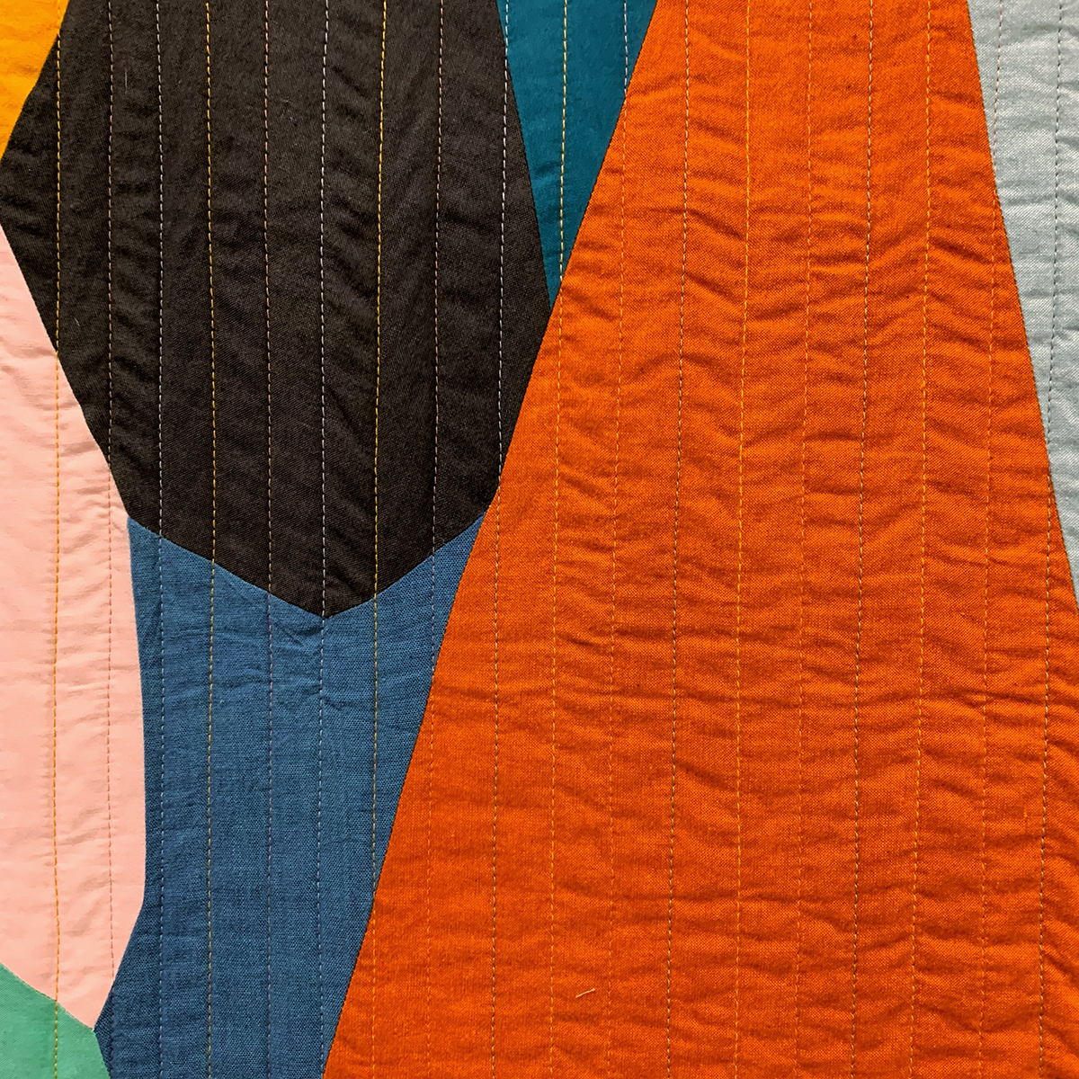
Hextraordinary by Isabelle Selak of @southbaybella
What I love about it:
- It’s a hexagon quilt that is unconstrained by expectations that all hexagons are regular (all sides and angles of equal measurements)
- Many of the hexagons form points that lead your eye around the quilt
- A wide range of values are included in the design
- Multiple quilting thread colors integrate well with the fabric palette
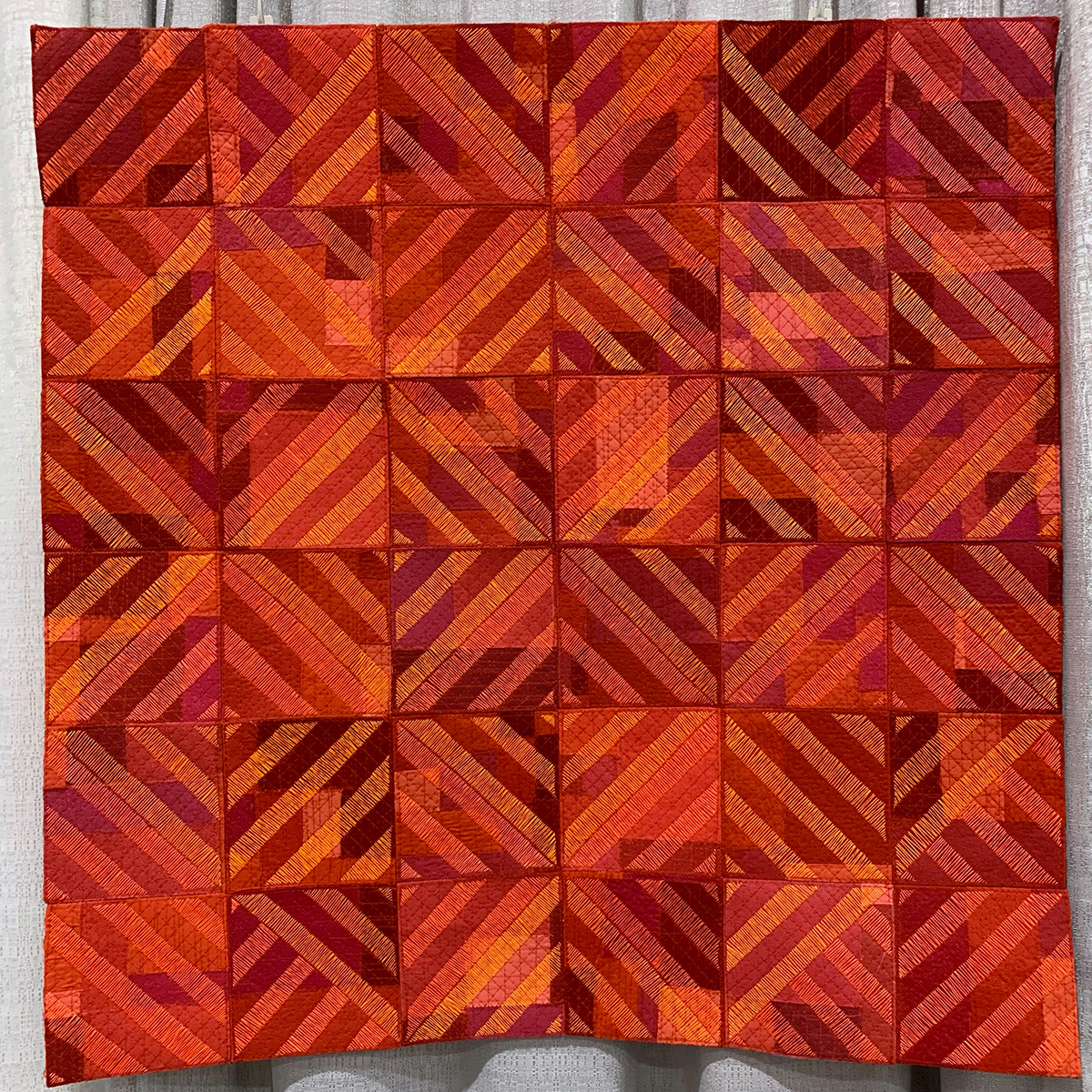
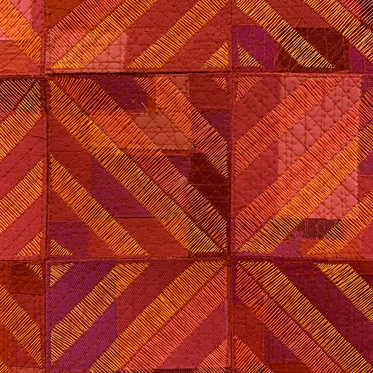
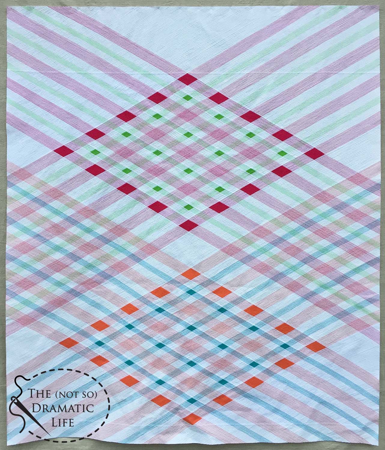
Seeing Red Feeling Blue by Jennifer Broemel of @Jen.broemel
What I like about it:
- The use of layering, particularly how the wide stitching creates a transparency effect when viewing the quilt
- From a distance the overall design appears to have a mostly traditional, even formal layout, but as you get closer it becomes clear that several non-traditional construction techniques were used.
- Potholder style construction done in a contemporary way
- The warm color palette
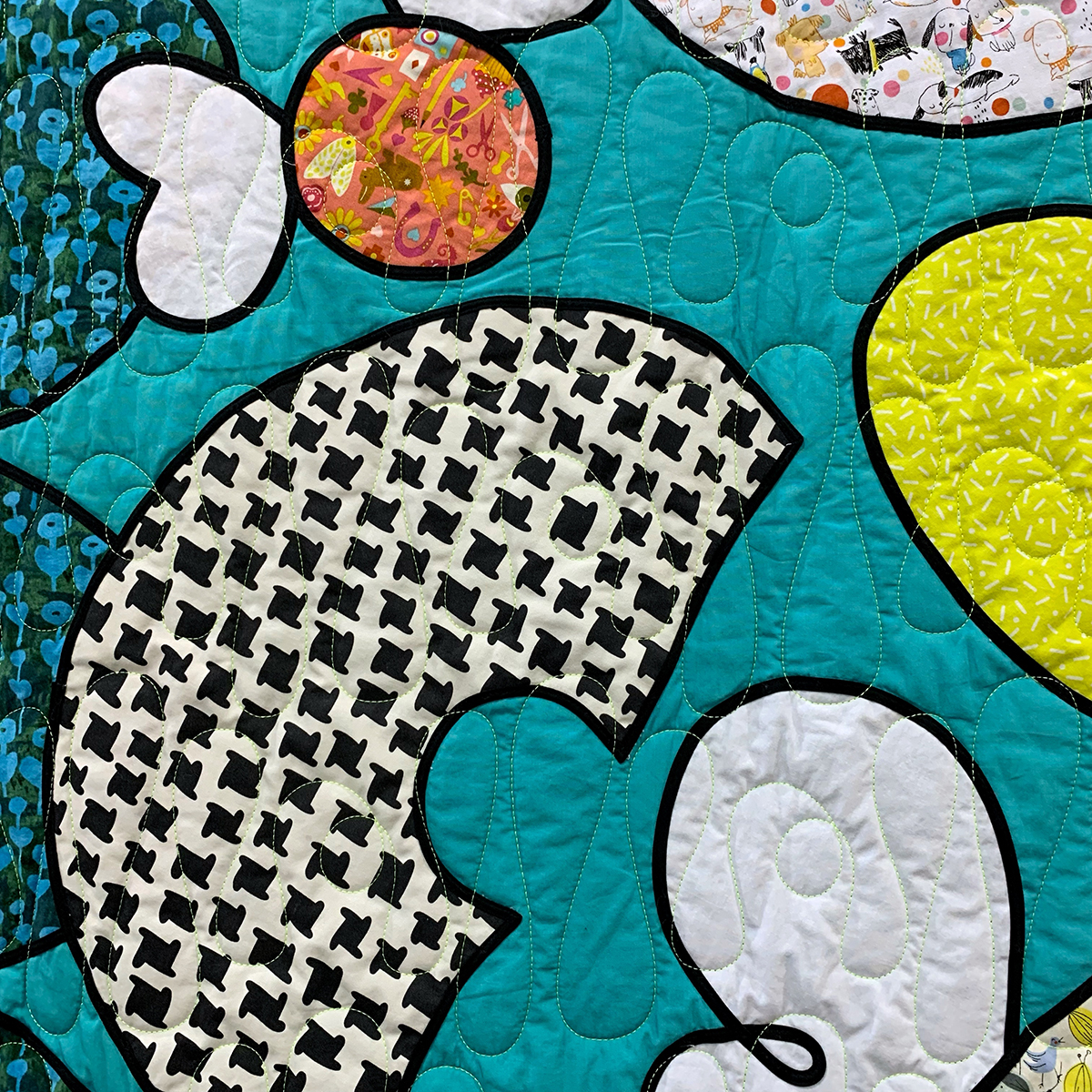
Radioactive Flying Donuts by Emily Watts of @emilywattsquilts
What I like about it:
- Black bias tape line as a design element- especially since this technique is most commonly used in formal compositions, and Emily’s work here is definitely not formal
- The use of high contrast prints in areas that pop out visually from the background
- A color palette that combines bright and muted colors

Poof, There It Is by Laura Loewen of @quiltfortco
What I like about it:
- The texture created from the poofs made from wool yarn and hand poof-ified!
- High contrast hand quilting
- The overall color palette and how it shifts from warm to cool as you move down the quilt (and how the poofs shift color too, but the hand quilting is a single color throughout)


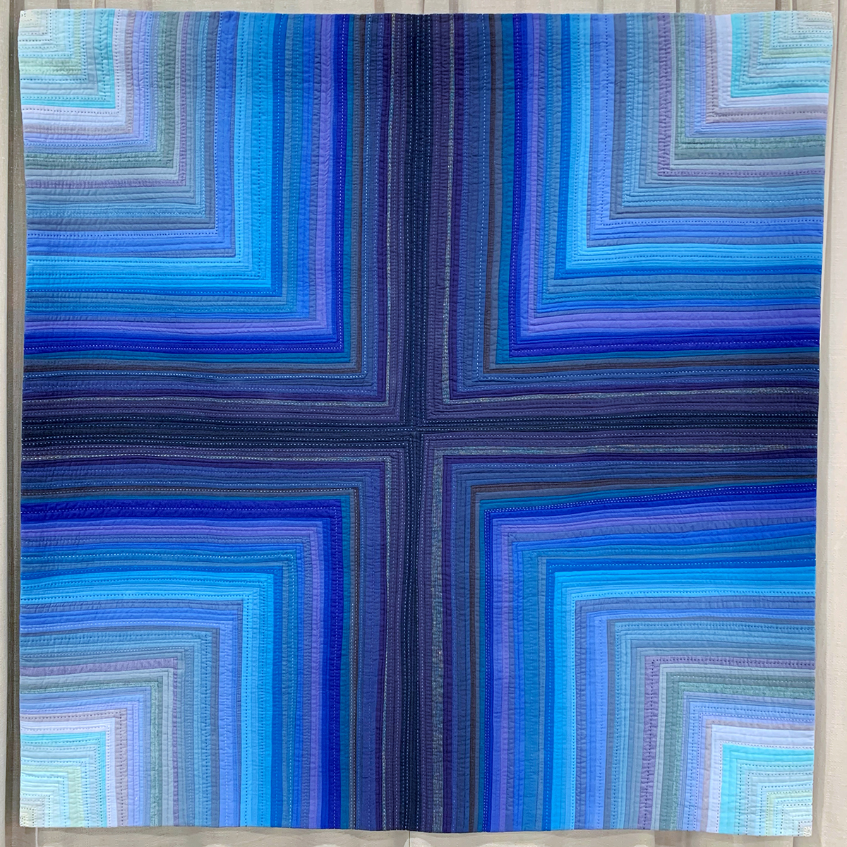
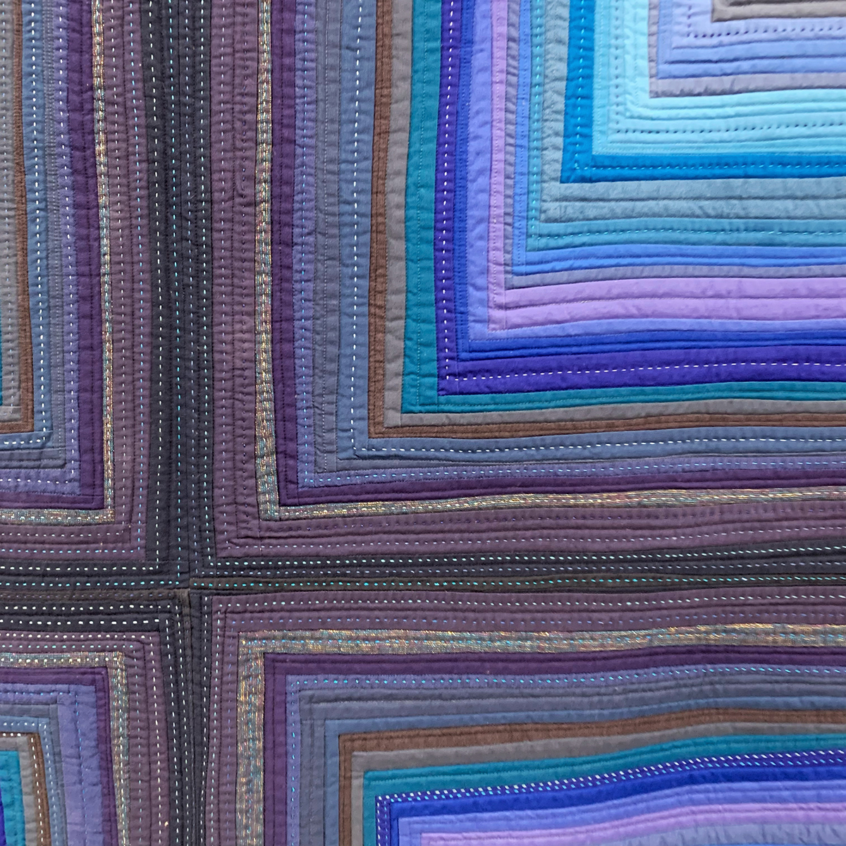
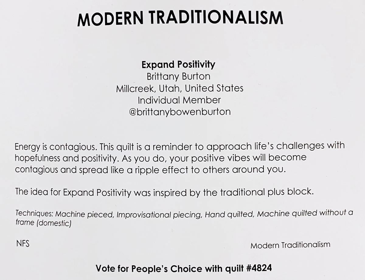
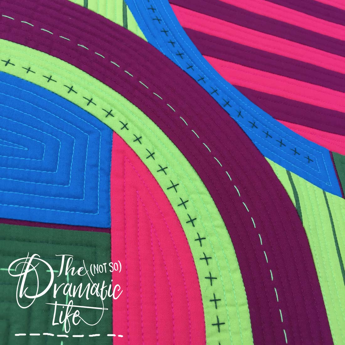
Expand Positivity by Brittany Burton of @brittanybowenburton
What I like about it:
- The color palette starts dark in the center and works towards light colors in the corners, but it isn’t a constant gradual shift- the value shifts back and forth along the path
- The piecing is intentionally and unapologetically wonky while still clearly evoking the traditional starting point for the design
- Combining hand and machine quilting
- Using contrasting thread for the hand quilting portions of the design
Thanks for joining me to take a closer look at some of my favorite quilts at QuiltCon 2022!
No Comments