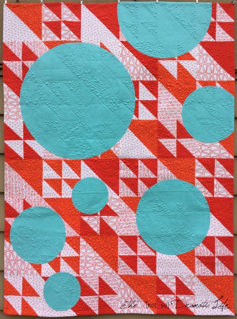
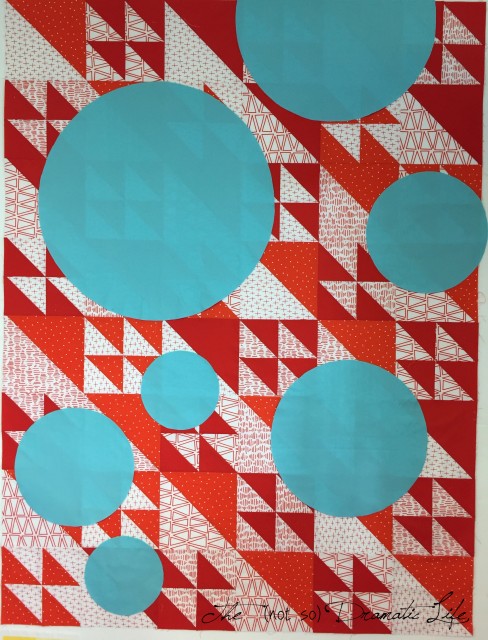
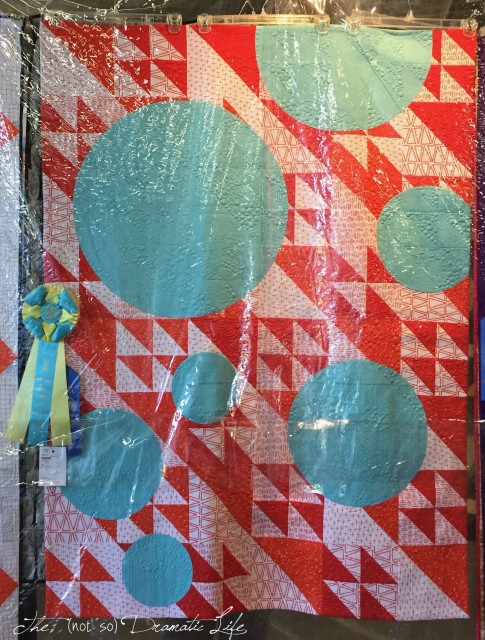
Overlay is the quilt I created using the Rockstar line from Riley Blake fabrics for the Modern Quilt Guild challenge last Spring.
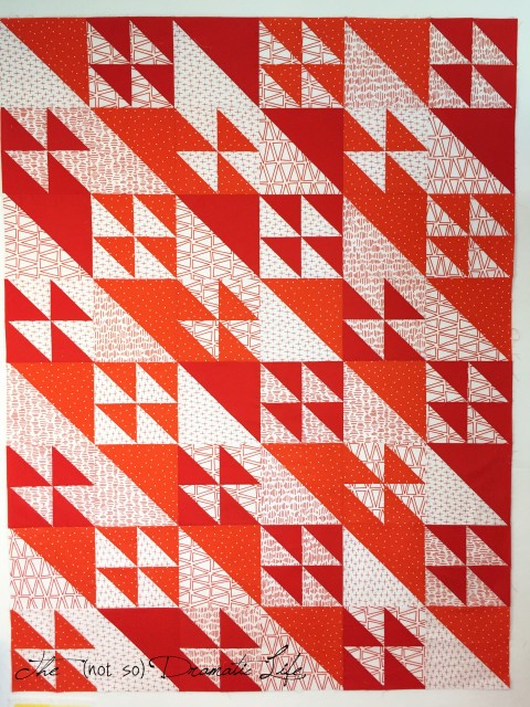
I focused on the red and white prints because I liked the idea of using such a classic color combination (such as the popular red & white quilt exhibition!) in contemporary prints. The design of the quilt also embraced the juxtaposition of classic and contemporary. The first step for this project was to make a traditional quilt top using a Flock of Geese block.
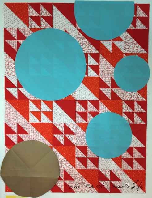
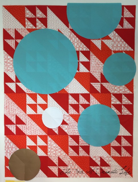
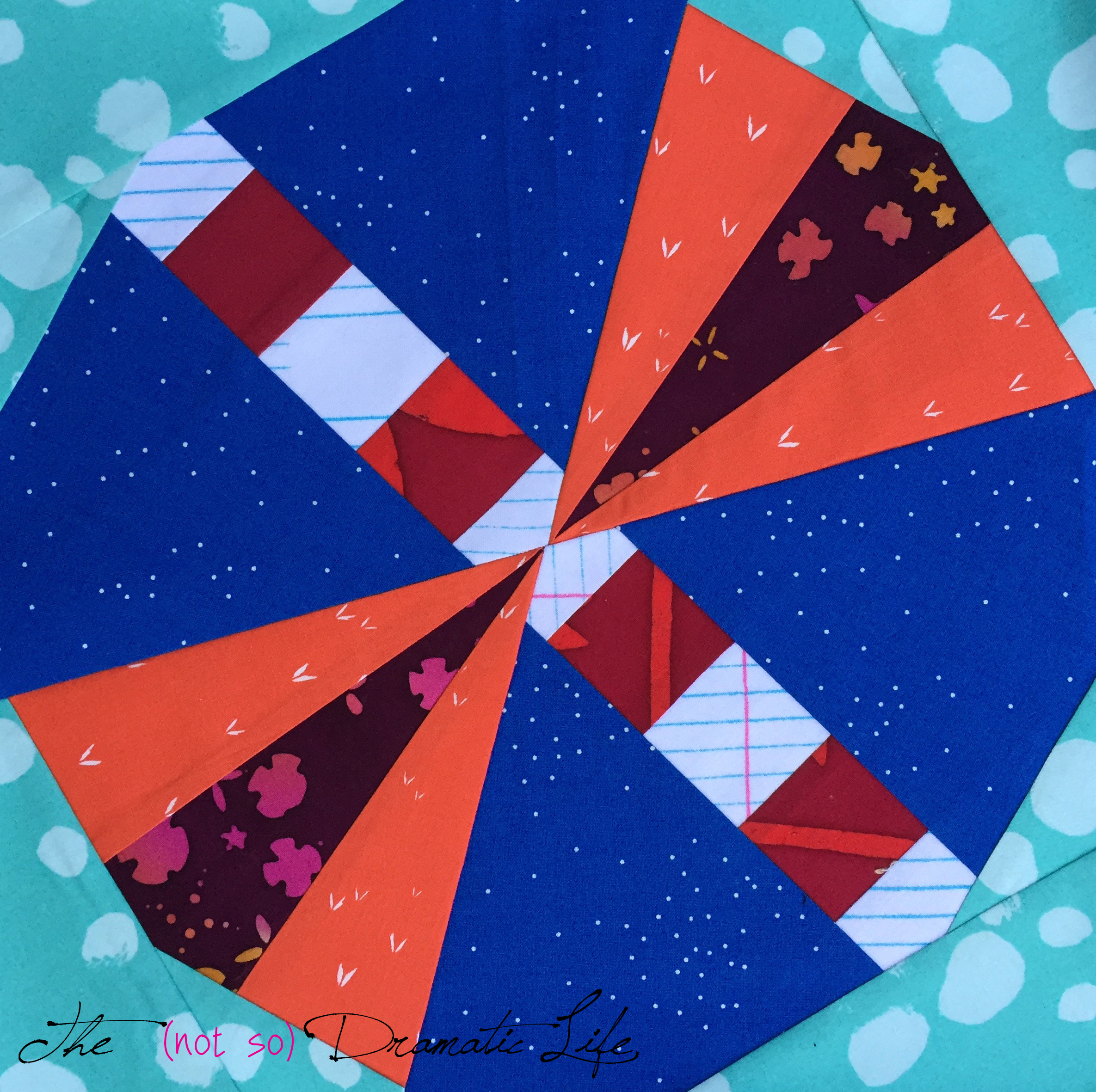
Once the top was complete, I started deciding which areas would be obstructed by the circular overlays. To assist with this process, I made circles from printer and craft paper so I could experiment with scale.
Once the right scale was achieved, I used the paper pieces as templates to cut the fabric pieces.
After determining the final layout, I cut corresponding circles from quilt top that had a radius 1/2″ smaller. Then I machine pieced in the circles- thats right- there is NO APPLIQUÉ in this quilt!
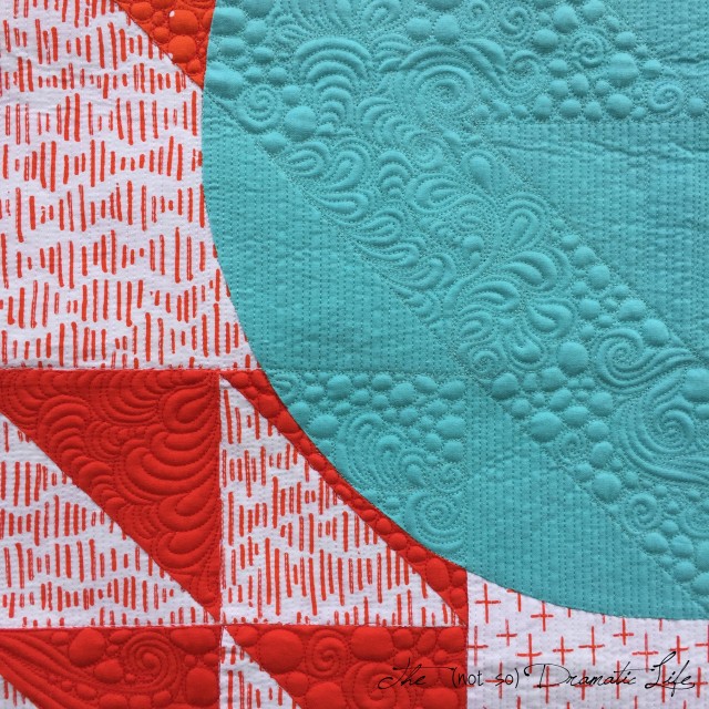
For me, the quilting is where my vision really comes to life. I wanted the texture to tell the story of the quilt even in the sections where the overall pattern is obscured by the circles. For example- if you were to paint a mural on a brick wall, the color changes with the design, but the underlying texture remains the same. In this quilt, the Flock of Geese design is carried through the entire quilt top using the quilting.
Where the white portions of the Flock of Geese block would fall, vertical matchstick quilting is used. In the red areas, organic mixed motif quilting is used. The thread color matches each fabric used on the front of the quilt.
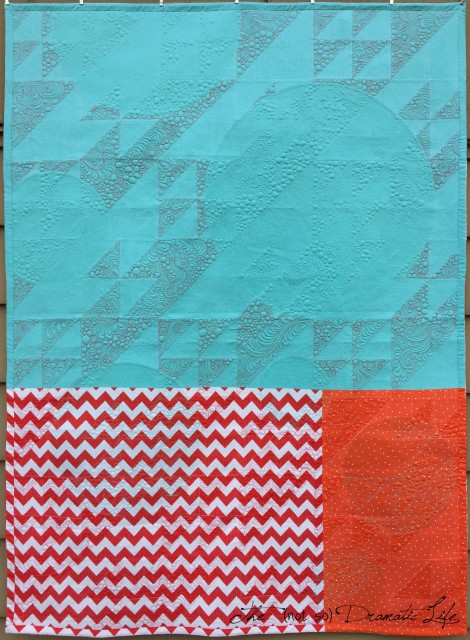
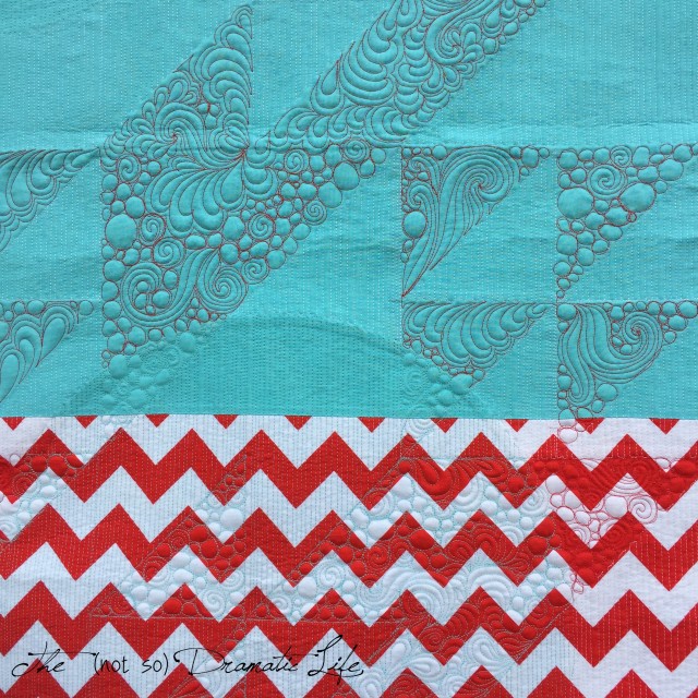
The back of the quilt is a mix of red, white, and aqua Riley Blake fabrics. A facing finishes the edges of the quilt so there is no visual border trying to contain the circles that appear to float off the edge.
On the back of the quilt, you can really see some of the thread color changes that blend in on the front of the quilt.
I was able to enter this quilt into the county fair, and it received a first place and a best of division award!
Quilt Stats:
Title: Overlay
Size: 47″ x 63″
Techniques: Machine Piecing
Quilting: Matchstick and Mixed Motif Free-motion Quilting using an A-1 Longarm
Fabric: Riley Blake Rockstar Prints and solids on the front, assorted Riley Blake fabrics on the back
Batting: Hobbs 80/20
Thread: Pieced using Gutermann Mara 100, Quilted with 50wt Aurifil in three colors to match the fabrics used
Binding: Facing in coordinating Riley Blake prints
This quilt was entered into QuiltCon 2018

7 Comments
Maja Harder
December 13, 2017 at 1:08 amReally love this design. The classic colours make a great contrast to the more contemporary pattern 😊
– https://www.bloglovin.com/blogs/maja-harder-18257183
Rochelle Summers
December 13, 2017 at 1:43 amThank you for explaining your technique and the vision for the quilting. It helps to understand the process and gives a greater appreciation of the effort put into the making.
Danice
December 13, 2017 at 3:46 amHow pretty. I love the quilt and those colors. Excellent work. No appliqueing, all pieced, that is amazing.
Craftsy Quilt Designer Fellowship Finalist! | The (not so) Dramatic Life
March 19, 2018 at 10:41 pm[…] Overlay […]
Four Quilts are Going to QuiltCon! – The (not so) Dramatic Life
June 2, 2021 at 3:08 pm[…] Overlay is one of my favorite quilts that I have made, and it will be seen in the Modern Traditionalism Category. […]
Want to Design Your Own Quilts? This Class Will Get Your Creative Juices Flowing – The (not so) Dramatic Life
October 12, 2022 at 7:53 pm[…] Overlay involved using the traditional color placement for the Flock of Geese quilt block, but then inserting large pieced circles into the quilt once the entire quilt top was complete. […]
Turning One Block into Two Unique Quilts Without Being Repetitive – The (not so) Dramatic Life
October 21, 2022 at 12:01 am[…] Ultimately this design took the original design, broke up the block pattern with an unexpected element, and then reconstructed the design with a different technique. The color vs. texture elements brings in the question of what is positive or negative space in the composition. You can read more about Overlay here. […]