I have been looking forward to one announcement all year, and it happened yesterday—Pantone released its 2025 Color of the Year!
The color choices announced this week will affect color palettes for years, and the 2025 color is Mocha Mousse.
Connection, Comfort, and Harmony
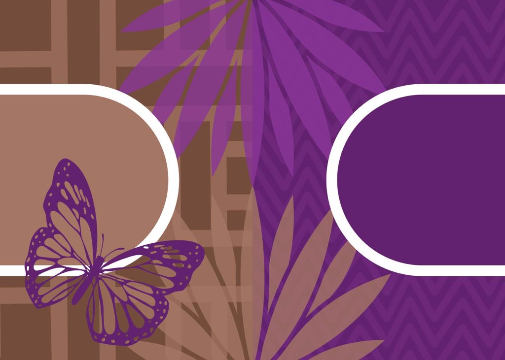
The Pantone color of the year influences color palettes used in products and artwork created worldwide. Mocha Mousse (shown on the left in the image above) is a warm medium brown. Here’s how Pantone describes it:
For 2025, the Pantone Color Institute selects PANTONE 17-1230 Mocha Mousse, a warming, brown hue imbued with richness. It nurtures us with its suggestion of the delectable qualities of chocolate and coffee, answering our desire for comfort.
Pantone
A Rich Violet
Pantone wasn’t the only one releasing their Color of the Year today. As quilters, the Kona Color of the Year is another fun announcement. Nocturne is a rich, pure violet with an intensity and saturation that will be fun to experiment with in the coming year.
While this post focuses on the Pantone Color of the Year, I have created a couple of palettes that include both colors of the year.
Using the Color of the Year
When approaching a new-to-you color, it’s tempting to pair it with colors you know will work. Most colors work well with white backgrounds. Neutralized colors like Mocha Mousse can play well with a range of other neutral fabrics but also can serve as a palette that complements stronger, more vibrant hues.
I am the most drawn to color combinations that draw a range of values and/or a similar saturation level as the key color. This technique allows the focal color to meld with its surroundings and play against the surrounding hues to accentuate every color in the composition.
If you have been watching my work for very long (or had the misfortune to be with me at a quilting retreat past midnight), you may have gathered that brown is not a color I am drawn to while quilting.
For many years growing up, the carpet in our house was a terrible shade of brown. It never showed dirt, but that was because the entire floor looked like dirt already. Ever since that time, I’ve never been able to embrace brown as a dominant color in design. Using this year’s color effectively will be a big challenge for me!
For many years, we, as quilters, have embraced bright, bold colors in our designs. In the past two years, Pantone has selected the pastel Peach Fuzz (2024) and the muted Very Peri (2023), moving us away from the intense colors of the last decade.
Is Brown a Neutral?
Depending on your social circle, there is some disagreement about whether or not brown is a neutral color.
When approaching interior design or fashion, brown can function as a neutral, similar to how blue denim jeans can also function as a neutral.
I lean towards the school of thought that true grey is the only neutral, and brown is a neutralized version of a specific hue. All shades of brown lean towards a particular color on the color wheel that has been neutralized by mixing it with the complementary color or creating a shade by mixing the hue with black, which means there is always a specific color base that doesn’t make it a true neutral.
I have only seen Mocha Mousse on a screen, so there may be some distortion of the color, but based on what I can see, Mocha Mousse has undertones of orange.

A Color-Based Quilt Challenge
Sarah Ruiz and Elizabeth Ray are hosting the Pantone Color of the Year Challenge again in 2025! Make sure you follow them both on Instagram so you will be the first to know the details.
A Color Tool Made for Quilters
How do you choose which fabrics and threads are the best matches for the color of the year?
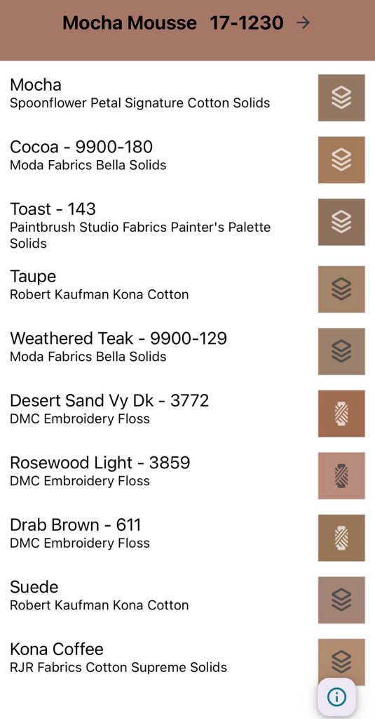
Steph Skardal created an app called A Quilty Solid. The app has several tools focused on helping quilters determine the best quilting solids for a particular color palette. Here, you can see a portion of the quilting solids and threads that closely match Mocha Mousse:
Color Palettes with Mocha Mousse
All of these palettes include five colors featuring Mocha Mousse. Of course, you could have a palette with as many colors as you like, but five colors can serve as a basic range that you can easily expand or simplify- some of my favorite Modern quilts only use two colors!

Palettes with Mocha Mousse and Nocturne
Combining the Pantone and Kona colors of the year is a frequent challenge in many quilting groups and guilds, so I’m starting with a couple of palettes incorporating both colors.


A Monochromatic Palette
Monochromatic Palettes use dark and light versions of a single color. The range of values can create particularly dynamic designs.

Analogous Palettes
Analogous palettes combine colors next to each other on the color wheel. When developing an analogous color scheme, you can place your key color anywhere within the gradient.


Split Complementary Palette
While analogous colors stick together on the color wheel, complementary colors are opposites. With the split complementary palette, we start with the key color and then choose the color on either side of its complementary color.

Seasonal Palettes
Do you have different quilts for different seasons? Or have you seen artwork that feels like it captures a moment in time? Each time a new color of the year is announced, I like to visualize how that color would feel at different times of the year.
Spring Palettes


Summer Palettes


Autumn Palettes


Winter Palettes


What is Your Palette?
Are you planning to use Mocha Mousse or Nocturne in a project this year? I can’t wait to see what you make!


2 Comments
Carrie Wikander
December 6, 2024 at 8:17 amWell done Cassandra. Although I still feel like the mocha mousse is still a downer in most of the palettes – its just so blah. My favorites are the analogous palettes and the monochromatic palette. Ithink maybe a desert sunset palette might dressit up as well- or maybe not…ugh, still hate it. But those palettes could work with it maybe…
Kathie
December 6, 2024 at 11:47 amI really love the blue summer pallet. TBH when we bought our house two years ago, I was thrilled that few of the finishes were done in gray and many were done in browns. I was over the gray trend almost when it started. I love the warmth of browns. That said, I rarely use brown in my quilts. I much prefer the cool blues and greens with white as my neutral of choice. If I have to add a warm, it is usually a pale yellow or orange. So while it’s fun to see what the color of the year is, I never limit myself to what’s on trend when I can find joy in reaching for my favorites instead of what “they” say I should use in my own creations.