What is your least favorite color? Do you ever use it in a quilt?
The 2025 Pantone Color of the Year is one of my least favorite fabric colors, but it inspired two of the quilts I made this year. (Mocha Mousse Mountain and Utah Overlook)
A Quilting Design Challenge
Earlier this year, one of the quilting groups I’m in started discussing “ugly” colors and how they work together. I mentioned a project in a color course I took in college where we had to create two pieces: one using only “pretty” colors and the second using only “ugly” colors. Without fail, the pieces using “ugly” colors were more successful.
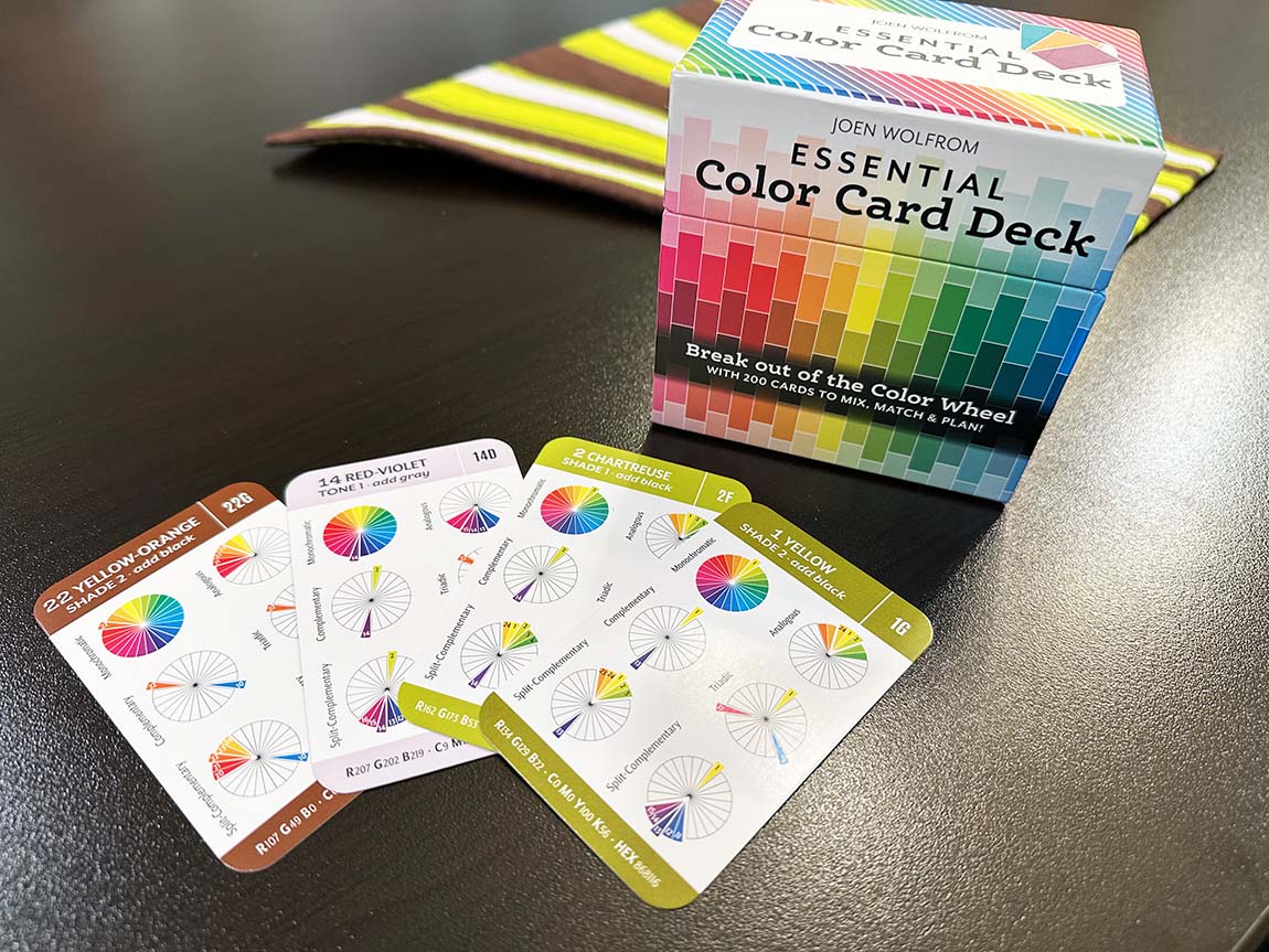
We decided that this premise would make a fantastic challenge project for the year. Starting with a color card deck consisting of 24 color sections, each with 8 cards, we each pulled the ugliest color from each section. From those 24 cards, we each created palettes of 4-6 colors to use for a quilt or related project.
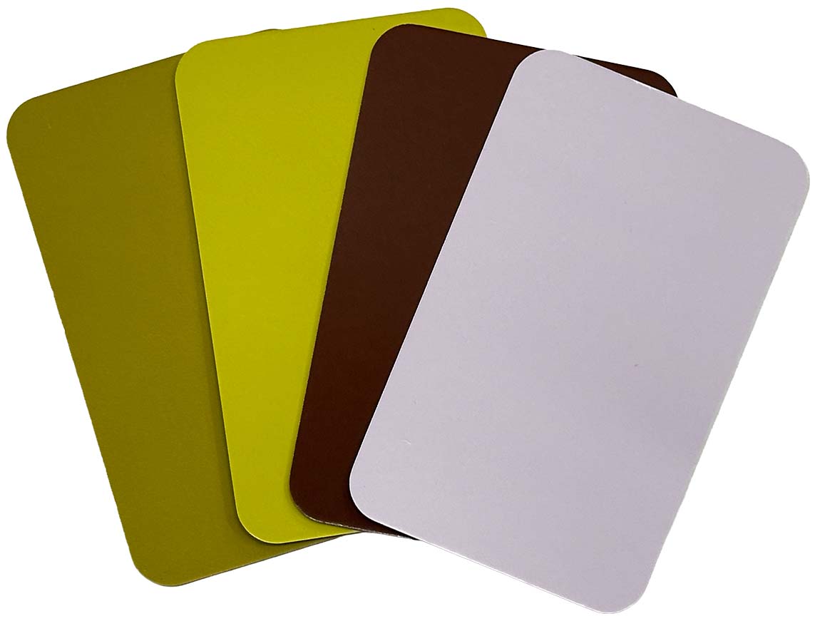
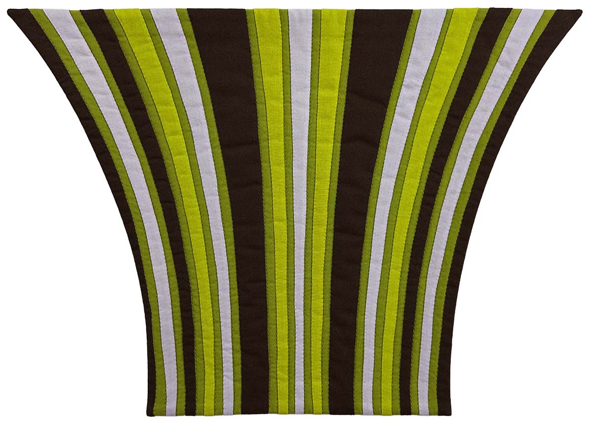
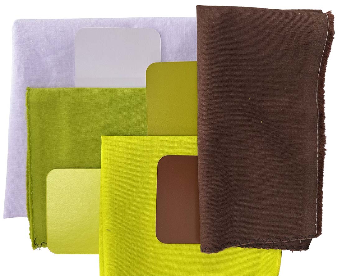
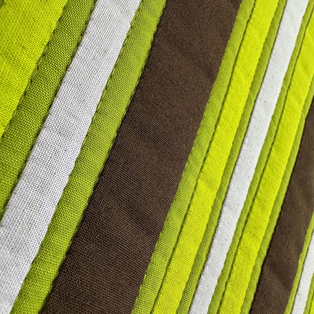
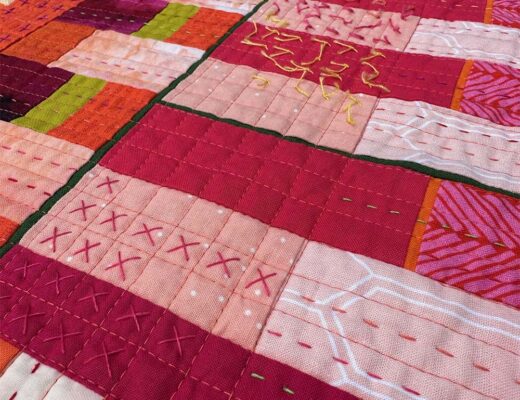
To create my final palette, I selected colors with a wide range of values. The lightest color is a pale violet, and the darkest is a deep brown. My midtones are both green, one muted, and the other a sharper accent color.
Creating a Design
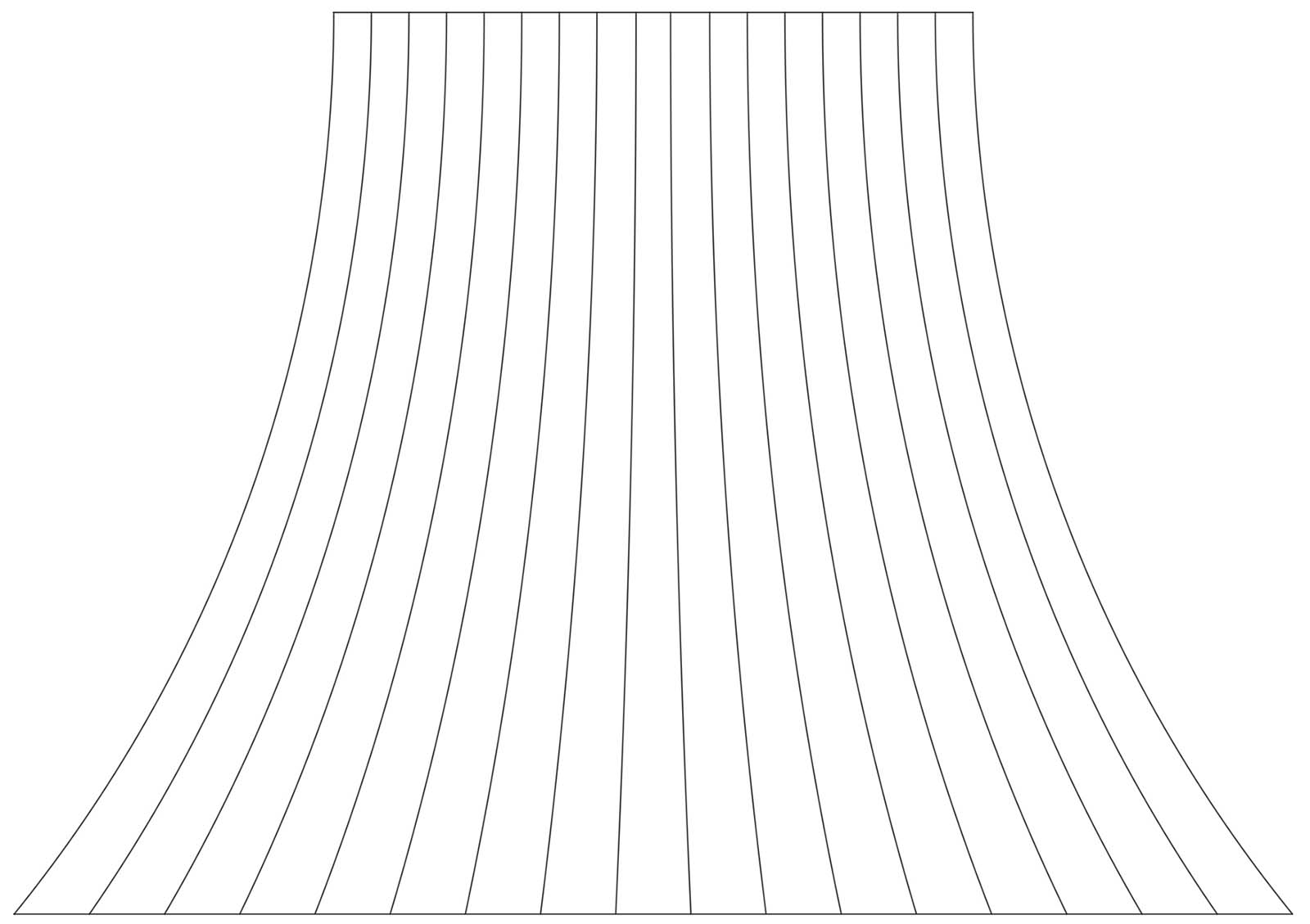
For this design, I was inspired by videos of candy pulling, such as this one of handcrafted candy canes. As the candy is pulled, it creates striations as it goes from a large mass to a narrower form. This effect is even more pronounced when the candy includes stripes. I like the idea of capturing movement in a static form, so I used this as an opportunity to experiment.
I used AutoCAD to create the line drawing that served as the starting point for this design.
Making the Quilt
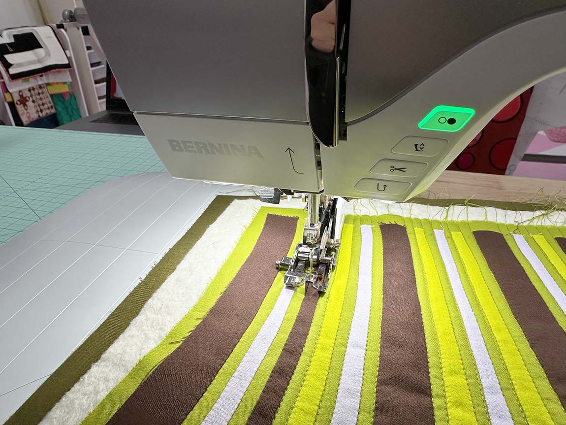
To create the striped effect of the design, I decided to use my favorite appliqué technique, in which appliqué pieces butt up against each other on a base fabric. When I turn the edges under during needle-turn appliqué, the base fabric shows in narrow lines. In the image below, you can see that one half of the piece has finished appliqué, while the other half still has the raw edges exposed, blocking out the base fabric.

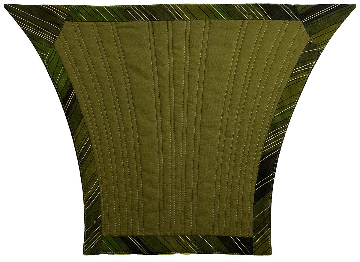
The color stripes are the feature of this design, so I kept the quilting simple, stitching along each side of the appliqué with thread matching the base fabric.
The biggest technical challenge in creating this design was adding a facing to the acute angles at the top. I have encountered these points in binding, but never with a facing, so I needed to try something a little different. I used extra bias binding from a previous quilt. The bias hugs the edges and lies nicely along the curved edges of the design. For the corners, I pulled out scraps of the same fabric and cut triangular pieces to match the template. The edge towards the center of the quilt is on a fold.
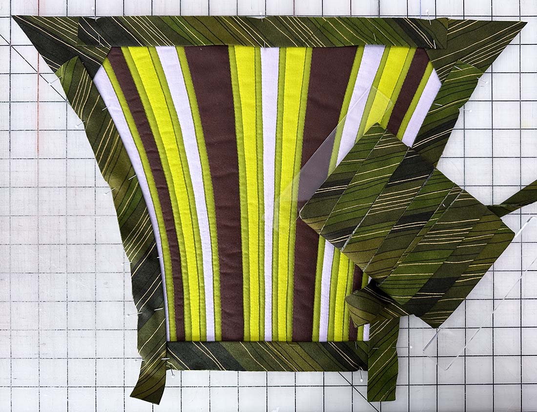
Getting the points to be, well, pointy, proved tricky. I ultimately ended up taking out my first round of stitching, cutting out most of the batting in the quilt’s corner (which was possible due to the light quilting), and restitching. Removing that bulk made the corners look much better!
The Results
Do I like the colors now? On their own, I still don’t care for most of this color palette, but I think it’s generally effective when combined. I am looking forward to working with this design concept again on a larger scale and will explore other color options as well.

Quilt Stats
- Title: Stretching the Color Limits
- Size: 17” x 12”
- Techniques: Needle Turn Appliqué
- Quilting: Walking Foot Quilting on a BERNINA 770 QE PLUS
- Fabric: All Solids
- Batting: A scrap of Hobbs 80/20 Cotton/Wool blend
- Thread: 50-weight Aurifil to match each color of fabric for appliqué and quilting
- Edge Finish: Facing
6 Comments
Kathie
November 21, 2025 at 7:49 amPersonally, I LOVE that colorway! Brown slacks, a green blazer with a cream blouse…not gray. Not a fan of gray. Which means that I will have to do this challenge with gray. LOL. Love the curved shape.
Junetta
November 21, 2025 at 8:56 amI think these are groovy colors! You did an excellent job pushing your creativity. It was good that you made the project small, with a focus on the inspirational shape. Gray would also be my color challenge. Yuck…
Heather
November 21, 2025 at 2:33 pmI love both those greens and that lavender!! And although I don’t generally like brown, I do love the way that this color combo makes my brain really want to read that brown as almost a berryish deep burgandy (even as it is definitely brown). Looks great!!
Shanda Siekert-Logue
November 21, 2025 at 7:03 pmYour palette rocks! The bright green makes it work!
Mary
November 21, 2025 at 7:47 pmVery dramatic! Love all the colours together but I still don’t like Brown! 😀
Kate
January 10, 2026 at 7:41 amI love green and brown together. To me, this quilt and its colorway evokes a forest in springtime. One person’s ugly is another person’s beautiful.