Coral is just about the perfect color as far as I’m concerned. It sits so nicely between pink and orange which is one of my favorite color combinations. So when Pantone announced the color of the year for 2019, I was ecstatic! So far this is my second project to incorporate Living Coral, and I have another in the works that has lots of coral pieces included in a wider color scheme.
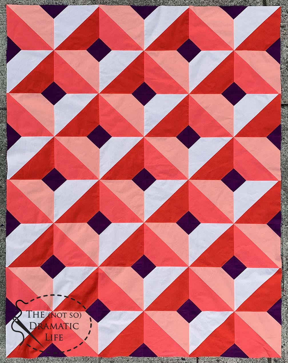
I think a lot about value when I design a quilt, and success of this particular design depends on it. A monotone interpretation of the color Coral helps create the illusion of dimension. Living Coral has a value that sits near the middle of the value scale, so I selected two lighter fabrics and one darker fabric for the design. Since coral doesn’t easily go to a really dark value without drastically muting the color, I selected a dark violet for the receding squares. The dark, cool color ended up setting off the coral nicely.
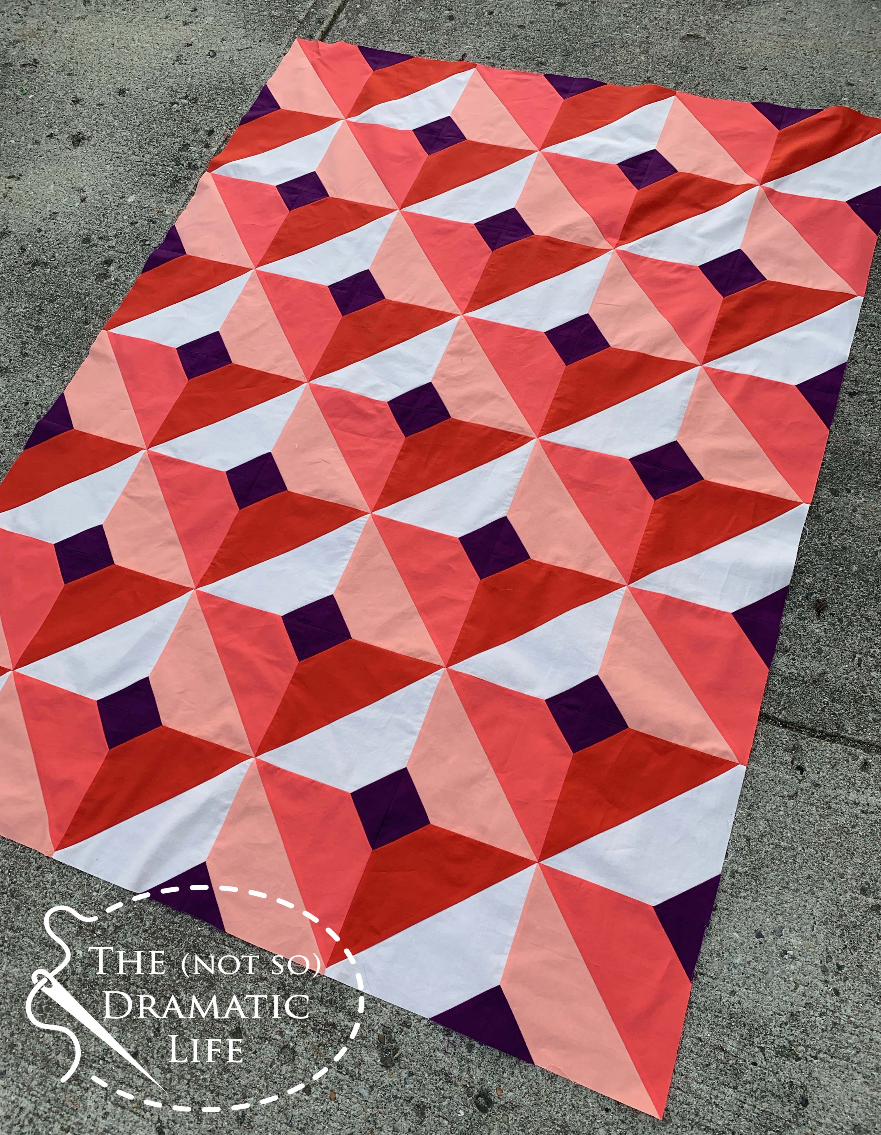
I have thoroughly enjoyed exploring a mostly monotone quilt with more traditional piecing techniques, and I can’t wait to finish it up!
Quilt (top) Stats
Title: The Value of Coral
Size: 42″ x 56″
Techniques: Machine Piecing
Fabric: Solids
Thread: Pieced with 50wt Aurifil
This quilt top is my entry in the 2019 Pantone Quilt Challenge hosted by No Hats in the House and Bryan House Quilts. I hope you will check out all of the exciting entries!
I am a resident of the United States
4 Comments
Danice
June 15, 2019 at 12:25 amReally pretty quilt top. The dark violet really does accent the coral well. ‘Would have never thought of that color.
Favorite Color Palette | The (not so) Dramatic Life
December 13, 2019 at 1:11 am[…] it in the past year. I used the Pantone Living Coral color in a dominant manor in two quilts, The Value of Coral and Forward and […]
My favorite thread weight: The Value of Coral | The (not so) Dramatic Life
April 27, 2020 at 10:42 pm[…] If you are interested in reading more about the design of this quilt, check out this post! […]
Michele T
April 7, 2021 at 2:14 pmWow! This is gorgeous! I spent two days searching for your quilt design and finally found it here! Whew!