
In addition to the standard contest categories, QuiltCon includes two specialty categories each year. One focuses on a specific set of fabrics, while the other centers on a specific theme. When they announced this year’s theme, I was over the moon because it aligned perfectly with a design concept I had already started experimenting with.

The American Patchwork and Quilting Challenge Category
What’s the category I’m so excited about?
The Pick-A-Color Scrappy Challenge
For QuiltCon 2027, the MQG and American Patchwork & Quilting want to see your take on single-hued scrappy in modern quilts. Dig out your color wheel, pick your color, and start scrapping. These quilts must feature a minimum of 10 different fabrics, with the colors all in one area of the color wheel. The challenge is open to individuals or groups.
Category description from the QuiltCon Website
Initial Inspiration
When photographing my quilts, I always take straight-on full and detail shots, but I also like to take a few from a sharp angle. I always enjoy how dynamic this view of a quilt looks, particularly with block-based designs. Suddenly one day, I was struck with the idea that I could make modern-traditional designs with a forced perspective, so the entire quilt would have the aesthetic of that angled photograph while looking at it straight-on
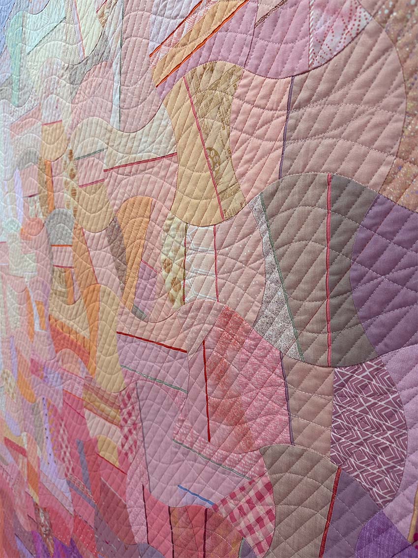
Shifting Perspectives
I tested this concept on a relatively simple design for a hexagon challenge last year. Rather than piecing these designs, I’m using hand appliqué on a gradient backing that appears in narrow stripes as I turn the edges of each piece under during stitching. I used the gradient to guide the color placement of the main design components.
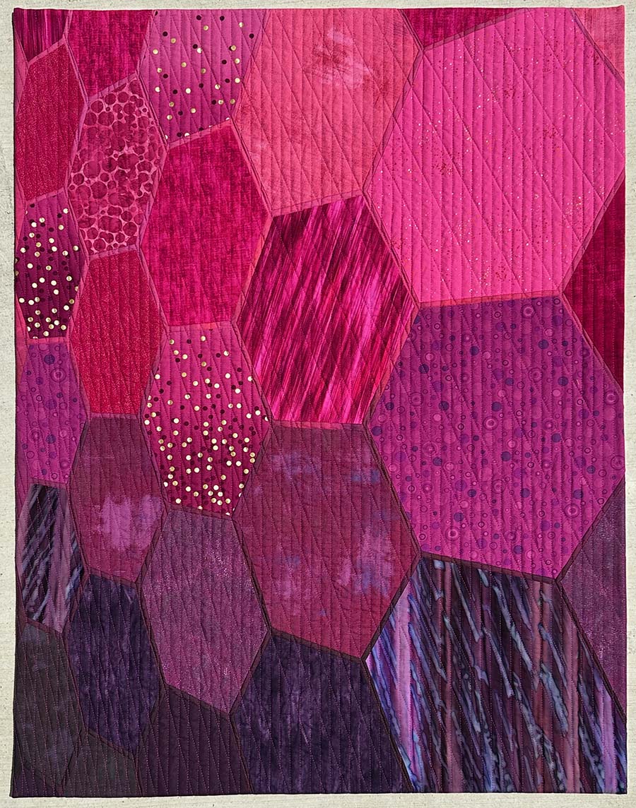
Quilt Block Inspiration
For these early explorations, I kept the overall shapes within the design relatively simple. I liked the idea of incorporating curves in this piece, and I originally considered a Double Wedding Ring design variation. However, as I developed the design, it felt a bit busy for what I was trying to accomplish.
I returned to one of my favorite reference books, The Encyclopedia of Pieced Quilt Patterns by Barbara Brackman, to find a traditional block that would work with this style of reinterpretation. I ultimately landed on this block with orange-peel-like motifs called either White Rose or Whig Rose.
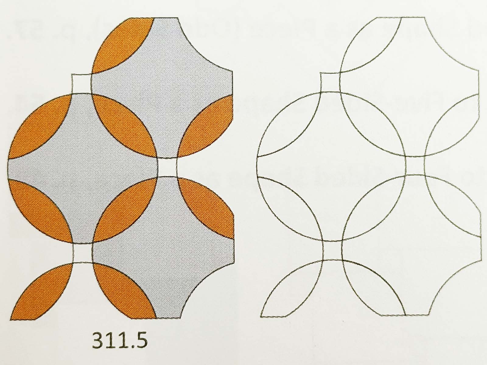
Drafting the Design
To start the design, I drafted a traditional version of the quilt top in AutoCAD. The only trick in this part of the design was estimating how many repeats would work well for the quilt’s overall size. Since the gradient base fabric was key to the overall design, I knew the finished piece needed to be about the width of the fabric. I had a bit more leeway with the quilt’s height, as long as the proportions worked well.
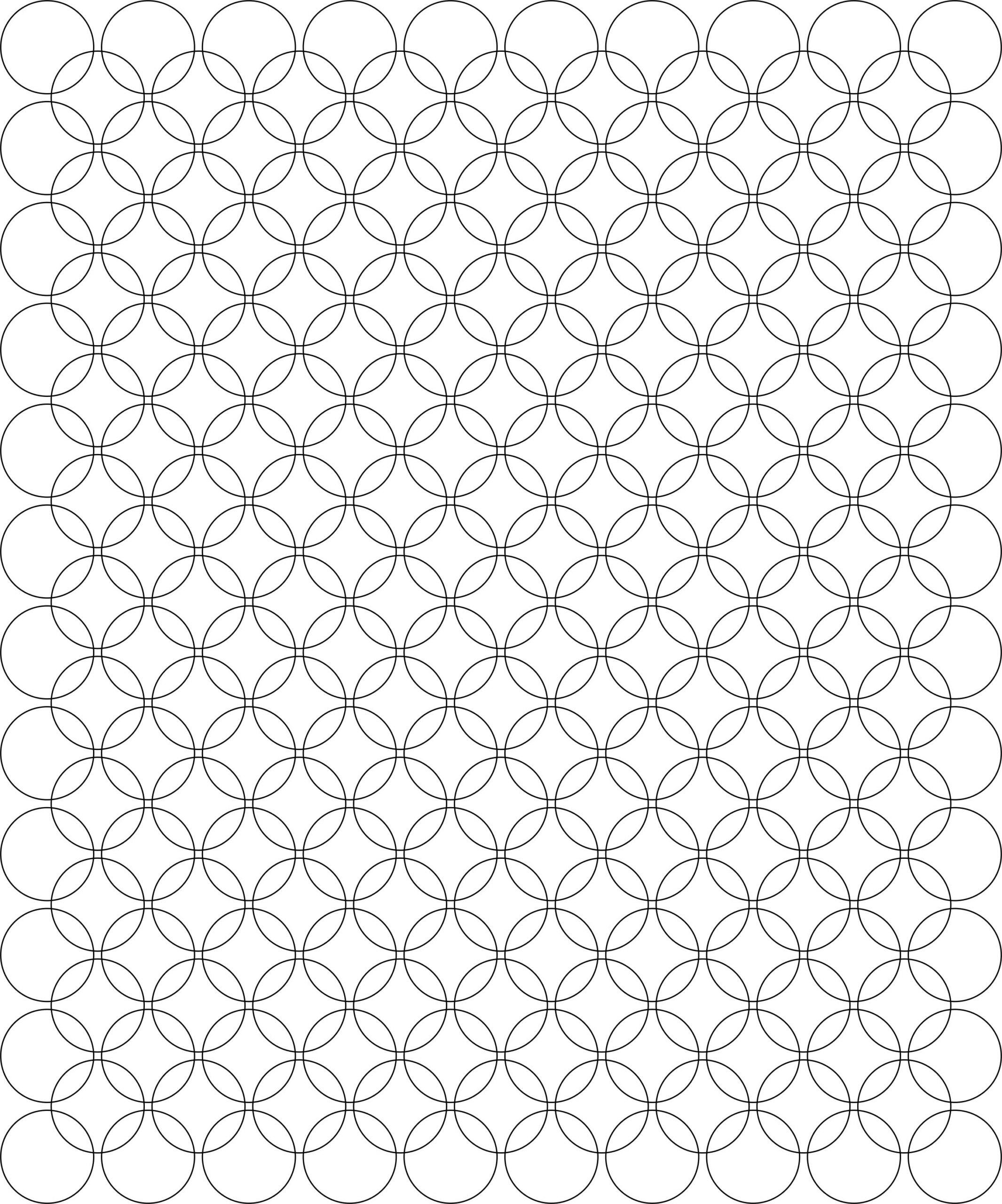
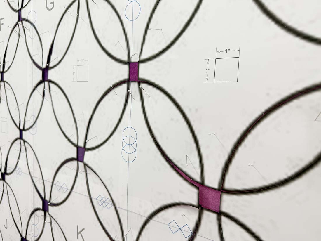
Next, I imported a PDF version of the design into Photoshop to adjust the perspective of the design.
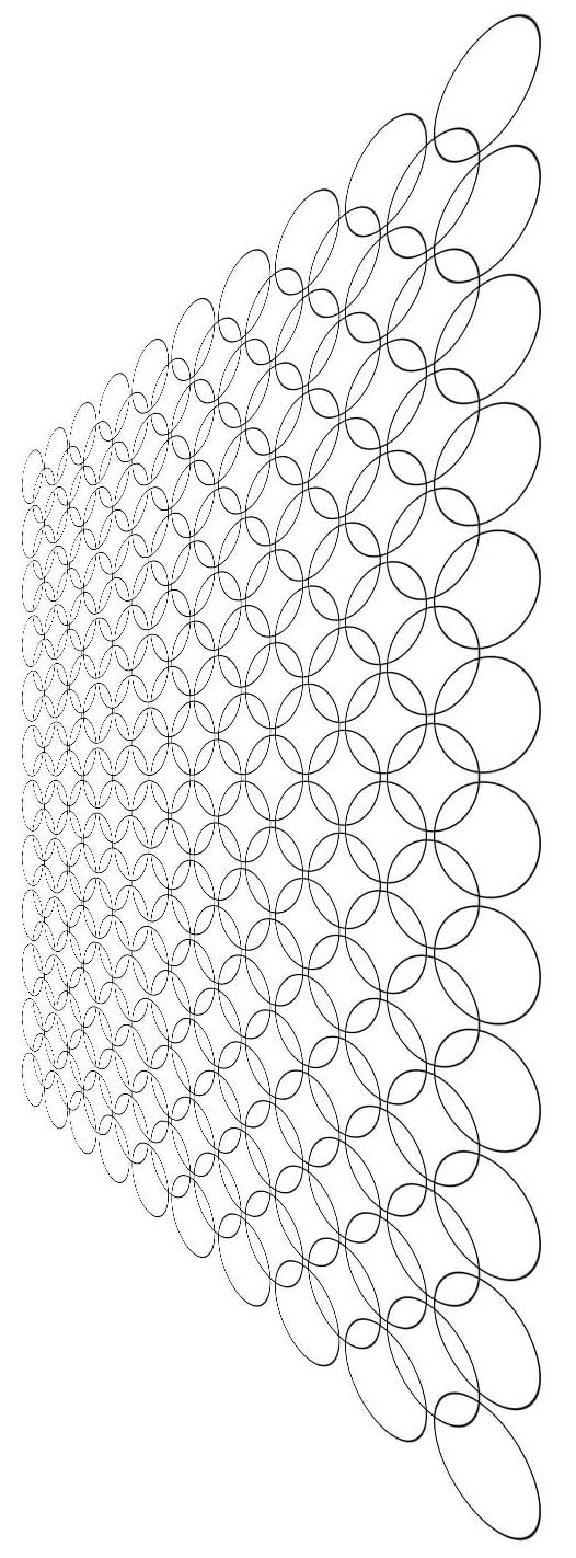
Switching between vector- and pixel-based programs resulted in somewhat heavier, pixelated lines. I typically re-draft the design over the reference image, but I decided to skip that step this time around. Since I’m the only person who will be working from these templates, I went ahead and printed the design first to see if I could work from this blurrier version of the image. (Spoiler alert— it was totally fine!)
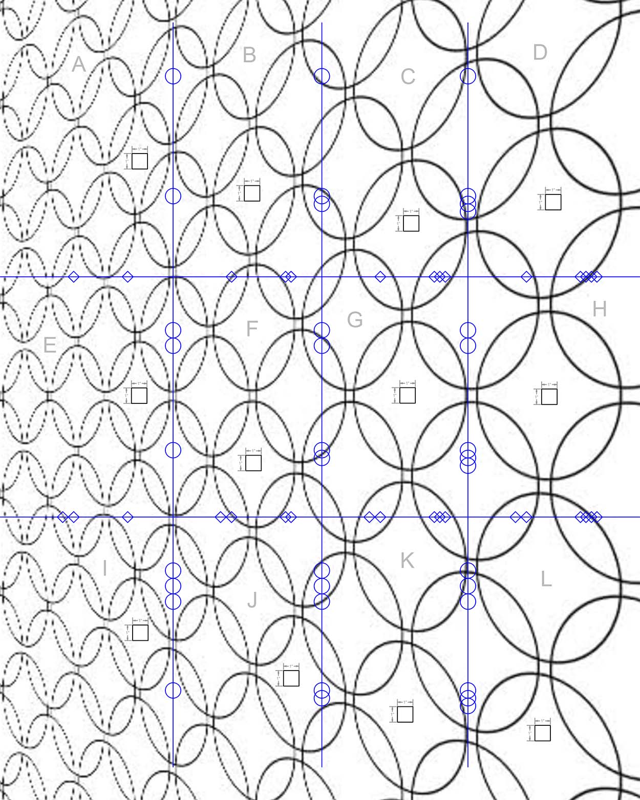
I added registration lines and labels to the design to make it easier to assemble the printed templates. I’m lucky to have a printer that handles 11” x 17” paper, so the assembly goes fairly quickly.
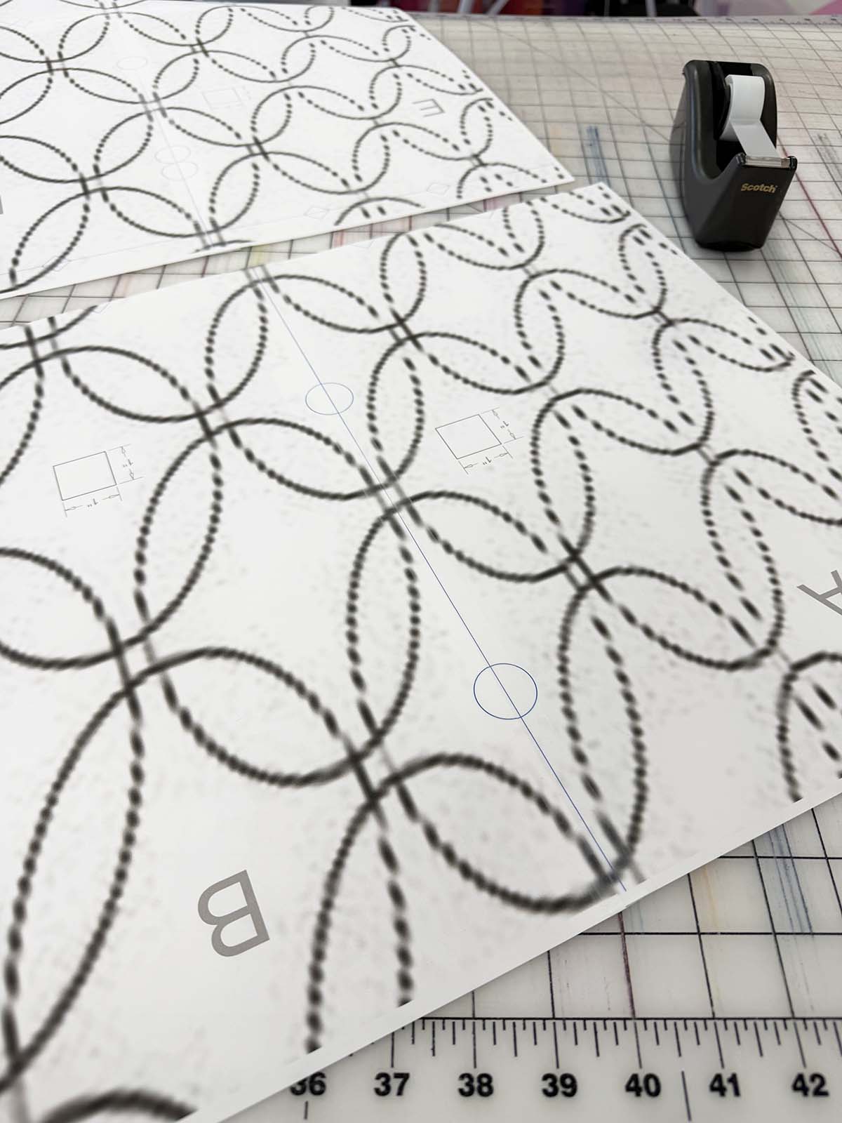
Moving to the Design Wall
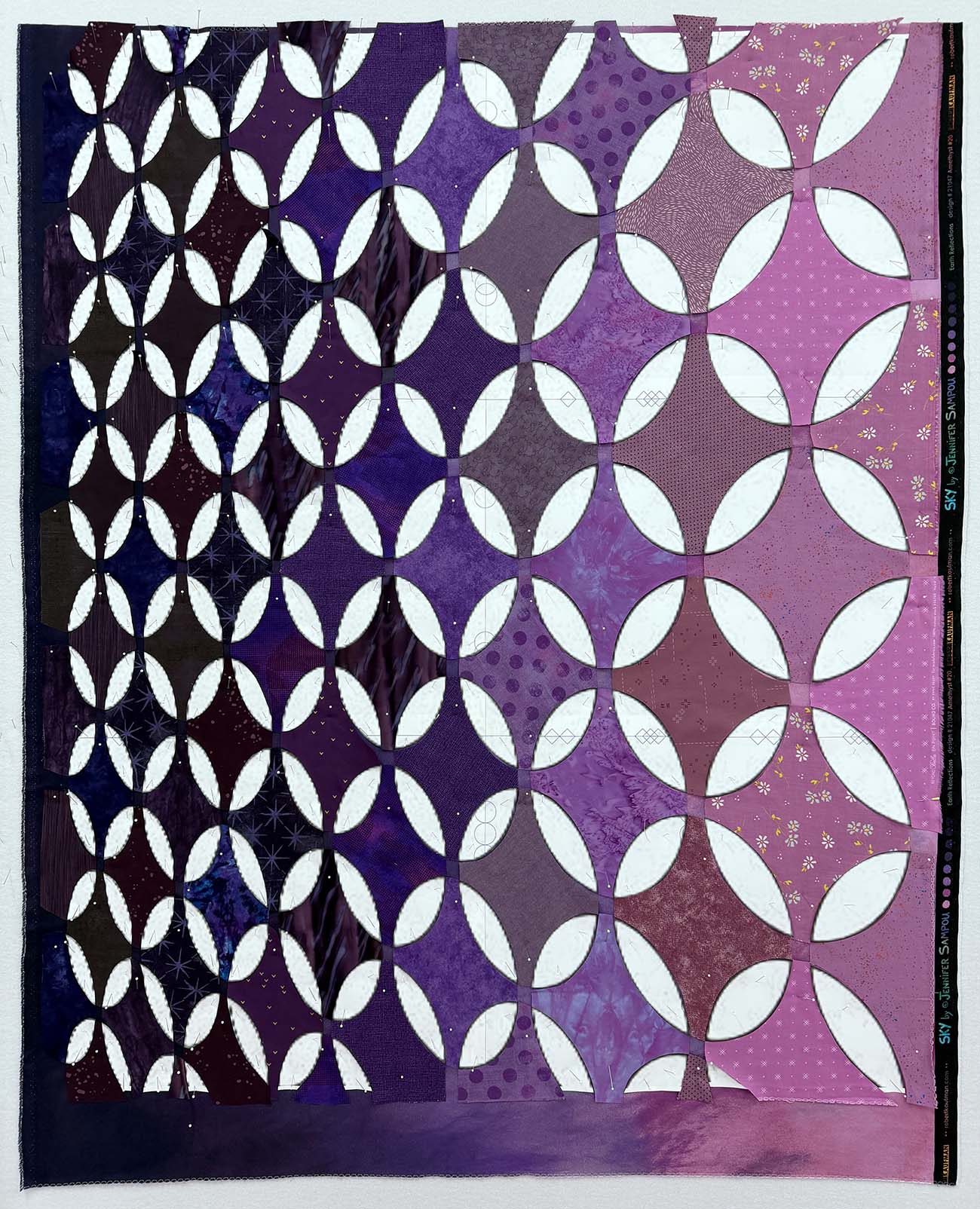
Once I’ve assembled the full quilt template, I pin it over the base fabric, which is a fantastic purple gradient.
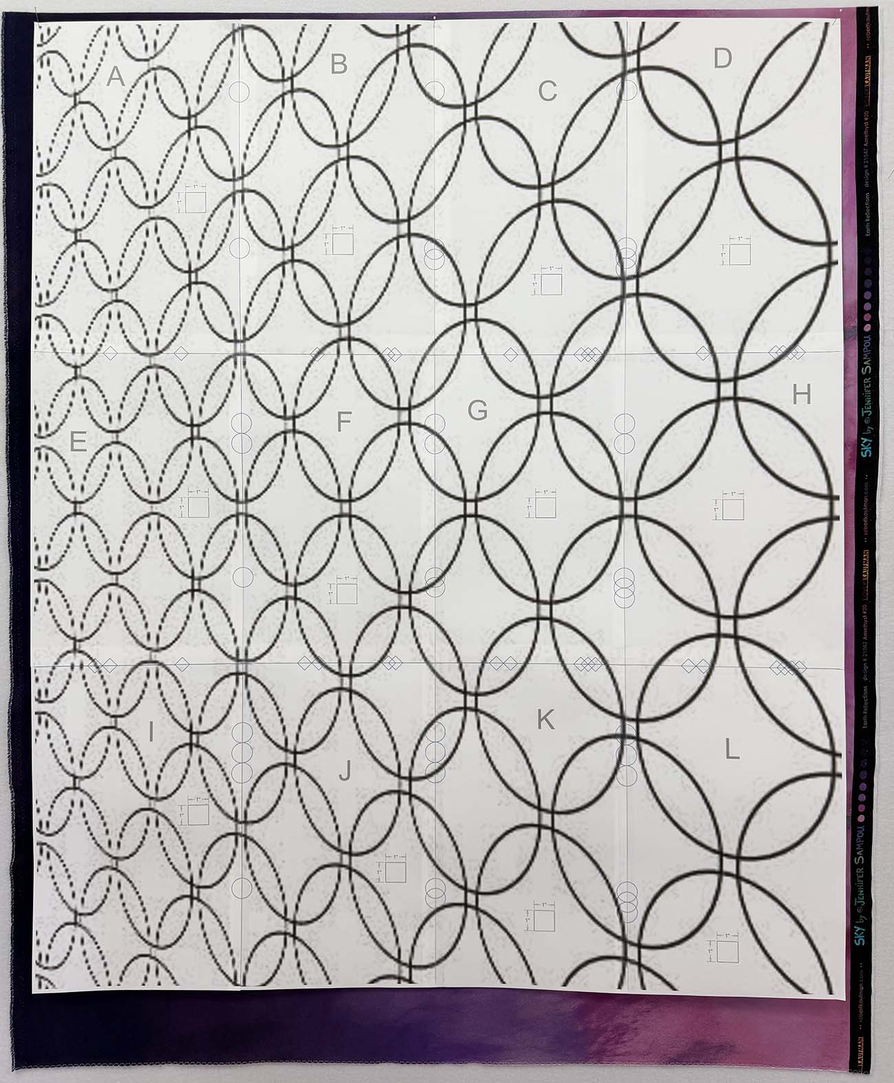
I cut out all of the template pieces with scissors while it is up on the design wall. Cutting pieces one by one helps me keep each piece oriented correctly with all of the surrounding pieces. For this design, I decided to eliminate the small square pieces where the orange peel shapes (almost) converge.
Fabric Selection
Most of the fabrics I used in this quilt are from my stash, but I did add several pieces of violet/purple to work with the colors of the gradient base fabric. I first placed the fabrics for what would be the background fabrics in a pieced version of the design. I wanted these fabrics to match the base fabric as much as possible without being exactly the same. I left a strip of the gradient fabric visible at the bottom of the quilt to use as a color reference.
I’m pleased with how the value in the gradient fabric enhances the forced-perspective design. Keeping the value of the background fabrics close to the base fabric creates subtle movement and a slight glow across the piece.
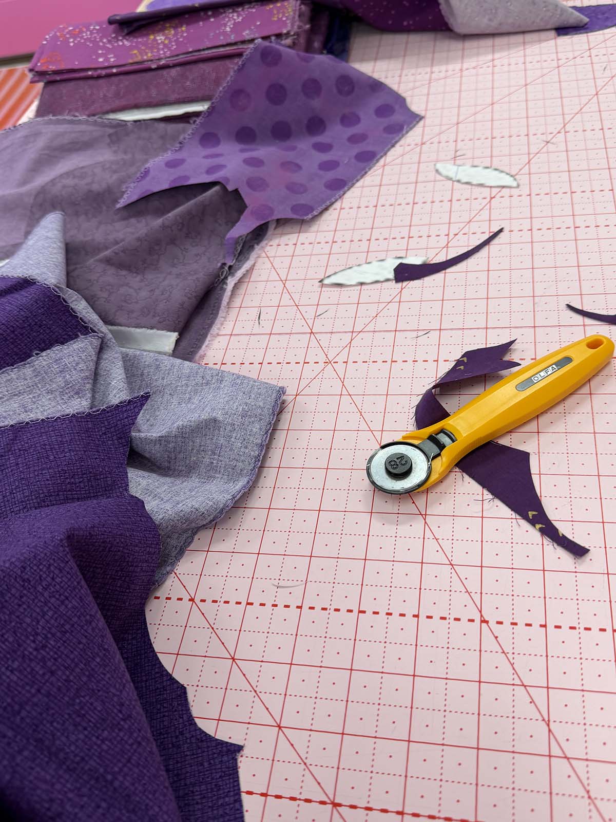
As I placed the fabrics, I kept my full fabric palette out on a nearby cutting table. I cut each unique piece by laying the template paper over the fabric and cutting carefully with a 28mm rotary cutter. I’ve found this style of appliqué works best if I shave off just a tiny bit of the template as I cut. Every piece in this quilt is different, so I cut them one by one to make sure I knew where each design component was placed.
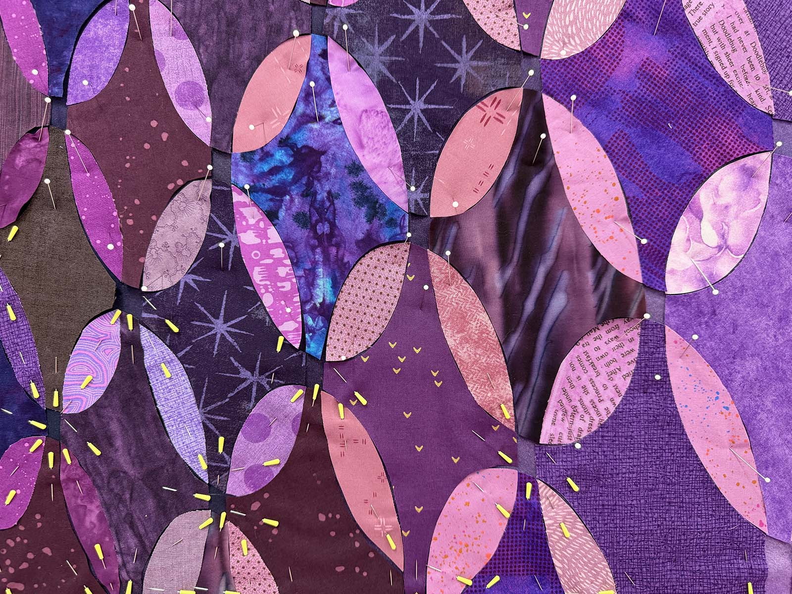
The orange-peel-inspired segments are slightly lighter than the surrounding fabrics, but many of the background fabrics repeat in the orange peels in other sections of the quilt.
Every fabric in this quilt came from the violet/purple section of my fabric stash. In context with other purple fabrics, some appear very pink, while others look very grey, and some lean toward blue or even beige.
What’s Next
The design process for the quilt top is complete, so now it’s time to take it off the design wall. This is probably my least favorite part of the entire construction process. Up until this point, I stick each piece to the design wall with a straight pin. Now I pull out my favorite appliqué pins and make sure the appliqué fabrics are attached only to the base fabric.
Once it is off the wall, I baste and hand-stitch each piece in place. I can’t wait to see this piece come together!

No Comments